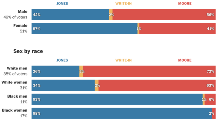
Democrat Doug Jones won in the senate race against Republican Roy More last night. The Washington Post provides how different demographic groups voted, based on a poll “conducted by Edison Research for the National Election Pool, The Washington Post and other media organizations.”
-
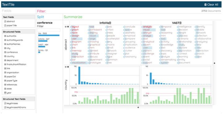
Enrico Bertini, a professor at New York University, delves into the less flashy but equally important branch of visualization: analysis. Much of what Enrico describes applies to the other branches too, so it’s worth the full read:
One aspect of data visualization I have been discovering over the years is that when we talk about data visualization we often think that the choice of which graphical representation to use is the most important one to make. However, deciding what to visualize is often equally, if not more, important, than deciding how to visualize it. Take this simple example. Sometime a graph provides better answers to a question when the information is expressed in terms of percentages than absolute values. I think it would be extremely helpful if we could better understand and characterize the role data transformation plays in visualization. My impression is that we tend to overemphasize graphical perception when content is what really makes a difference in many cases.
Getting to that what often requires iteration between the analysis and presentation facets of visualization. I spend about the same time on the analysis side as on presentation, and that’s only because I’m more fluent with my analysis tools. I don’t have to spend a lot of time reading documentation. The amount of production during the analysis phase is definitely much higher.
-
Michael Wines, reporting for The New York Times:
“The politicization of the census would erode what is already fragile trust and confidence in the integrity of the count,” said Vanita Gupta, the president of the Leadership Conference on Civil and Human Rights, which has worked for years on census issues.
The Trump administration’s heated rhetoric on immigration, race and the trustworthiness of government is fueling fears that minorities, legal and undocumented immigrants and others — from asylum-seekers to victims of the opioid crisis — will be even harder to locate and count. The 2010 census actually overcounted non-Hispanic whites by 0.8 percent and undercounted African-Americans by 2.1 percent and Hispanics by 1.5 percent.
For context, the overcount and undercount numbers aren’t statistically different from that of the 2000 Census. The Census has always had to account for some groups reporting more than others.
But much of this comes from a general distrust of government — more so among some than others — and that trust level isn’t exactly on the rise these days. With that, in tandem with an administration not above swaying the numbers, the upcoming census could get messy. As the census approaches, I hope everyone assumes their right to be counted in this country.
-
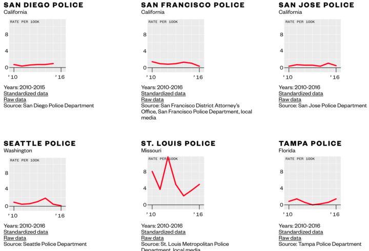
Data for police shootings is usually the subset that only includes fatalities. Vice News made requests nationwide to get data on people who were shot but not killed by police. To accompany their story, Vice News made the data and code available for download:
Ultimately, we obtained some data from 47 departments — with 4,099 incidents in all. Departments in New York’s Suffolk and Nassau Counties didn’t provide us with any data. Maryland’s Montgomery County Police Department gave us only partial incident-level information and no total number of police shootings, so we excluded them from the analysis.
We put all this information together to analyze trends across the departments and to compare them with one another — the first time this has ever been done for both fatal and nonfatal shootings.
Get the data and look for yourself.
-
NASA. Data. Good.
Tracking the aerosols carried on the winds let scientists see the currents in our atmosphere. This visualization follows sea salt, dust, and smoke from July 31 to November 1, 2017, to reveal how these particles are transported across the map.
The first thing that is noticeable is how far the particles can travel. Smoke from fires in the Pacific Northwest gets caught in a weather pattern and pulled all the way across the US and over to Europe. Hurricanes form off the coast of Africa and travel across the Atlantic to make landfall in the United States. Dust from the Sahara is blown into the Gulf of Mexico. To understand the impacts of aerosols, scientists need to study the process as a global system.
-
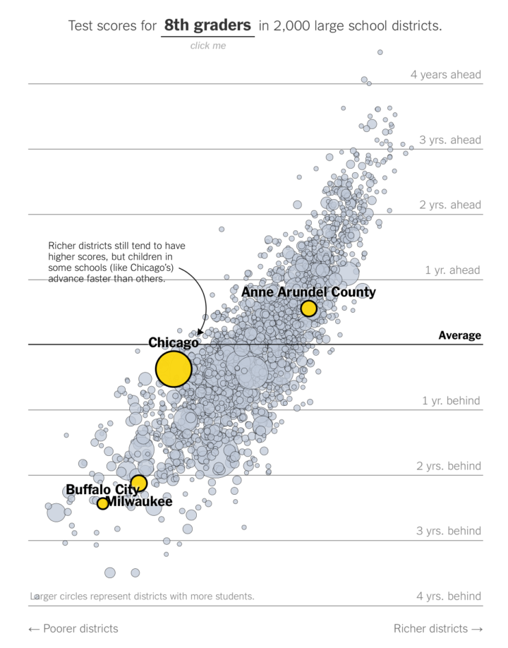 Emily Badger and Kevin Quealy, reporting for the Upshot, highlights research from Sean Reardon, a professor of poverty and inequality in education. Reardon’s research suggests that the relationships between income and standardized test scores should be reevaluated.
 This new data shows that many do overcome them. It also suggests that states that rate schools and select which ones to reward or shutter based on average test scores are using the wrong metric, Mr. Reardon argues. And so are parents who rely on publicly available test scores to identify what they believe are the best school districts — and so the best places to live.
“Most people think there’s some signal in that,” Mr. Reardon said of average test scores. “But it’s a pretty bad signal.”
The interactive charts in the article let you peek at how school districts in your area compare to each other and nationally.
-
How to Make a State Map Grid with Small Multiples in R
Combining small multiples with the grid layout can make for an intuitive geographic reference.
-
There’s another essay on Distill by Shan Carter and Michael Nielsen. They describe and demonstrate how one might use artificial intelligence to augment human intelligence.
Our essay begins with a survey of recent technical work hinting at artificial intelligence augmentation, including work on generative interfaces – that is, interfaces which can be used to explore and visualize generative machine learning models. Such interfaces develop a kind of cartography of generative models, ways for humans to explore and make meaning from those models, and to incorporate what those models “know” into their creative work.
Because, you know, it’s not all about machines taking over the world.
-
Alec Wilkinson, reporting for The New Yorker, profiled Thomas Hargrove, who is deep into finding serial killers algorithmically and through public data:
Thomas Hargrove is a homicide archivist. For the past seven years, he has been collecting municipal records of murders, and he now has the largest catalogue of killings in the country—751,785 murders carried out since 1976, which is roughly twenty-seven thousand more than appear in F.B.I. files. States are supposed to report murders to the Department of Justice, but some report inaccurately, or fail to report altogether, and Hargrove has sued some of these states to obtain their records. Using computer code he wrote, he searches his archive for statistical anomalies among the more ordinary murders resulting from lovers’ triangles, gang fights, robberies, or brawls. Each year, about five thousand people kill someone and don’t get caught, and a percentage of these men and women have undoubtedly killed more than once. Hargrove intends to find them with his code, which he sometimes calls a serial-killer detector.
Find out more and download data from Hargrove’s nonprofit the Murder Accountability Project.
-
Lena Groeger, Ryann Grochowski Jones and Abrahm Lustgarten, reporting for ProPublica with a searchable map of sites in need of bomb cleanup:
The military spends more than a billion dollars a year to clean up sites its operations have contaminated with toxic waste and explosives. These sites exist in every state in the country. Some are located near schools, residential neighborhoods, rivers and lakes. A full map of these sites has never been made public – until now. Enter your address to see the hazardous sites near you, or select a state.
Oh. Yay.
-
-
Remember the artist Tatsuo Horiuchi who uses Microsoft Excel to paint scenery? Four years later, he’s still at it. Watch below.
Horiuchi is my favorite example of someone who shows that the tool is secondary to what you want to make. Spend less time debating about what software you should use to visualize your data, and spend more time deciding what you want to show.
-
Data can provide you with important information, but when the collection process is flawed, there’s not much you can do. Ken Schwencke, reporting for ProPublica, researched the tiered system that the FBI relies on to gather hate crime data for the United States:
Under a federal law passed in 1990, the FBI is required to track and tabulate crimes in which there was “manifest evidence of prejudice” against a host of protected groups, including homosexuals, regardless of differences in how state laws define who’s protected. The FBI, in turn, relies on local law enforcement agencies to collect and submit this data, but can’t compel them to do so.
Right there. There are no standards or set definitions of a hate crime. Some local agencies participate. Many don’t. Those who participate might only collect partial information.
This data that dates back to 1990 is still in the anecdote phase.
-
Compact Ways to Visualize Distributions in R
For when you want to show or compare several distributions but don’t have a lot of space.
-
Lidar, which is like radar but with lasers instead of radio waves, can provide high-detail surveys of the land. The state of Washington is using the tool for beautiful results.
In 2015, the Washington State Legislature mandated that the Department of Natural Resources, Washington Geological Survey collect, analyze, and publicly distribute detailed information about our state’s geology using the best available technology – lidar. The main focus of this new push for lidar collection is to map landslides, but there are innumerable additional benefits and applications of this data both inside and outside of the field of geology.
[via National Geographic]
-
This looks like a fun Processing tutorial by Etienne Jacob. Use noise to draw organic-ish loopy GIFs. I bet the logic could be ported to R.
-
Judith Duportail, writing for the Guardian, requested her personal data from dating service Tinder. She got back 800 pages of all the information she voluntarily gave away.
As I flicked through page after page of my data I felt guilty. I was amazed by how much information I was voluntarily disclosing: from locations, interests and jobs, to pictures, music tastes and what I liked to eat. But I quickly realised I wasn’t the only one. A July 2017 study revealed Tinder users are excessively willing to disclose information without realising it.
Is it bad that all I can think of is Facebook sitting in front of a fireplace with a glass of scotch muttering under its breath: “800 pages? Child’s play.”
Of course after hearing some big number or quantity that defines how much information a company has on an individual, everyone raises their eyebrows. And then they go right back to plugging in more information about themselves.
Good times ahead, I am sure.
-
I hate that this feels like something civilians should know. Bonnie Berkowitz and Aaron Steckelberg, reporting for the Washington Post, describe with a graphic how the United States might counter a nuclear missile fired by North Korea.
-
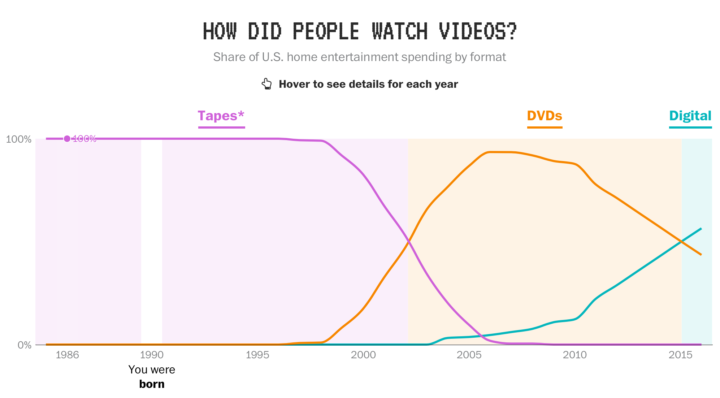
In a fun piece by Reuben Fischer-Baum, reporting for The Washington Post:
In the past three decades, the United States has seen staggering technological changes. In 1984, just 8 percent of households had a personal computer, the World Wide Web was still five years away, and cell phones were enormous. Americans born that year are only 33 years old.
Here’s how some key parts of our technological lives have shifted, split loosely into early, middle and current stages.
There will always be a place in my heart that longs for the good ol’ days of my Walkman, modem sounds, and the phone-less outdoors. Tear.
-
How I Made That: Interactive Heatmap
Add interaction so that you can show different segments of the data and allow comparisons.







 Visualize This: The FlowingData Guide to Design, Visualization, and Statistics (2nd Edition)


