I hate that this feels like something civilians should know. Bonnie Berkowitz and Aaron Steckelberg, reporting for the Washington Post, describe with a graphic how the United States might counter a nuclear missile fired by North Korea.
-
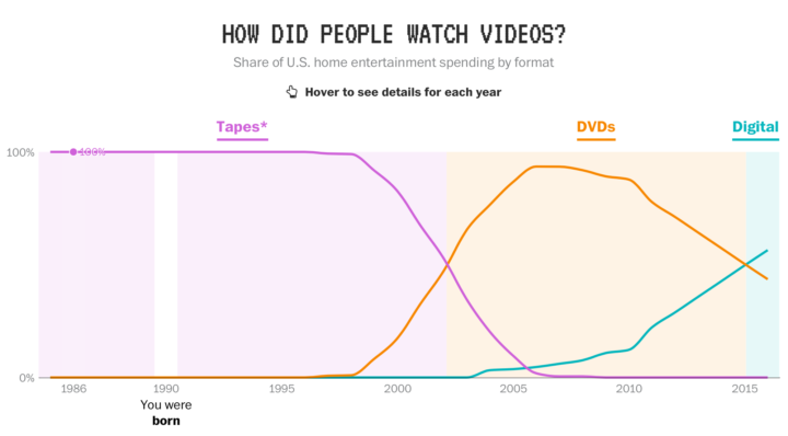
In a fun piece by Reuben Fischer-Baum, reporting for The Washington Post:
In the past three decades, the United States has seen staggering technological changes. In 1984, just 8 percent of households had a personal computer, the World Wide Web was still five years away, and cell phones were enormous. Americans born that year are only 33 years old.
Here’s how some key parts of our technological lives have shifted, split loosely into early, middle and current stages.
There will always be a place in my heart that longs for the good ol’ days of my Walkman, modem sounds, and the phone-less outdoors. Tear.
-
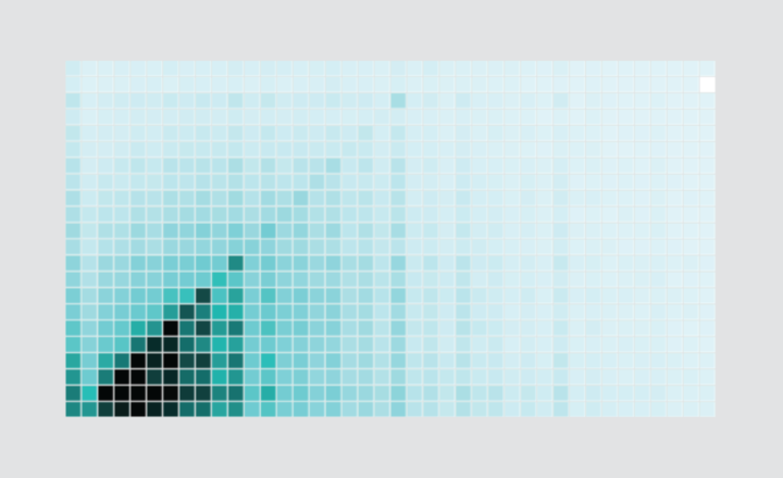
How I Made That: Interactive Heatmap
Add interaction so that you can show different segments of the data and allow comparisons.
-
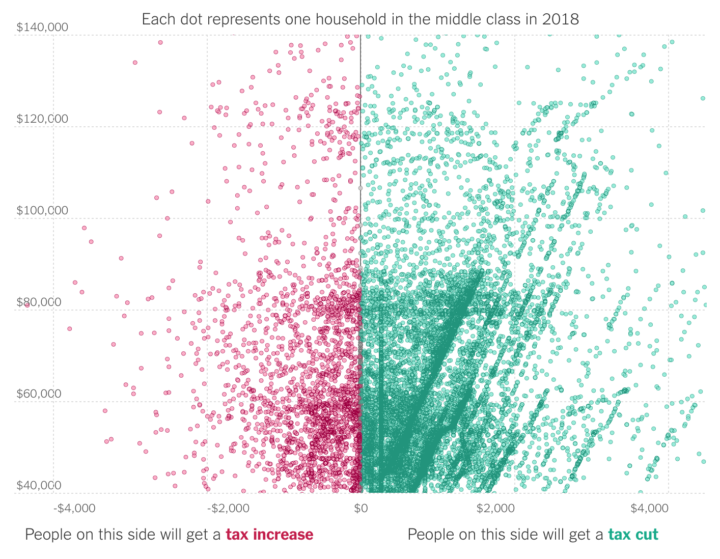
A lot of tax debate centers around the “average” American family, with focus on both tax cuts and increases for what seems like the same groups of people. The difficulty in these arguments is that there’s a ton of variation within the same income brackets because of the various factors to consider in tax calculations.
Quoctrung Bui and Ben Casselman, reporting for The Upshot, explain with 25,000 example households plotted by the tax delta and income.
-
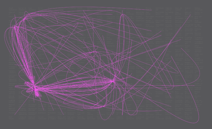
Shifting from one occupation to another can take a swing in the career path. Given your current job, what paths could you take? Here are some constructed possibilities.
-
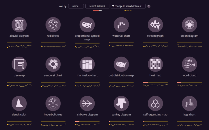
Anna Vital, in collaboration with the Google News Lab, shows the search popularity of chart types, books about charts, and tools for charting. The project is called The Visualization Universe. It surprises me to see some chart types so high on the list, such as the Gantt chart and Ishikawa diagram, but maybe that’s more of an indicator of where I am in the visualization spectrum.
-
This is fine. Totally normal. Eric Newcomer reporting for Bloomberg:
Hackers stole the personal data of 57 million customers and drivers from Uber Technologies Inc., a massive breach that the company concealed for more than a year. This week, the ride-hailing firm ousted its chief security officer and one of his deputies for their roles in keeping the hack under wraps, which included a $100,000 payment to the attackers.
Ugh.
-
Last year, ProPublica revealed that Facebook allowed housing advertisers to exclude races in their campaigns. Facebook said they would address the issue. ProPublica returned to the topic. Facebook didn’t do a very good job.
All of these groups are protected under the federal Fair Housing Act, which makes it illegal to publish any advertisement “with respect to the sale or rental of a dwelling that indicates any preference, limitation, or discrimination based on race, color, religion, sex, handicap, familial status, or national origin.” Violators can face tens of thousands of dollars in fines.
Every single ad was approved within minutes.
Ugh.
-
Keith Collins reporting for Quartz:
Since the beginning of 2017, Android phones have been collecting the addresses of nearby cellular towers—even when location services are disabled—and sending that data back to Google. The result is that Google, the unit of Alphabet behind Android, has access to data about individuals’ locations and their movements that go far beyond a reasonable consumer expectation of privacy.
What.
Google says they didn’t store or use the data. But still. If you’re Google, you should know better.
-
The administration’s current pick for deputy director of the United States Census Bureau is Thomas Brunell. He is a political science professor outside of the Bureau and argues against “competitive elections.”
Danny Vinik and Andrew Restuccia, reporting for Politico:
Since 2005, he has worked at the University of Texas at Dallas, where his research and writing has focused on redistricting and voting rights cases. He has frequently advised states on redrawing their congressional maps. In his 2008 book, “Redistricting and Representation,” he argued that partisan districts packed with like-minded voters actually lead to better representation than ones more evenly split between Democrats and Republicans, because fewer voters in partisan districts cast a vote for a losing candidate. He has also argued that ideologically packed districts should be called “fair districts” and admits that his stance on competitive elections makes him something of an outlier among political scientists, who largely support competitive elections.
Hm.
I’m not familiar with Brunell’s research, but shouldn’t the pick for deputy director of the giant statistical, nonpartisan agency be, um, a statistician? Someone who is familiar with how the Bureau and its 5,000-plus employees function day-to-day?
Hm.
-
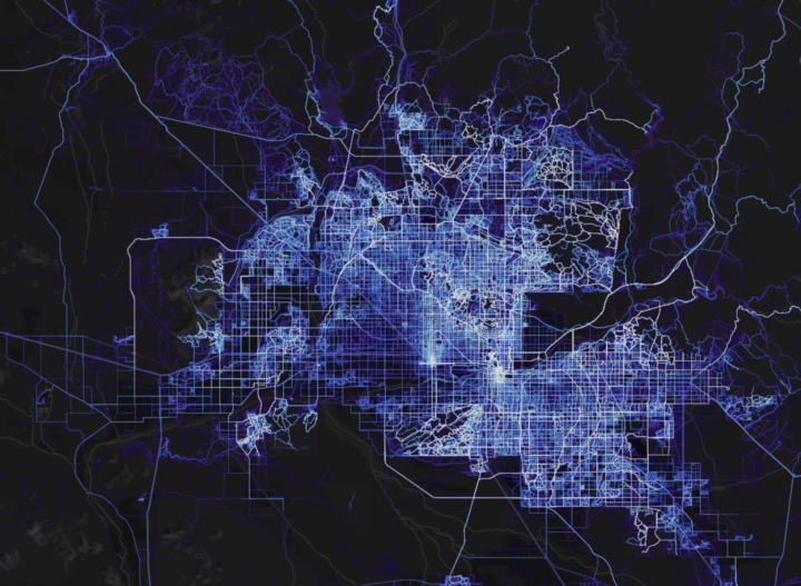
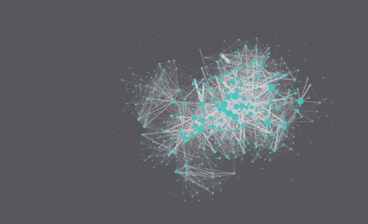
A few years back, cycling and running app Strava mapped the paths of its users. Now with a lot more data and the challenges that come with that, Strava provides a more fine-tuned rendering of where the world cycles and runs.
Beyond simply including more data, a total rewrite of the heatmap code permitted major improvements in rendering quality. Highlights include twice the resolution, rasterizing activity data as paths instead of as points, and an improved normalization technique that ensures a richer and more beautiful visualization.
-
Russell Goldenberg released Scrollama.js in an effort to make scrollytelling more straightforward to implement.
Scrollytelling can be complicated to implement and difficult to make performant. The goal of this library is to provide a simple interface for creating scroll-driven interactives and improve user experience by reducing scroll jank. It offers (optional) methods to implement the common scrollytelling pattern to reduce more involved DOM calculations. For lack of a better term, I refer to it as the sticky graphic pattern, whereby the graphic scrolls into view, becomes “stuck” for a duration of steps, then exits and “unsticks” when the steps conclude.
Bookmarked for later.
-
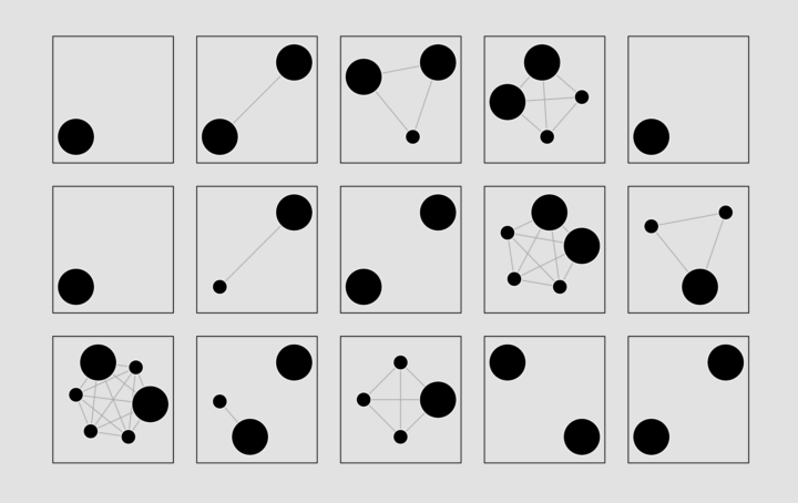
Getting Started with Network Graphs in R
Add the vertices. Connect them with edges. Repeat as necessary.
-
-
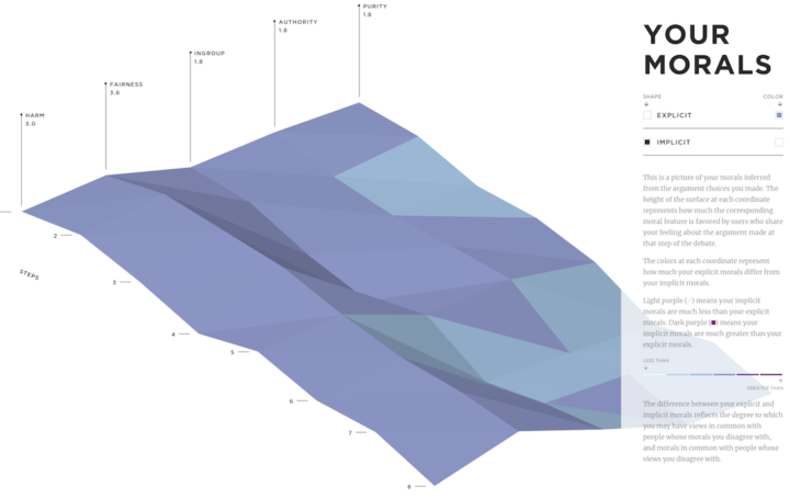
Collective Debate from the MIT Media Lab gauges your moral compass with a survey and then tries to “debate” with you about gender bias using counterpoints from the opposite side of the spectrum. The goal isn’t to be right. Instead, it’s to try to understand the other side. At the end, you see how you compare to others.
-
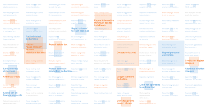
The House Republicans will vote on a tax bill soon that adds about $1.4 trillion to the federal debt. Alicia Parlapiano and Adam Pearce, reporting for The New York Times, look at every change in this scroller.
I like that the visual is kept simple with a two-column, stacked bar chart as the backdrop. The chart provides scale, but the focus in on the text.
-

Generative music comes from the design of a system that produces notes that follow a set of rules. Tero Parviainen provides a detailed, interactive explainer for how this works in practice using ample examples. Take your time with this one.
-
Because you can never have enough time series charts that show increases of CO2 and temperature over decades. By Kevin Pluck:
Differing from the variations we’ve seen before, time is on the circle, and the metrics are on the vertical. Then it rotates for dramatic effect.
See also the the two-dimensional Cartesian version from Bloomberg and the polar coordinate version by Ed Hawkins. There are also plenty more temperature charts. I think after this, we’re set for a while.
-
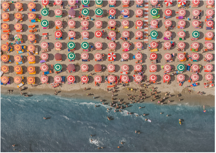
Photographer Bernhard Lang takes pictures in small planes and helicopters, pointing his camera towards the ground. In the ongoing project Aerial Views, he focuses on patterns and structures, which makes for interesting visuals that you’d miss on the ground.
Recently for Members
Second Edition
 Visualize This: The FlowingData Guide to Design, Visualization, and Statistics (2nd Edition)
 Visualize This: The FlowingData Guide to Design, Visualization, and Statistics (2nd Edition)
New tools, refined process.
Browse by Chart Type See All →


