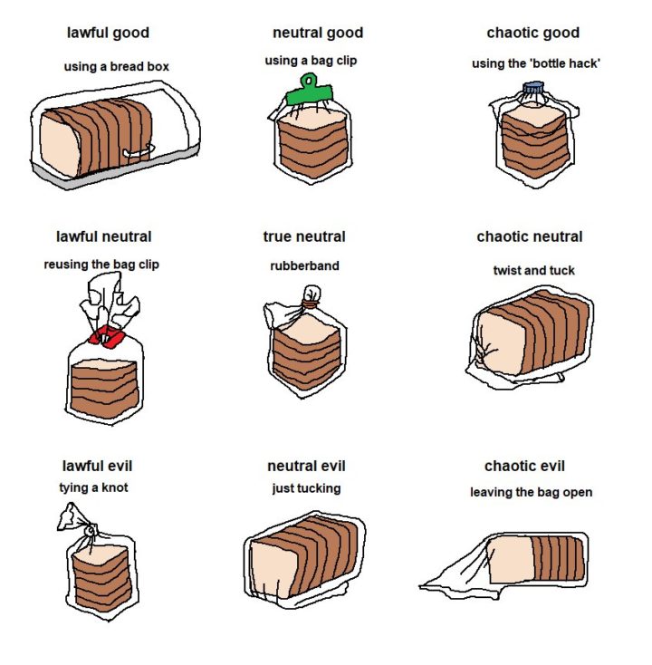
From @aurelianrabbit, the bread bag alignment chart. Lawful neutral, right here.
Bread bag alignment chart
Second Edition
 Visualize This: The FlowingData Guide to Design, Visualization, and Statistics (2nd Edition)
 Visualize This: The FlowingData Guide to Design, Visualization, and Statistics (2nd Edition)
New tools, refined process.