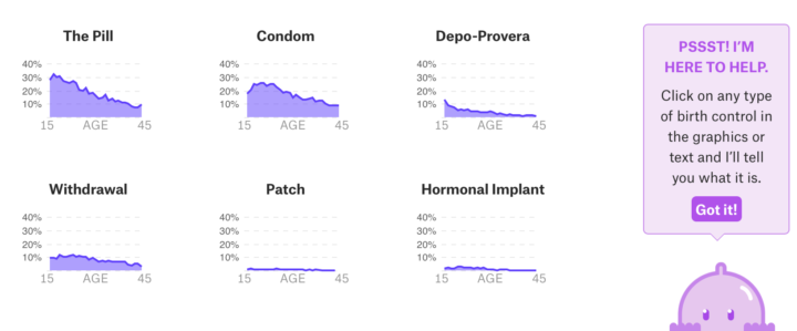
• Membership
  • Newsletter
  • Projects
  • Learning
  • About
  • Member Login
  • Data Underload  /  spending

    How Different Income Groups Spend Money

    After living expenses, where does the money go, and how does it change when you have more cash available?

    Read More
  • Olympians in your living room through augmented reality

    February 7, 2018

    Topic

    Infographics  /  augmented reality, New York Times, Olympics

    Well this is awesome. The Winter Olympics start this Friday, and The New York Times published this piece using augmented reality. Point your phone’s camera somewhere flat in your room, and you see four olympians in a still action shot. Walk around them, walk up to them, and see the details.

    My four-year-old got a kick out of it.

    For the last Winter Olympics, The Times aimed to make the extreme scales that athletes compete on more relatable. So it’s interesting to see them go the other direction, zooming in close to individuals.

    I’m looking forward to the 2022 Winter Olympics when I get to experience the events through the athletes themselves and then pick the tricks that they do Choose-Your-Own-Adventure style.

  • Roger Federer career in rankings and wins

    February 7, 2018

    Topic

    Statistical Visualization  /  Roger Federer, sports, tennis

    Professional tennis player Roger Federer won his 20th Grand Slam title recently. He’s in year 20 of his career, and over time, he rose, he dominated, he declined, and he came back. Schweizer Radio and Fernsehen visualized Federer’s achievements over the years and compared him to other tennis stars in the process.

    It reminds me of the Serena Williams piece by The Los Angeles Times a while back. This one is more refined though. I especially like the updating time series line that stays with you as you scroll. It shows where you are contextually, and provides progression for different parts of Federer’s career.

  • Scissors congruence

    February 6, 2018

    Topic

    Infographics  /  geometry, theorem

    The Wallace–Bolyai–Gerwien theorem says that if you have two polygons of equal area, you can cut one into pieces, and then place them back together to form the second piece. Dima Smirnov and Zivvy Epstein made an interactive to demonstrate. Draw two shapes and watch the magic happen.

  • Statistics crash course

    February 5, 2018

    Topic

    Statistics  /  learning, video

    Odds are if you’re reading this, you know what statistics is already, but if not (or you want to explain to someone else), Crash Course just started a series to explain the basics. Watch below.

    [arve url=”https://www.youtube.com/watch?v=sxQaBpKfDRk” /]

  • Redistricting the congressional map with different goals

    February 2, 2018

    Topic

    Maps  /  FiveThirtyEight, gerrymandering, government

    FiveThirtyEight asks, “There’s a lot of complaining about gerrymandering, but what should districts look like?” Looking for an answer, they imagined redistricting with different goals in mind, such as gerrymandering favoring Republicans or Democrats, promoting competitive elections, and maximizing majority-minority.

    Check out the possibilities for the nation or zoom in to a specific state. The latter provides a further breakdown by district and then race. So yeah, if you’re into this stuff, set aside some time to poke at this one.

  • Bruises

    February 1, 2018

    Topic

    Data Art  /  Giorgia Lupi, health, human, Kaki King

    Musician Kaki King’s daughter suffers from a condition (Idiopathic Thrombocytopenic Purpura) where her body attacks her own platelets, which leads to spontaneous bruising and burst blood vessels. In coping with the stress as a parent who can only do so much for her suffering child, King collaborated with information designer Giorgia Lupi.

    The result: a mix of personal data collection, reflection, music, and data art entitled Bruises — The Data We Don’t See.
    Read More

  • How I Made That: Animated Square Pie Chart

    Also known as waffle charts. Using animated transitions between values, you can allow for comparisons between categories.

  • Secret army bases seen in public fitness tracking map

    January 31, 2018

    Topic

    Data Sharing  /  military, privacy, Strava

    Last year, fitness tracking app Strava released a high detail map of public activity data. Looking more closely, security student Nathan Ruser noticed activity in various parts of the globe that revealed secret US army bases.
    Read More

  • Guides  /  missing data

    Visualizing Incomplete and Missing Data

    We love complete and nicely formatted data. That’s not what we get a lot of the time.

    Read More
  • Finding fake followers

    January 29, 2018

    Topic

    Statistical Visualization  /  bot, fake, Twitter

    This fake follower piece by Nicholas Confessore, Gabriel J.X. Dance, Richard Harris, and Mark Hansen for The New York Times is tops. In search of shortcuts to greater influence, many buy followers, likes, and retweets on Twitter. The numbers go up, but a lot of extra “influence” is just automated fluff.

    The Times focuses on one company, Devumi, and investigates the follower pattern of some of the customers, as shown above. The scroll-y explanation is good. It’s even got pseudocode in there to explain the type of bots.

    Good stuff.

  • Hand-drawn how-to instructions using zero words

    January 29, 2018

    Topic

    Infographics  /  illustration, postcards

    Inspired by Dear Data, the data drawing pen pal project, designers Josefina Bravo, Sol Kawage, and Tomoko Furukawa use the postcard medium to send each other weekly how-to instructions for a wide variety of everyday things. The only rule is that they can’t use words.

    As of writing this, they’re on week 37, which covered how to roll maki, how to eat an apple like a boss, and how to make mayonnaise.

  • Release strategies for Oscar-nominated films

    January 26, 2018

    Topic

    Statistical Visualization  /  movies, Oscars

    Evie Liu and William Davis, reporting MarketWatch, looked at release strategies of Oscar nominees over the past few years. Some go for the wide release with the movie playing in over 1,500 theaters, whereas others choose a platform release with the movie playing in fewer than 50 theaters. The last seven of eight Best Picture winners went with the latter route.

  • Is there something wrong with democracy?

    January 25, 2018

    Topic

    Infographics  /  democracy, New York Times

    Max Fisher and Amanda Taub, for The New York Times, answer the question with a video and charts. And if you’re wondering how they generated a high resolution chart to video, Adam Pearce has you covered.

  • World population estimator and gridded data from NASA

    January 24, 2018

    Topic

    Data Sources  /  NASA, population

    Population data typically comes in the context of boundaries. City data. County data. Country data. With their Population Estimate Service, NASA provides data at higher granularity. You can request estimated population in the context of a world grid.

    Here’s an interactive map to demonstrate the API. Click and drag a shape across any region in the world and get an estimate of the population within that shape. [via kottke]

  • Data Underload  /  demographics

    The Demographics of Others

    I think we can all benefit from knowing a little more about others these days. This is a glimpse of how different groups live.

    Read More
  • Surprise, the world was warmer again in 2017

    January 22, 2018

    Topic

    Statistical Visualization  /  environment, global warming, New York Times

    According to NASA estimates, 2017 was the second warmest year on record since 1880. Henry Fountain, Jugal K. Patel, and Nadja Popovich reporting for The New York Times:

    What made the numbers unexpected was that last year had no El Niño, a shift in tropical Pacific weather patterns that is usually linked to record-setting heat and that contributed to record highs the previous two years. In fact, last year should have benefited from a weak version of the opposite phenomenon, La Niña, which is generally associated with lower atmospheric temperatures.

    Good times ahead.

  • Data to identify Wikipedia rabbit holes

    January 22, 2018

    Topic

    Data Sources  /  Wikipedia

    New data dump from the Wikimedia Foundation:

    The Wikimedia Foundation’s Analytics team is releasing a monthly clickstream dataset. The dataset represents—in aggregate—how readers reach a Wikipedia article and navigate to the next. Previously published as a static release, this dataset is now available as a series of monthly data dumps for English, Russian, German, Spanish, and Japanese Wikipedias.

  • Porn traffic before and after the missile alert in Hawaii

    January 19, 2018

    Topic

    Infographics  /  missile, porn

    PornHub compared minute-to-minute traffic on their site before and after the missile alert to an average Saturday (okay for work). Right after the alert there was a dip as people rushed for shelter, but not long after the false alarm notice, traffic appears to spike.

    Some interpret this as people rushed to porn after learning that a missile was not headed towards their home. Maybe that’s part of the reason, but my guess is that Saturday morning porn consumers woke earlier than usual.

  • Page 148 of 392
  • <
  • 1
  • ...
  • 145
  • 146
  • 147
  • 148
  • 149
  • 150
  • ...
  • 392
  • >

Analyze, visualize, and communicate data usefully, beyond the defaults.

Become a member →

Recently for Members

May 8, 2025
When the data is not what it seems

May 1, 2025
Finding the Right Charts

April 24, 2025
Visualization Tools, Datasets, and Resources – April 2025 Roundup

April 17, 2025
Breaking Out of Chart Software Defaults

April 15, 2025
Line Chart with Decorative Neon Accents

Browse by Chart Type See All →

Surface Plot Chord Diagram Alluvial Diagram Density Plot Pictogram Dot Map Bar Chart Race Histogram Choropleth Map Variable Width Bar Chart

Browse By Topic

  • Visualization

    Seeing data

  • Maps

    Seeing geographic data

  • Infographics

    Explaining data

  • Networks

    Connecting data

  • Statistics

    Analyzing data

  • Software

    Working with data

  • Sources

    Getting data

  • Design

    Making data readable

Get the Book

Visualize This: The FlowingData Guide to Design, Visualization, and Statistics

Available now.

Order: Amazon / Bookshop

Made by FlowingData

  • The Process

  • Data Underload

  • Chart Everything

  • Guides

  • Books

  • Shop

  • About
  • Contact
  • Newsletter
  • LinkedIn
  • Instagram
  • Bluesky
  • RSS
Copyright © 2007-Present FlowingData. All rights reserved.