Pinball feels like a game of chance that is uncontrollable from any angle. In typical Vox fashion, the video explains the game and its predictability.
-
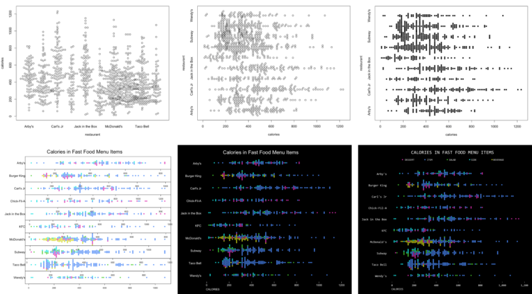
How to Make Better-Looking, More Readable Charts in R
Defaults are generalized settings to work with many datasets. This is fine for analysis, but data graphics for presentation benefit from context-specific design.
-
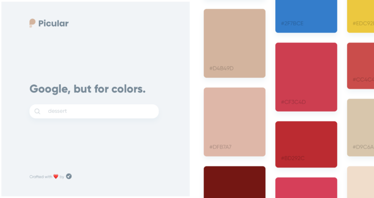
Picular is a simple tool that lets you search for a topic, and with Google Images as source, outputs a set of colors related to your query. This is going to be a great timesaver.
-
A research study on mortality and alcohol consumption is making the rounds. Its main conclusion is that all alcohol consumption is bad for you, because of increased risk. David Spiegelhalter, the chair of the Winton Centre for Risk and Evidence Communication, offers a different interpretation of the data:
Let’s consider one drink a day (10g, 1.25 UK units) compared to none, for which the authors estimated an extra 4 (918–914) in 100,000 people would experience a (serious) alcohol-related condition.
That means, to experience one extra problem, 25,000 people need to drink 10g alcohol a day for a year, that’s 3,650g a year each.
To put this in perspective, a standard 70cl bottle of gin contains 224 g of alcohol, so 3,650g a year is equivalent to around 16 bottles of gin per person. That’s a total of 400,000 bottles of gin among 25,000 people, being associated with one extra health problem. Which indicates a rather low level of harm in these occasional drinkers.
Therefore:
The paper argues that their conclusions should lead public health bodies “to consider recommendations for abstention”.
But claiming there is no ‘safe’ level does not seem an argument for abstention. There is no safe level of driving, but government do not recommend that people avoid driving.
Come to think of it, there is no safe level of living, but nobody would recommend abstention.
Burn.
See also Spiegelhalter talk about weighing risk against benefits in a video from 2010.
-
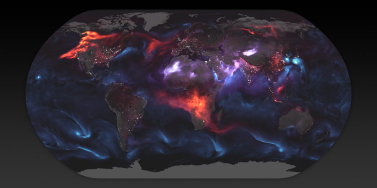
Using a mathematical model based on satellite data, NASA shows an estimate of aerosol in the atmosphere on August 23, 2018:
The visualization above highlights GEOS FP model output for aerosols on August 23, 2018. On that day, huge plumes of smoke drifted over North America and Africa, three different tropical cyclones churned in the Pacific Ocean, and large clouds of dust blew over deserts in Africa and Asia. The storms are visible within giant swirls of sea salt aerosol (blue), which winds loft into the air as part of sea spray. Black carbon particles (red) are among the particles emitted by fires; vehicle and factory emissions are another common source. Particles the model classified as dust are shown in purple. The visualization includes a layer of night light data collected by the day-night band of the Visible Infrared Imaging Radiometer Suite (VIIRS) on Suomi NPP that shows the locations of towns and cities.
Gnarly.
-
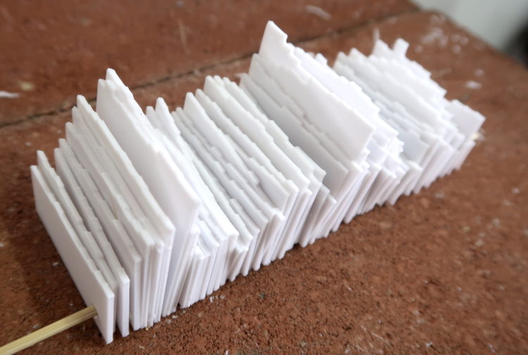
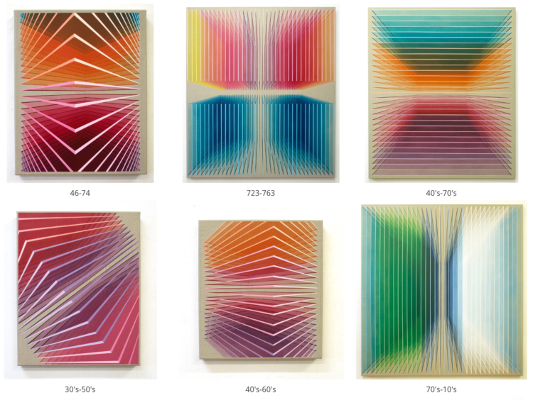
After seeing a 1950s physical visualization, I wondered if I could follow a similar process using modern techniques.
-
Members Only

It can feel like there’s so many rules of visualization that it’s impossible to make a proper visualization. The key: Nothing is absolute.
-
Lucy Engelman has synesthesia, which is a perceptual response where one sensory pathway is stimulated, and a secondary sense is triggered. Daniel Mullen, in collaboration with Engelman, paints what she sees through the secondary sense.
In Lucy’s case, when she sees or thinks about time and numbers (days of the week, months, hours, years) as well as letters/words ie a person’s name, she experiences a different colour sequence in her mind’s eye. Additionally, time is spatial and coloured related, as in the days of the week, months, years, all have a coloured location in space and a shifting orientation. Essentially, she has an ever changing complex and luminous filter to view the abstract concepts of our world.
[via @mariuswatz]
-
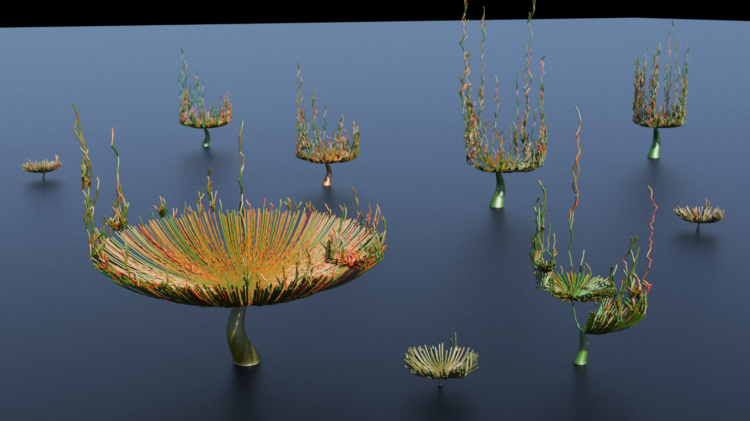
Peter Beshai was tasked with visualizing the toxicity in Twitter conversations. He arrived at this organic-looking model using 3-D visual effects software. Nice.
-
Statistics. I kid, I kid. Hugo Bowne-Anderson, host of the DataFramed podcast, culled some information together that he’s gathered from interviewing data scientists. This is what data scientists really do.
One result of this rapid change is that the vast majority of my guests tell us that the key skills for data scientists are not the abilities to build and use deep-learning infrastructures. Instead they are the abilities to learn on the fly and to communicate well in order to answer business questions, explaining complex results to nontechnical stakeholders. Aspiring data scientists, then, should focus less on techniques than on questions. New techniques come and go, but critical thinking and quantitative, domain-specific skills will remain in demand.
Other than the best spots to nap in between classes, this is one of the most important things I learned in (statistics) graduate school.
-
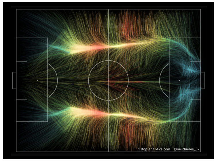
A fun experiment by Neil Charles that used the aesthetics of wind maps to represent World Cup 2018 play activity:
It looks like the familiar shape of an average football game, with the bulk of the play happening out wide and then converging onto the opponent’s area. Colour in this is example is by number of passes (hotter = more) and I’ve also drawn locations with fewer passes more faintly, but the aim is visual impact rather than strict best practice so I deliberately haven’t included a legend.
Clearly this has to be done for every other sport now.
-
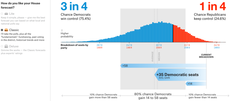
Ever since the huge forecasting upset in 2016, I’ve tended to stay away from that stuff. I mean, it was painful to watch the Golden State Warriors, a huge favorite to win the championship basically the whole series, lose to the Cleveland Cavaliers. Yeah. The Warriors. What were you thinking of?
Alas, it is 2018, and FiveThirtyEight has their forecast for who will control the House. Mainly, I post for the burger menu to select the type of forecast you want.
-
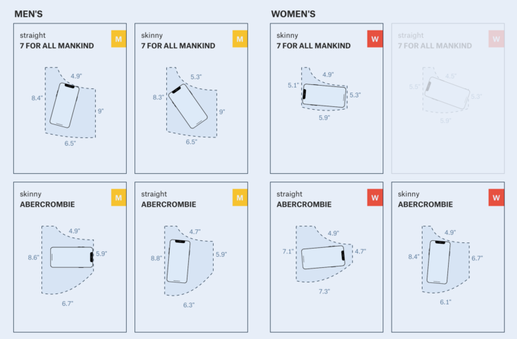
Frustrated with the size of pockets on women’s pants, Jan Diehm and Amber Thomas for The Pudding, measured pocket sizes in 20 popular jean brands. They compared men’s and women’s pockets and calculated what actually fits in the mix of sizes.
[W]e programmatically determined whether various everyday items could fit in an otherwise empty pocket in jeans that aren’t being worn. (If an object won’t fit in the pocket of a pair of jeans on the hanger, it certainly won’t fit when you’re wearing them.) Only 40 percent of women’s front pockets can completely fit one of the three leading smartphone brands. Less than half of women’s front pockets can fit a wallet specifically designed to fit in front pockets. And you can’t even cram an average woman’s hand beyond the knuckles into the majority of women’s front pockets.
Impressive and informative work.
It reminds me of the Amanda Cox graphic that compared women’s dress sizes for different brands in 2011. There’s also the broken waistline measurement.
Let’s just all wear sweats from now on.
-
Members Only
Made-by-hand visualization has been making a mini comeback as of late, and it’s been fun to see what people do with data away from the computer.
Of course, we don’t have the time to draw every chart and map by hand, but there are some parts of the practice we can use in our own work.
-
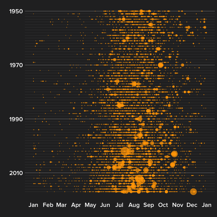
Peter Aldhous for BuzzFeed News delves into the increasing number of wildfires in California:
Most of California’s rain and snow falls in between October and March, which means that fire season peaks in the summer, as vegetation dies and dries out. In Southern California, the season extends into the fall, when Santa Ana winds, which blow from the dry interior toward the coast, whip up small fires into major conflagrations.
As the state has dried and warmed, the fire season has started earlier and larger areas have burned. Similar changes have occurred across the western US.
Grab the data and code to look for yourself.
-
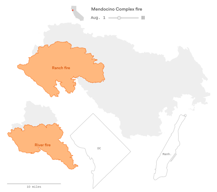
The Mendocino Complex Fire, now the largest in California ever, continues to burn. I live a couple of hundred miles away, but the sky is yellow and orange at times, and it was smokey a few days ago. It’s a bit crazy. Lazaro Gamio for Axios provides a quick view to show scale with an animated graphic compared against Washington, D.C. and Manhattan.
-
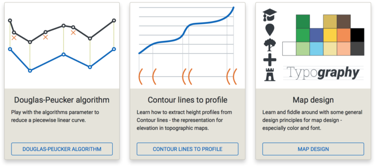
Map-making is a tricky business with many variables to consider that can directly change how someone interprets the land and people in a location. The Cartography Playground is a simple site to test these variables interactively. Learn about algorithms, mess with appearance, and toggle through representations.
-
A gray piece of paper moves along a gradient. You won’t believe your eyes.
A demo of lightness perception pic.twitter.com/BSVpgcuIw1
— Akiyoshi Kitaoka (@AkiyoshiKitaoka) August 12, 2018
-
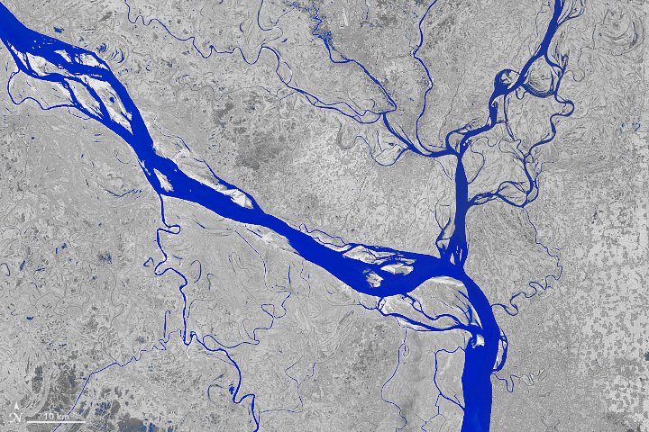
The Padma River in Bangladesh is constantly shifting its 75-mile path. Joshua Stevens for the NASA Earth Observatory shows what the shifting looked like through satellite imagery, over a 30-year span.
Kasha Patel:
The upper section of the Padma—the Harirampur region— has experienced the most erosion and shows the most notable changes. The river has become wider at this section by eroding along both banks, although most activity occurred on the left bank. Using topographic, aerial, and satellite imagery, scientists found that the left bank shifted 12 kilometers towards the north from 1860 to 2009 and developed a meandering bend. The river left a scar where the water once flowed, as you can see in the 2018 image.
See also the dramatic shifts of the Ucayali River in Peru.
-
The camera on the slightly creepy arm takes a picture of the pages in the book, the software uses OpenCV to extract faces, and the faces are passed to Google Auto ML Vision comparing the faces to a Waldo model. The result: There’s Waldo.
Recently for Members
Second Edition
 Visualize This: The FlowingData Guide to Design, Visualization, and Statistics (2nd Edition)
 Visualize This: The FlowingData Guide to Design, Visualization, and Statistics (2nd Edition)
New tools, refined process.
Browse by Chart Type See All →


