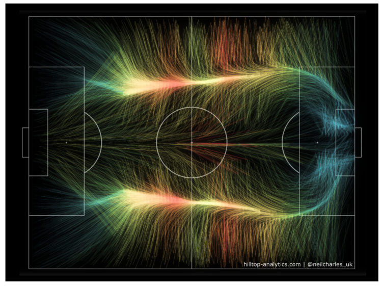
A fun experiment by Neil Charles that used the aesthetics of wind maps to represent World Cup 2018 play activity:
It looks like the familiar shape of an average football game, with the bulk of the play happening out wide and then converging onto the opponent’s area. Colour in this is example is by number of passes (hotter = more) and I’ve also drawn locations with fewer passes more faintly, but the aim is visual impact rather than strict best practice so I deliberately haven’t included a legend.
Clearly this has to be done for every other sport now.
 Visualize This: The FlowingData Guide to Design, Visualization, and Statistics (2nd Edition)