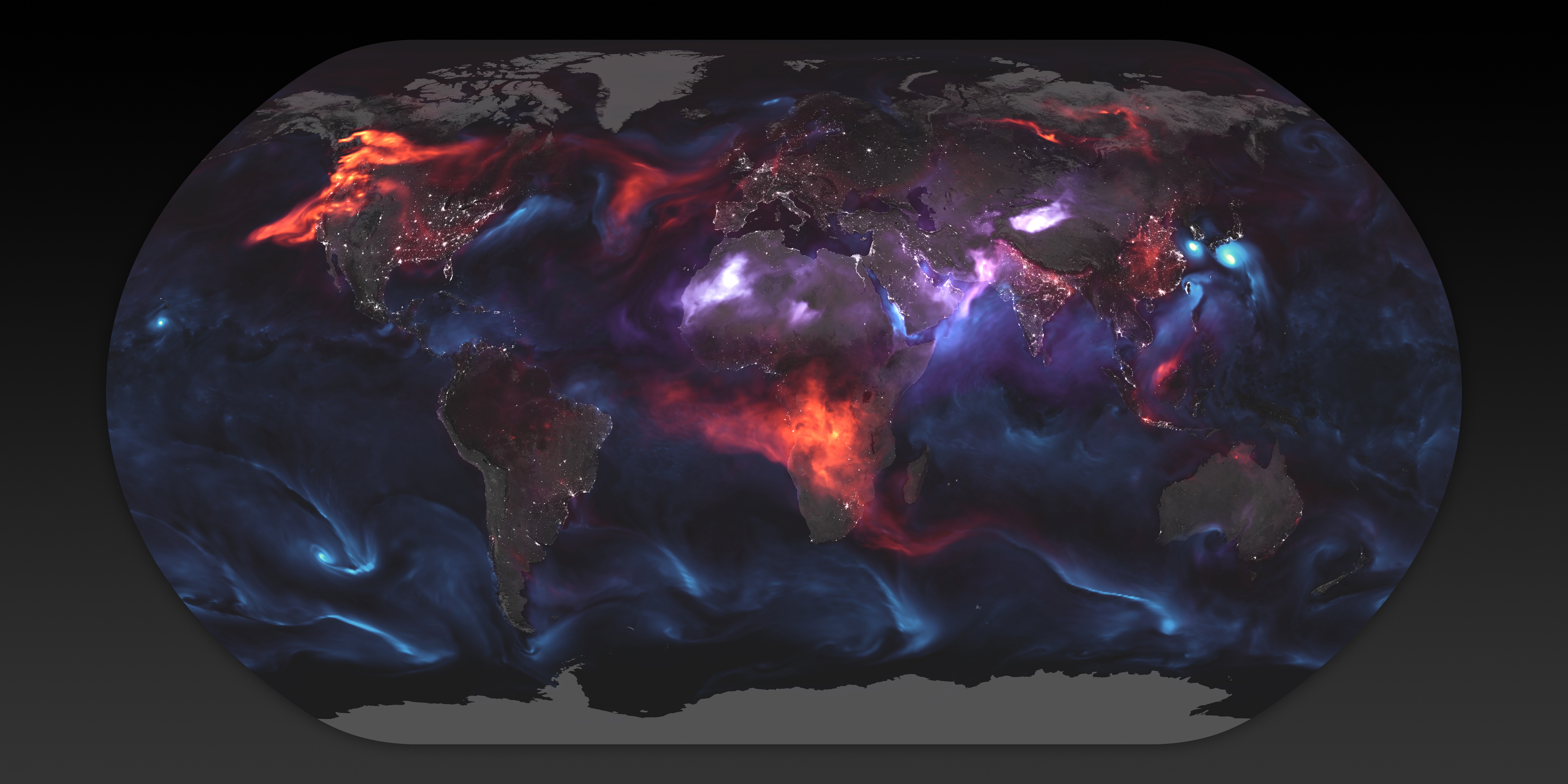
World map shows aerosol billowing in the wind
Aug 24, 2018

Using a mathematical model based on satellite data, NASA shows an estimate of aerosol in the atmosphere on August 23, 2018:

The visualization above highlights GEOS FP model output for aerosols on August 23, 2018. On that day, huge plumes of smoke drifted over North America and Africa, three different tropical cyclones churned in the Pacific Ocean, and large clouds of dust blew over deserts in Africa and Asia. The storms are visible within giant swirls of sea salt aerosol (blue), which winds loft into the air as part of sea spray. Black carbon particles (red) are among the particles emitted by fires; vehicle and factory emissions are another common source. Particles the model classified as dust are shown in purple. The visualization includes a layer of night light data collected by the day-night band of the Visible Infrared Imaging Radiometer Suite (VIIRS) on Suomi NPP that shows the locations of towns and cities.

Gnarly.

Become a member. Support an independent site. Make great charts.

See What You Get

Learn to Visualize Data See All →

Build Interactive Area Charts with Filters

When you have several time series over many categories, it can be useful to show them separately rather than put it all in one graph. This is one way to do it interactively with categorical filters.

A Course for Visualization in R, Taking You From Beginner to Advanced

Where to start? What to learn next? Here’s a course to help take you from beginner to advanced.

How to Untangle a Spaghetti Line Chart (with R Examples)

Put multiple time series lines on the same plot, and you quickly end up with a mess. Here are practical ways to clean it up.

How to: make a scatterplot with a smooth fitted line

Oftentimes, you’ll want to fit a line to a bunch of data points. This tutorial will show you how to do that quickly and easily using open-source software, R.

Favorites

All the Household Types in the U.S.

No need to restrict ourselves to the most common types. There are thousands. Let’s look at all of them.

The Best Data Visualization Projects of 2011

I almost didn’t make a best-of list this year, but …

How People Like You Spend Their Time

Looking at American time use for various combinations of sex, age, and employment status, on weekdays and weekends.

Famous Movie Quotes as Charts

In celebration of their 100-year anniversary, the American Film Institute …