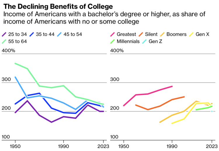
• Membership
  • Newsletter
  • Projects
  • Learning
  • About
  • Member Login
  • Tree blanket color-coded by local temperature

    November 20, 2024

    Topic

    Data Art  /  blanket, crochet, physical, temperature

    Speaking of data blankets, the knitting club in the area I live has an annual tradition of making sweaters for trees in their downtown. One of the trees was wrapped with a temperature blanket.

    Each color corresponds to a temperature range. Each knitted row reflects the high temperature for each day throughout the past year. The bottom starts with September 1, 2023.

    Let’s get more data into the physical world.

  • Bathymetry blanket crochet

    November 20, 2024

    Topic

    Data Art  /  bathymetry, crochet, ocean, physical

    Jesse Gwinn, from NOAA, was at sea on a mapping expedition and to pass the downtime between tasks, she crocheted a bathymetry blanket:

    I assigned 11 colors to different depth ranges: reds and yellows for shallower waters (~2,000-4,000 meters/1.2-2.5 miles), blues and purples for deeper areas (~4,000-6,000 meters/2.5-3.7 miles). Each vertical row contains two colors, illustrating the deepest and shallowest points recorded in a 6-hour period. The relative location of the color change is positioned to represent the average depth of the seafloor for that timeframe. […] The finished blanket contains 97 rows, representing 582 hours (a little more than 24 days) worth of bathymetry data collected using multibeam sonar.

  • Emoji rain and Bluesky Matrix

    November 19, 2024

    Topic

    Infographics  /  Bluesky, emoji, firehose, Jared Short

    Bluesky firehose fun continues. Jared Short shows emoji usage as rain drops that fall down the screen. Larger drops represent longer posts.

    Or, if the Matrix aesthetic is your thing, Short did that too:

  • Stream of deleted Bluesky posts

    November 19, 2024

    Topic

    Data Sources  /  Bluesky, deletion, firehose

    To demonstrate how easy and cheap it is to access the Bluesky firehose, Final Words listens for deletion events and lets them fly and vanish from existence.

  • Tunnel through the live Bluesky firehose

    November 19, 2024

    Topic

    Infographics  /  Bluesky, firehose, Theo Sanderson

    Bluesky has a relatively easy-to-use firehose that lets you dip into the stream of events through the platform. Theo Sanderson made this tunnel view to immerse yourself in the stream of consciousness composed by Bluesky users.

    This is feeling a lot like early Twitter, which makes me think we should enjoy it while it lasts.

  • Data Underload  /  age, boxing, Mike Tyson

    Mike Tyson Fights Against Age

    The 58-year-old Mike Tyson fought the 27-year-old Jake Paul, likely wrapping up Tyson’s boxing career that started in 1985 when he was 18. Given the big age difference in the final fight, I wondered the age of past Tyson opponents. This is the timeline.

    Read More
  • Participation in the annual United Nations climate conference

    November 18, 2024

    Topic

    Statistical Visualization  /  climate change, New York Times, United Nations

    For the New York Times, Mira Rojanasakul visualized annual participation in the United Nations Climate Change Conference, which has been running every year since 1995.

    If you think of the numbers as a proxy for the nations that care about climate change, things don’t look great for North America, but the shifts also provide a window into the politics of caring.

  • Make the Chart: Interactive Line Chart with Ghost Trails

    Using faded lines to show the overall changes in a time series and to provide a point of reference for the present.

  • Swooping vote margins

    November 15, 2024

    Topic

    Infographics  /  election, margin, New York Times

    The New York Times used swooping arrows to show vote swings left and right for the 2016, 2020, and 2024 elections. A shift left makes the section of an arrow blue, and a shift right makes a section of the arrow red. They show these arrows for demographic groups, too, which have static sizes, but the map above scales the arrows for electoral votes.

    I was trying to figure out where I saw this method before. Then I saw it:

    More specifically, the wordless version:

    Then I had to eat lunch.

  • Margin of victory over past elections, in Minnesota

    November 15, 2024

    Topic

    Network Visualization  /  election, margin, Minnesota Star Tribune

    For the Minnesota Star Tribune, Yuqing Liu and C.J. Sinner show how the margin of victory changed each presidential election in Minnesota. Each bubble represents a county, size shows total votes, and diverging color scale represents the margin of victory for Democrat and Republican.

    My affinity for force-directed bubbles contractually requires that I share this.

  • Members Only

    Connect the Charts

    November 14, 2024

    Topic

    The Process  /  connections

    This week we look at connecting multiple charts explicitly and implicitly to provide a cohesive narrative or visual metaphor around a dataset.

  • Data Underload  /  age, employment, work

    Employment Rates and Age, More Work and More Years

    In 1935, the United States Congress passed the Social Security Act to provide financial support to those 65 years and older. Full retirement age would slowly rise to 67 by 2022. We can see how this changed the scales of who works and for how long through employment rates by age and time.

    Read More
  • Evolution of the love song

    November 13, 2024

    Topic

    Statistical Visualization  /  David Mora, love, Michelle Jia, Pudding, song

    For The Pudding, David Mora and Michelle Jia examine the death of the love song, or rather, the evolution of the love song to include other types alongside the sappy and puppy dog types.

    Each bubble represents a song, and bubble size represents the number of weeks each song spent in the Billboard Top 10. Then they go back and forth between the bubble view above, beeswarm charts, and an alluvial diagram below.

    FD readers will likely be interested in the footnotes at the end of the piece. There are notes on methodology, song classification, and a link to download the data.

    The Pudding has been publishing at a rapid pace these past couple months. It’s quite a treat.

  • See you on Bluesky

    November 12, 2024

    Topic

    Site News

    Bluesky, maybe best pitched as a place for those who liked Twitter and Google Reader more than a decade ago, is having a moment right now. You can find me there.

    It’s always hard for these things to maintain momentum, but we’ll see. The shift feels real this time. A good portion of the visualization community is over there, and some, like me, are rediscovering social media.

    Sky Follower Bridge is a useful plugin for Chrome and Firefox to find the people you used to follow on X.

    Hope to see you there.

  • Dot density map for election results

    November 12, 2024

    Topic

    Maps  /  Economist, election

    With what is now a common mapping method, The Economist used a dot density map to show election results by county. The dot counts are scaled to population density.

    At first glance, I thought it was a 2024 version of this 2020 election map that shows the mix of voting within regions. A two-dimensional angle for grains of sand. But the map above shows just the winner of each county, which caught me off guard, because I associate the method with mixing demographic groups.

  • Mapping every voter as a grain of sand

    November 12, 2024

    Topic

    Maps  /  election, metaphor, Washington Post

    To show the mix of votes across the country, the Washington Post used a sand pile metaphor. Each grain of sand represents a vote for red or blue, and more votes create larger piles. Some piles are more red and some are more blue, but overall, you get a lot of mixed piles.

    This is in contrast to a choropleth map that shows the winner in each region. One is not necessarily better than the other. Instead, this sand map shows a different angle to the data.

  • Days without rain

    November 12, 2024

    Topic

    Statistical Visualization  /  Bloomberg, drought, rain

    New York City recently issued a drought warning because of an abnormally dry fall. For Bloomberg, Denise Lu used a heatmap to highlight day streaks without rain via precipitation measurements in Central Park.

    It’s more of an event-driven graphic than a pattern-driven one. I wonder if reversing the color scale would be useful here. Would it make the longer streaks appear “dryer” with empty space?

  • 23andMe sinking

    November 11, 2024

    Topic

    Data Sharing  /  23andMe, BBC

    For BBC, Zoe Kleinman reports:

    Not so long ago, 23andMe was in the public eye for all the right reasons.

    Its famous customers included Snoop Dogg, Oprah Winfrey, Eva Longoria and Warren Buffet – and millions of users were getting unexpected and life-changing results.

    Some people discovered that their parents were not who they thought they were, or that they had a genetic pre-disposition to serious health conditions. Its share price rocketed to $321.

    Fast forward three years and that price has slumped to just under $5 – and the company is worth 2% of what it once was.

    What went wrong?

    It’s mostly wishful thinking on my part, but maybe people started to feel strange about sending their DNA to a company they didn’t know that much about.

  • What might have sank the Bayesian superyacht

    November 8, 2024

    Topic

    Infographics  /  New York Times, superyacht

    A $40 million superyacht called the Bayesian sank off the coast of Sicily, but the exact cause is unknown. The New York Times illustrated the possibilities:

    Reports immediately after the disaster raised the possibility that the Bayesian had been hit by a tornado-like disturbance called a waterspout, but the authorities don’t think that happened. Still, the wind was doing something dangerous: It was changing direction.

    According to a nearby weather station, it was blowing west-southwest then southwest, then north-northwest. This increased the chances of getting ambushed by a random gust that could slam into the side of a boat, which can tilt even a big vessel.

  • Members Only

    Random Everyday Walk

    November 7, 2024

    Topic

    The Process  /  random, uncertainty

    This week we talk randomness in the everyday.

  • Page 14 of 391
  • <
  • 1
  • ...
  • 11
  • 12
  • 13
  • 14
  • 15
  • 16
  • ...
  • 391
  • >

Analyze, visualize, and communicate data usefully, beyond the defaults.

Become a member →

Recently for Members

May 8, 2025
When the data is not what it seems

May 1, 2025
Finding the Right Charts

April 24, 2025
Visualization Tools, Datasets, and Resources – April 2025 Roundup

April 17, 2025
Breaking Out of Chart Software Defaults

April 15, 2025
Line Chart with Decorative Neon Accents

Browse by Chart Type See All →

Density Plot Strip Plot Barcode Chart Organogram Stacked Area Chart Spiral Chart Calendar Choropleth Map Difference Chart Cartogram

Browse By Topic

  • Visualization

    Seeing data

  • Maps

    Seeing geographic data

  • Infographics

    Explaining data

  • Networks

    Connecting data

  • Statistics

    Analyzing data

  • Software

    Working with data

  • Sources

    Getting data

  • Design

    Making data readable

Get the Book

Visualize This: The FlowingData Guide to Design, Visualization, and Statistics

Available now.

Order: Amazon / Bookshop

Made by FlowingData

  • The Process

  • Data Underload

  • Chart Everything

  • Guides

  • Books

  • Shop

  • About
  • Contact
  • Newsletter
  • LinkedIn
  • Instagram
  • Bluesky
  • RSS
Copyright © 2007-Present FlowingData. All rights reserved.