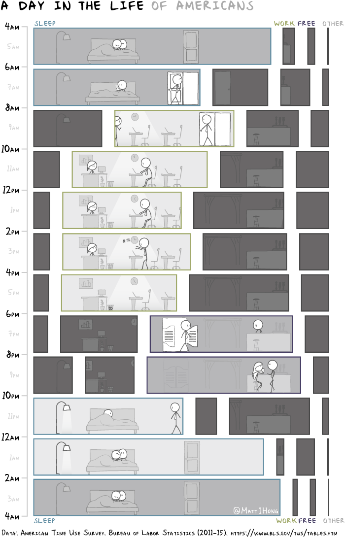
Matt Hong used a stacked bar chart over time as the frame for a data comic about American time use. Each row represents a 2-hour window during the day, and each stack represents the percentage of Americans doing an activity: sleep, work, free, and other. The activity with the highest percentage gets a highlight.
As a fan of time use data, this is totally my jam. Also, the data comic space is underutilized.
 Visualize This: The FlowingData Guide to Design, Visualization, and Statistics (2nd Edition)