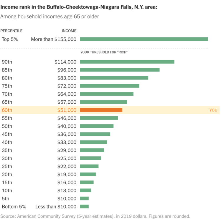
In a compare-your-preconceptions-against-reality quiz, The Upshot asks, “Are you rich?” Enter your nearest metro area, income, and what you consider to be rich. See where you actually land.
-
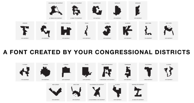
Gerry uses congressional district boundaries as letters. Hahahahaha. Oh wait.
-
Members Only
-
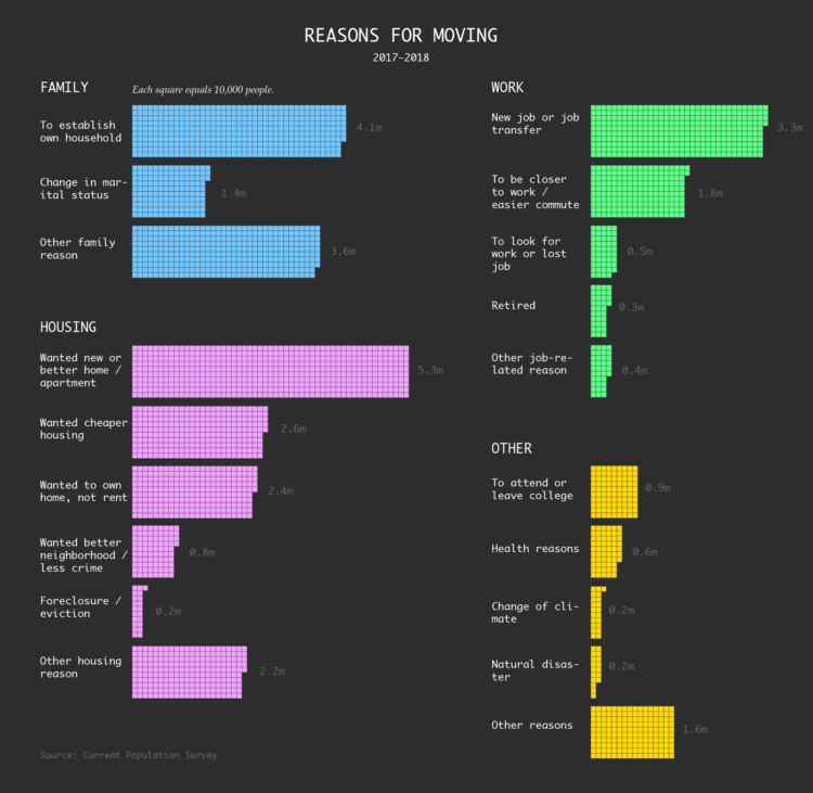
Here are the estimates from the Current Population Survey for the most recent time segment between 2017 and 2018.
-
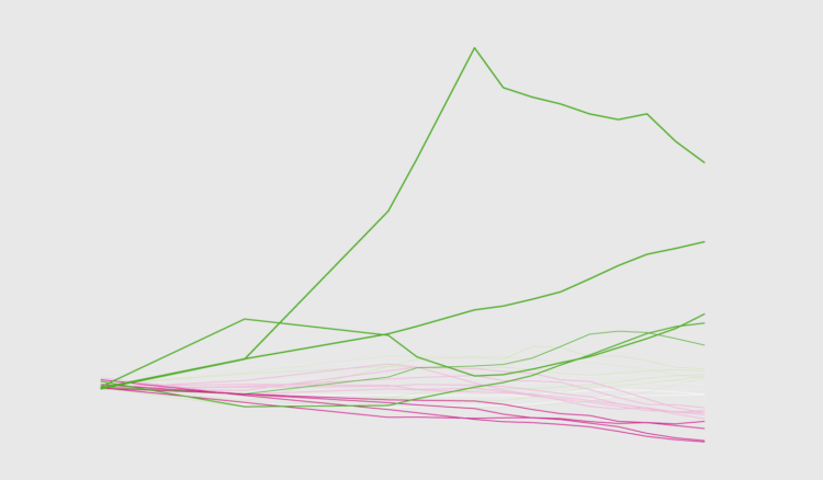
How to Make Baseline Charts in R
By shifting the baseline to a reference point, you can focus a line chart on relative change, which can improve the visibility of smaller categories.
-
Using blobbies with varying traits such as size, speed, and food gathering ability, Primer simulates natural selection in the explainer video below. Blobby.
-
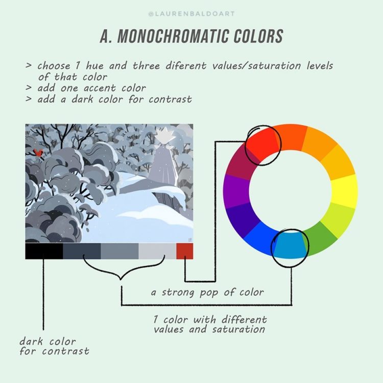
Lauren Baldo illustrated how he applies color theory in his paintings and illustrations. You don’t have to travel far to see how this transfers to visualization.
-
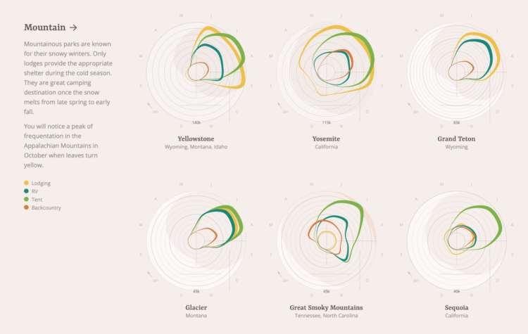
When staying at national parks, some people choose a tent. Some bring an RV. Others might stay in a lodge or sleep under the stars. Of course, it depends on where they stay and the weather during any given time of year. Using data from the National Park Service, Jordan Vincent charted all these things with a multi-faceted approach.
Each band represents patterns for an accommodation type over a year, band width represents number of nights stayed per month, and radius represents volume. Average temperature sits in the background.
Oftentimes, putting so many variables together in one view hides patterns, but this abstract view feels intuitive, even if less concrete. [Thanks, Dario]
-
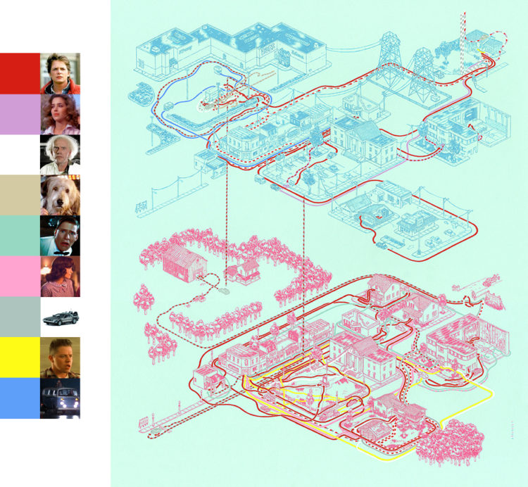
Andrew DeGraff painted maps that show the geography in movies and their characters’ paths. Above is the map for Back to the Future, with 1985 Hill Valley on the top and 1955 Hill Valley on the bottom.
There’s also a book version. [via kottke]
-
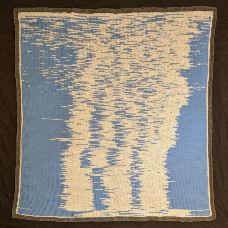
Seung Lee collected sleep data for his son’s first year. Then he knitted a blanket to visualize the data. The blanket is impressive. Collecting a baby’s sleep data for a year? More so.
-
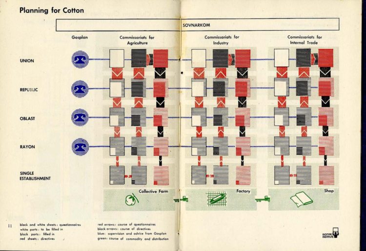
Jason Forrest delves into the history of a single Isotype and a bit of the general background on the picture language:
Isotype is a highly refined picture language designed for educating people with as few words as possible. Created by Otto Neurath in 1925, the International System of Typographic Picture Education (ISOTyPE) evolved over the next two decades with the collaboration of Marie Neurath and Gerd Arntz. The trio developed their distinct approach to data visualization iteratively, and very collaboratively. Otto provided the overall direction, Marie “transformed” the data to present the story, and Gerd designed the pictogram units and highly-refined designs.
-
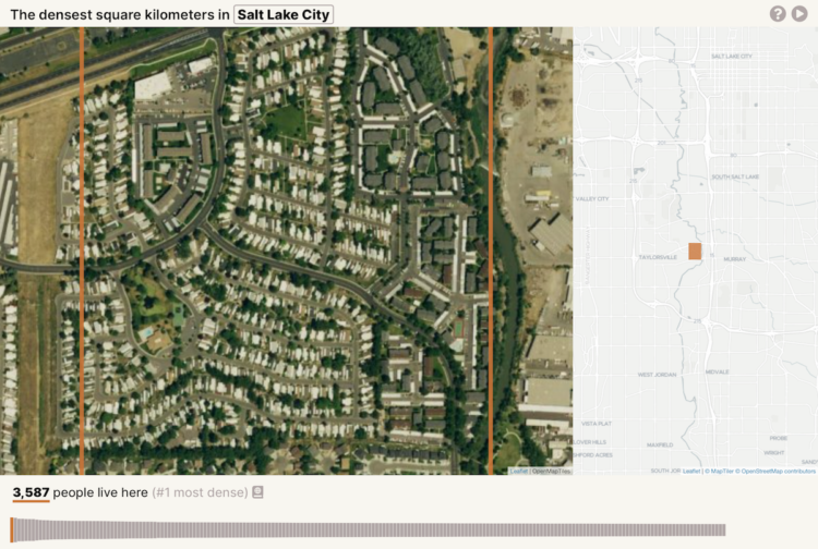
Based on data from Gridded Population of the World, geographer Garrett Dash Nelson calculated the square kilometers in major cities with the highest population density.
In the interactive visualization, I’ve taken GPW data for a curated selection of American cities. Some have old, historic cores, and others are dominated by more recent development; some have constricting physical geographies and others lie on relatively flat, open plains; some were built for horse transportation and others for the automobile era.
-
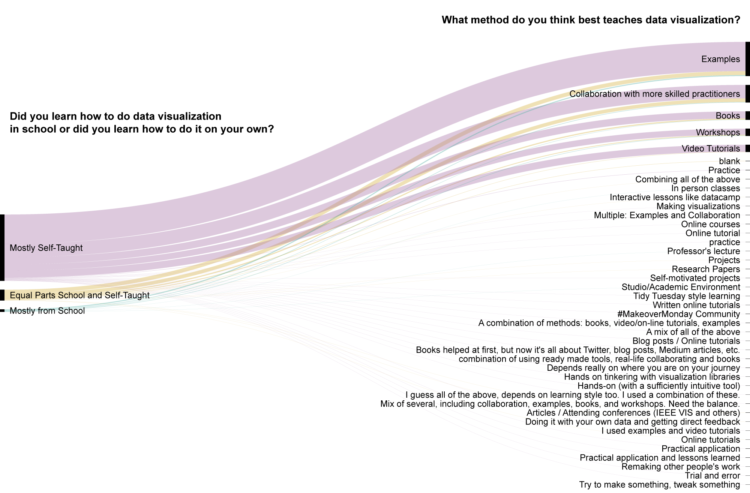
Visualization is still a relatively young field, so people learn about and how to visualize data in a lot of different ways. For instance, there weren’t any visualization-specific courses when I was in school, so I picked up a lot ad hoc. Alli Torban, looking at responses to the 2018 Data Visualization Survey, shows how others learned. The top three: examples, collaboration with those more skilled, and books.
-
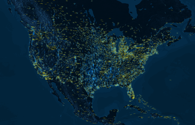
Airport runways orient certain directions that correlate with wind direction in the area. It helps planes land and take off more easily. So, when you map runways around the world, you also get wind patterns, which is what Figures did:
Winds circulate around the globe, forming patterns of gigantic proportions. These patterns become part of human culture and are reflected in our architecture. They are hidden designs, mapping the complexion of the earth, which we can uncover. By orienting on the direction of general winds, airports recreate wind patterns, forming a representation of a global wind map with steel and stone, thus making the invisible visible.
-
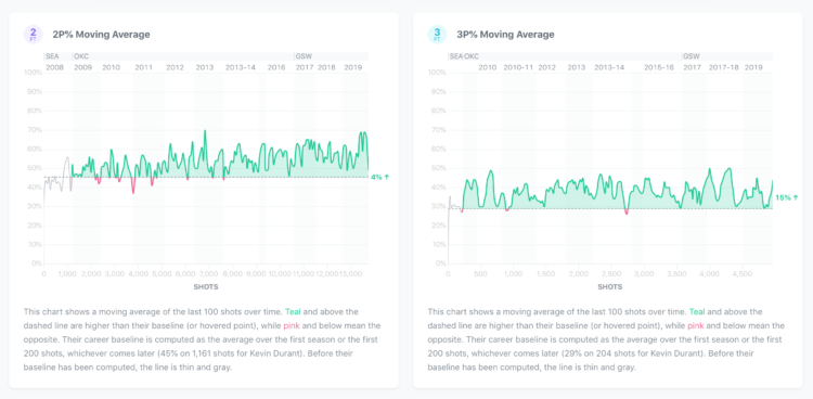
Wondering whether if a player’s shot improves over the course of his career, Peter Beshai shows shot performance for all players from the 2018-19 season:
To understand whether or not a player actually gets better over time, we need some kind of baseline to compare their current performance against. On Shotline, the baseline is set after a player completes their first season in the NBA and has shot at least 200 times. This may sometimes feel a bit arbitrary, and I guess it is, but it feels reasonable to compare a player’s first season’s performance to their current to understand whether they have improved or not. The graphs are set up to allow you to compare their current performance against any other point in time too if the baseline is not sufficiently interesting to you.
-
Members Only
-
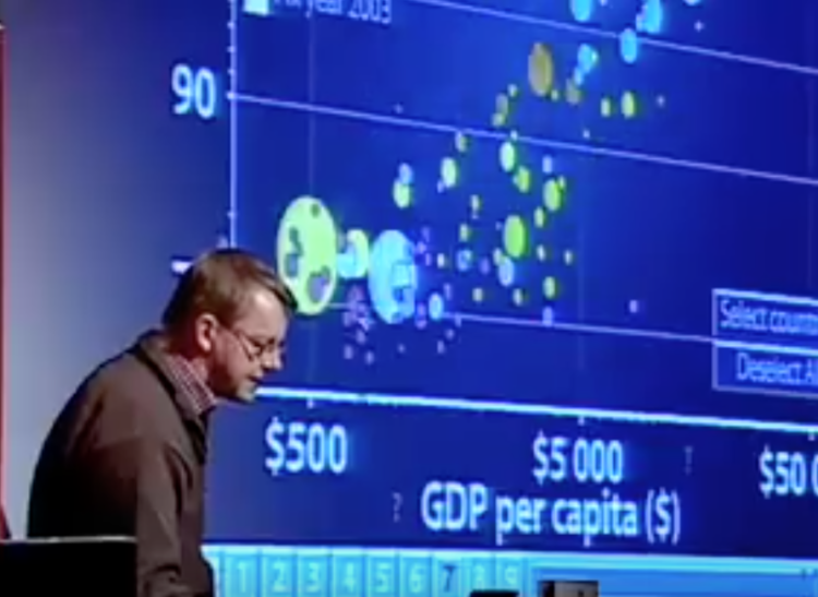
Rewind to 2006 when Hans Rosling’s talk using moving bubbles was at peak attention. Researchers studied whether animation in visualization was a good thing. Danyel Fisher revisits their research a decade later.
While they found that readers didn’t get much more accuracy from the movement versus other method, there was a big but:
But we also found that users really liked the animation view: Study participants described it as “fun”, “exciting”, and even “emotionally touching.” At the same time, though, some participants found it confusing: “the dots flew everywhere.”
This is a dilemma. Do we make users happy, or do we help them be effective? After the novelty effect wears off, will we all wake up with an animation hangover and just want our graphs to stay still so we can read them?
-
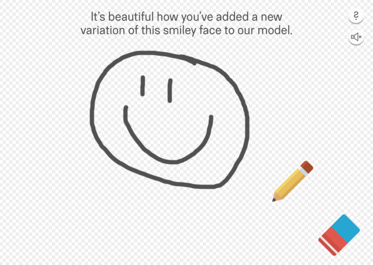
Working from the Quick, Draw! dataset, Moniker dares people to not draw a penis:
In 2018 Google open-sourced the Quickdraw data set. “The world’s largest doodling data set”. The set consists of 345 categories and over 15 million drawings. For obvious reasons the data set was missing a few specific categories that people enjoy drawing. This made us at Moniker think about the moral reality big tech companies are imposing on our global community and that most people willingly accept this. Therefore we decided to publish an appendix to the Google Quickdraw data set.
Draw what you want, and the application compares your sketch against a model, erasing any offenders.
-
The American Time Use Survey recently released results for 2018. That makes 15 years of data. What’s different? What’s the same?
-
Nicholas Rougeux, who has a knack and the patience to recreate vintage works in a modern context, reproduced Elizabeth Twining’s Illustrations of the Natural Orders of Plants:
If someone told me when I was young that I would spend three months of my time tracing nineteenth century botanical illustrations and enjoy it, I would have scoffed, but that’s what I did to reproduce Elizabeth Twining’s Illustrations of the Natural Orders of Plants and I loved every minute.
The best part is that you can select flowers in the text or on the illustrations to focus on a specific parts, which makes descriptions easier to interpret.




 Visualize This: The FlowingData Guide to Design, Visualization, and Statistics (2nd Edition)


