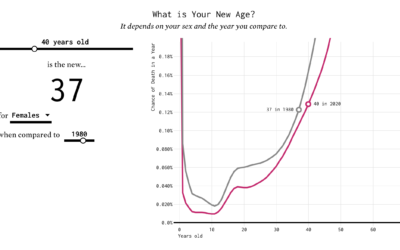
Cost of College
We know that more education usually equals more income, but as the cost of education continues to rise, the challenge to earn a college degree also increases. Based on estimates from the National Center for Education Statistics, here’s how much the cost has gone up over the years.
Rising Costs
Since 1967, the National Center for Education Statistics has tracked the cost of college: tuition, room, and board. Costs continue to rise for all types.

Public
Private
$43,139
$40,000
$40,000
$30,000
$30,000
The average total cost in 2018 was $20,050 per academic year.
4-year
$16,046
$20,000
$20,000
Board
In 1967, the cost was
$7,907
Room
$10,000
$10,000
Tuition
$0
$0
1967
1980
1990
2000
2010
2018
1967
1980
1990
2000
2010
2018
$40,000
$40,000
$25,596
$30,000
$30,000
2-year
$20,000
$20,000
$12,656
$10,281
$10,000
$10,000
$5,352
$0
$0
1967
1980
1990
2000
2010
2018
1967
1980
1990
2000
2010
2018
Cost is in 2017-18 dollars.
Source: National Center for Education Statistics / By: FlowingData

Public, 4-year
$30k
The average total cost in 2018 was $20,050 per academic year.
$20k
Board
In 1967, the cost was
$7,907
Room
$10k
Tuition
$0k
1967
1980
1990
2000
2010
2018
Public, 2-year
$10,281
$10k
$5,352
$0k
1967
1980
1990
2000
2010
2018
Private, 4-year
$43,139
$40k
$30k
$16,046
$20k
$10k
$0k
1967
1980
1990
2000
2010
2018
Private, 2-year
$30k
$25,596
$20k
$12,656
$10k
$0k
1967
1980
1990
2000
2010
2018
Cost is in 2017-18 dollars.
Source: National Center for Education Statistics
By: FlowingData
It doesn’t matter whether you’re looking at public versus private or four-year versus two-year. At the least, the cost of tuition, room, and board has just about doubled when you compare 2018 costs to that of 1967’s.
Notes
- The data comes the National Center for Education Statistics. I have a feeling this College Scorecard data might have been useful too.
- I used R to make the stacked area charts. Related tutorial: How to Make Stacked Area Charts in R.
Chart Type Used

Become a member. Support an independent site. Get extra visualization goodness.
See What You Get