• Membership
  • Newsletter
  • Projects
  • Learning
  • About
  • Member Login
  • Recursive painting in real life

    February 5, 2019

    Topic

    Network Visualization  /  painting, recursion

    It started with a mom holding her painting of a bird. Then someone painted that photo and took a picture of himself holding the painting. Then someone painted the photo of the man holding the painting of the picture of the mom holding the bird. The recursion continued. Luckily someone diagrammed all of the iterations:

    Just wow.

  • Average view of Earth from space

    February 4, 2019

    Topic

    Maps  /  average, Earth, satellite imagery

    Using a year’s worth of daily images from NASA’s Visible Infrared Imaging Radiometer Suite (VIIRS), Johannes Kroeger constructed the average snapshot for 2018. Fun.

  • Data Underload  /  parenthood, pregnancy

    How Many Kids We Have and When We Have Them

    Many parents stop at two kids. Most are done by three. Still, everyone has their own timelines. Here are 1,000 of them.

    Read More
  • Members Only

    Visualization Tools, Datasets, and Resources – January 2019 Roundup

    January 31, 2019

    Topic

    The Process  /  roundup, tools

    Throughout the month I collect new tools for data and visualization and additional resources on designing data graphics. Here’s the new stuff for January.

  • News story lifespan charts

    January 31, 2019

    Topic

    Statistical Visualization  /  Google, news, Schema Design, trends

    A wideout view of the news cycle can look like a series of rise and falls. Something captures the general public’s attention, and then it fades off. Thank you, next. This collaboration between Schema Design and Google Trends charts search volume for news stories and aligns them by their peaks, so that you can see these rise and falls.

    Transparent areas overlaid on each other show an “average” trend, and the more irregular shapes are made obvious because they stand out from the rest.

    See also the simpler view by Axios, who contributed stories to the project.

  • Evolution of the alphabet

    January 30, 2019

    Topic

    Infographics  /  alphabet, evolution, Matt Baker

    Matt Baker provides this nifty diagram on how the alphabet changed over the centuries, evolving to what it is now. Grab the print.

  • Closeness in relationships over time, illustrated with a couple of lines

    January 29, 2019

    Topic

    Infographics  /  cartoon, Olivia de Recat, relationships

    Cartoonist Olivia de Recat illustrated the closeness over time for various relationships. Charming. Unfortunately, the print is sold out. Sad trombone.

  • How to Make a Mosaic Plot in R

    Also known as a Marimekko diagram, the mosaic plot lets you compare multiple qualitative variables at once. They can be useful, sometimes.

  • Data Underload  /  marriage, pregnancy

    After Marriage, How Long People Wait to Have Kids

    First comes love, then comes marriage, then comes baby in the baby carriage. Sometimes.

    Read More
  • See every member’s path to the House of Representatives

    January 28, 2019

    Topic

    Network Visualization  /  Congress, New York Times, Path

    For The New York Times, Sahil Chinoy and Jessia Ma visualized the path to Congress for every member. See it all at once like above or search for specific members. The vertical scale represents previous categories of work and education and looks like it’s sorted by how common the categories were among Republicans and Democrats. The horizontal scale represents time, which starts at undergraduate and finishes at the House. Nice.

  • xkcd: technical analysis

    January 25, 2019

    Topic

    Infographics  /  humor, xkcd

    Seems about right.

  • Data Underload  /  age, birth, pregnancy

    Baby-Making Age

    We looked at prime dating age and when people usually marry. Now it’s time for the next step in the circle of life.

    Read More
  • Members Only

    Where to Find Data to Drive Your Visualization

    January 24, 2019

    Topic

    The Process  /  datasets

    Unfortunately, you can’t just conjure data out of thin air. Well, I guess you can, but it’d probably be sort of unreliable. Kind of. Maybe. So where do you find data? Here’s where I’m at in 2019.

  • Rail delay scarf goes for $8,500 on eBay

    January 24, 2019

    Topic

    Data Art  /  commute, scarf

    Sarah Weber posted a picture of a scarf that her mom knit to represent rail delays. Weber’s mom knitted two rows per day and used color to indicate the delay. Grey was under 5 minutes, pink was 5 to 30 minutes, and red was over 30 minutes.

    After getting some attention on the Twitters, the mom opted to put it up on eBay to benefit charity Bahnofs Mission. It went for $7,550 euros. Nice.

  • Scale of tens

    January 23, 2019

    Topic

    Infographics  /  scale

    I’m always up for some scaled perspective. From David Packer:

    Anyone need a video demonstrating 1000s, 100s, 10s and 1s? You're in luck pic.twitter.com/sMGKlXKVy7

    — Dave (@sheepfilms) January 21, 2019

  • DataKind receives $20M grant to expand on data for social good

    January 22, 2019

    Topic

    News  /  DataKind

    DataKind, the organization known for helping others use data for social good, received a $20 million grant from The Rockefeller Foundation and the Mastercard Center for Inclusive Growth:

    The grant will allow DataKind to transition from a project to a platform-based model, thereby, supporting more organizations on a set of high impact areas, such as community health and inclusive growth. We’re humbled and honored that these two groups are supporting our mission with $20M over five years to help us grow to support the needs of the sector.

    Awesome.

  • Looking for common misspellings

    January 22, 2019

    Topic

    Data Sources  /  Reddit, spelling

    Some words are harder to spell than others, and on the internet, sometimes people indicate the difficulty by following their uncertainty with “(sp?)”. Colin Morris collected all the words in reddit threads with this uncertainty. Download the data on GitHub.

  • Real-time speed of light from Earth to Mars

    January 21, 2019

    Topic

    Infographics  /  light, NASA, scale, speed

    Hurry up, light. We’re gonna be late:

    [arve url=”https://www.youtube.com/watch?v=CSqFBbNtt9c” /]

    By James O’Donoghue, the animation shows the speed of light in real-time. The distance between Earth, the moon, and Mars is to scale, but the locations are scaled up so that you can see them.

    See also the animations for Earth to the moon and of light orbiting Earth.

  • Personality quiz with traits on a spectrum

    January 18, 2019

    Topic

    Statistical Visualization  /  FiveThirtyEight, personality, quiz

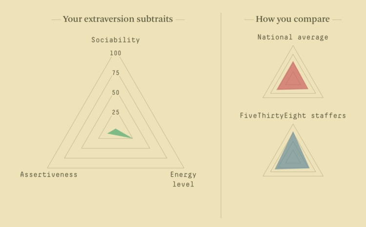
    Ah, the online personality quiz, oh how I missed you. Oh wait, this one is slightly different. For FiveThirtyEight, Maggie Koerth-Baker and Julia Wolfe provide a quiz used by psychologists to gauge personality traits:

    First, the Big Five doesn’t put people into neat personality “types,” because that’s not how personalities really work. Instead, the quiz gives you a score on five different traits: extraversion, agreeableness, conscientiousness, negative emotionality and openness to experience. For each of those traits, you’re graded on a scale from 0 to 100, depending on how strongly you associate with that trait. So, for example, this quiz won’t tell you whether you’re an extravert or an introvert — instead, it tells you your propensity toward extraversion. Every trait is graded on a spectrum, with a few people far out on the extremes and a lot of people in the middle.

    Dang it. I really wanted to know what Harry Potter character I am.

  • Members Only

    Datawrapper Review: A Focused Charting Tool That Requires No Code

    January 17, 2019

    Topic

    The Process  /  Datawrapper, review

    Datawrapper is an online tool that helps you make nice-looking charts for the web. No code is required. Instead, a focused interface lets you load data, pick your chart type, refine, and publish.

  • Page 130 of 392
  • <
  • 1
  • ...
  • 127
  • 128
  • 129
  • 130
  • 131
  • 132
  • ...
  • 392
  • >

Analyze, visualize, and communicate data usefully, beyond the defaults.

Become a member →

Recently for Members

May 8, 2025
When the data is not what it seems

May 1, 2025
Finding the Right Charts

April 24, 2025
Visualization Tools, Datasets, and Resources – April 2025 Roundup

April 17, 2025
Breaking Out of Chart Software Defaults

April 15, 2025
Line Chart with Decorative Neon Accents

Browse by Chart Type See All →

Sankey Diagram Square Pie Chart Line Chart Chord Diagram Line Map Beeswarm Calendar Density Plot Radar Chart Cartogram

Browse By Topic

  • Visualization

    Seeing data

  • Maps

    Seeing geographic data

  • Infographics

    Explaining data

  • Networks

    Connecting data

  • Statistics

    Analyzing data

  • Software

    Working with data

  • Sources

    Getting data

  • Design

    Making data readable

Get the Book

Visualize This: The FlowingData Guide to Design, Visualization, and Statistics

Available now.

Order: Amazon / Bookshop

Made by FlowingData

  • The Process

  • Data Underload

  • Chart Everything

  • Guides

  • Books

  • Shop

  • About
  • Contact
  • Newsletter
  • LinkedIn
  • Instagram
  • Bluesky
  • RSS
Copyright © 2007-Present FlowingData. All rights reserved.