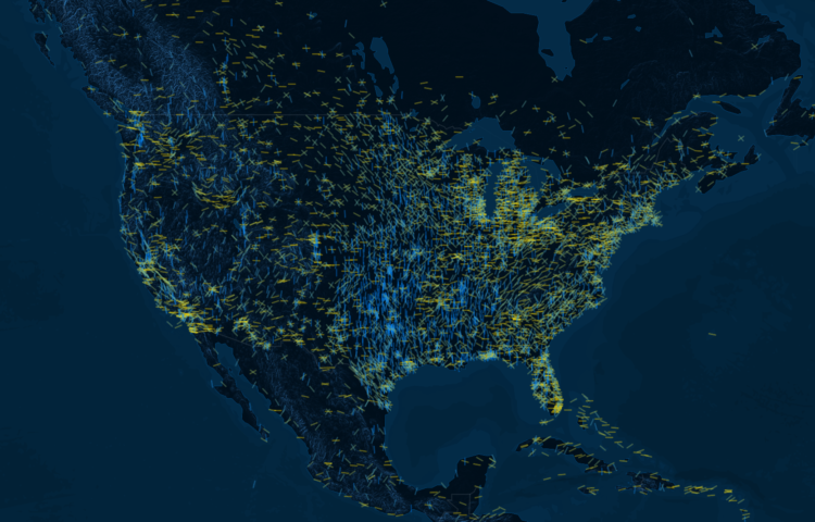
• Membership
  • Newsletter
  • Projects
  • Learning
  • About
  • Member Login
  • Opportunity rover’s path on Mars

    February 14, 2019

    Topic

    Maps  /  Jonathan Corum, Mars, NASA, New York Times, opportunity

    After a most unforgiving dust storm on Mars, NASA ended the 14-year mission with the Opportunity rover. It was originally only planned to last 90 days. Jonathan Corum, for The New York Times, mapped the little guy’s journey over the years.

  • Members Only

    Visualization Critique: Giving, Interpreting, and Rejecting

    February 14, 2019

    Topic

    The Process  /  critique

    Figure out the useful bits and get rid of everything else.

  • Language used for the wall

    February 14, 2019

    Topic

    Statistical Visualization  /  Kevin Quealy, Upshot, wall

    For The Upshot, Kevin Quealy continues on his path looking at the words used by Donald Trump. This time Quealy examines descriptions of the wall and who will pay for it, pre- and post-inauguration.

  • Data-driven porn

    February 13, 2019

    Topic

    Statistics  /  porn

    Gustavo Turner for Logic on his experiences covering the porn industry and the introduction of data into the stream:

    Over the course of these experiences, I learned about a major new force reshaping the industry: data. That day on set, the director’s instructions came directly from the production company, which decided on the topic and vetted the script. And the company based its creative direction on specific fantasies proposed by paying customers on an online forum that it owned. […]

    In the pre-internet days, a producer might notice that a particular kind of porn movie sold well, and then try to make more like it. Today, a corporate porn conglomerate can analyze a continuous stream of information from online viewers, who supply feedback in the form of comments, and leave behind a data trail as they travel around porn sites.

    What a time to be alive.

  • Data Underload  /  award, EGOT, film

    EGOT Winner Timelines

    Only 15 people have done it, since you know, it’s not really easy to do. Here’s how and when they did it.

    Read More
  • Generate a noise field from an image

    February 12, 2019

    Topic

    Data Art  /  gradient, noise

    Kjetil Golid made an interactive that lets you generate a noise field using a gradient from an image of your choosing. Fun. And excellent wallpaper material.

  • Scale of Star Wars characters and ships

    February 11, 2019

    Topic

    Infographics  /  scale, Star Wars

    [arve url=”https://www.youtube.com/watch?v=nHo_J5FtJ58″ /]

    It’s the scale of significant Star Wars characters, objects, and ships from Episode I through VIII, plus Rogue One and Solo. Need I say more?

  • Data Underload  /  algorithm, breweries, optimization, road trip

    Brewery Road Trip, Optimized With Genetic Algorithm

    Visit the best American breweries of 2018, based on RateBeer rankings, while minimizing travel time and distance.

    Read More
  • Evolution of the periodic table of elements

    February 8, 2019

    Topic

    Infographics  /  elements, Periodic Table, science

    As more elements were discovered, the table grew and changed layout. For Science Magazine, Jake Yeston, Nirja Desai, and Elbert Wang provide a visual history.

  • Members Only

    Stolen Charts, Reusing Visualization Methods, and the Difference

    February 7, 2019

    Topic

    The Process  /  learning, plagiarism

    In visualization, there are tools, templates, and defaults, which are meant to be copied and reused. Then there are data graphics that are designed with a specific purpose and dataset, which are something more than a certain chart type.

  • Distorting geography to show train travels

    February 7, 2019

    Topic

    Network Visualization  /  Jan Willem Tulp, train, travel

    Jan Willem Tulp visualized train travel times using distance and color as an indicator. His reasoning:

    When a train starts running from one station to the next station, conceptually, these two stations will temporarily be closer to each other. And that is exactly what this visualization shows: whenever a train moves to the next station — and only for as long as a train is moving — the origin station moves towards the destination station.

    Be sure to watch the animation run with organic-looking behaviors.

  • Data Underload  /  breweries, RateBeer

    Map of Best Breweries in America, 2018

    RateBeer puts out a list every year for top 100 breweries in the world. Here are the states that cracked the list.

    Read More
  • Recursive painting in real life

    February 5, 2019

    Topic

    Network Visualization  /  painting, recursion

    It started with a mom holding her painting of a bird. Then someone painted that photo and took a picture of himself holding the painting. Then someone painted the photo of the man holding the painting of the picture of the mom holding the bird. The recursion continued. Luckily someone diagrammed all of the iterations:

    Just wow.

  • Average view of Earth from space

    February 4, 2019

    Topic

    Maps  /  average, Earth, satellite imagery

    Using a year’s worth of daily images from NASA’s Visible Infrared Imaging Radiometer Suite (VIIRS), Johannes Kroeger constructed the average snapshot for 2018. Fun.

  • Data Underload  /  parenthood, pregnancy

    How Many Kids We Have and When We Have Them

    Many parents stop at two kids. Most are done by three. Still, everyone has their own timelines. Here are 1,000 of them.

    Read More
  • Members Only

    Visualization Tools, Datasets, and Resources – January 2019 Roundup

    January 31, 2019

    Topic

    The Process  /  roundup, tools

    Throughout the month I collect new tools for data and visualization and additional resources on designing data graphics. Here’s the new stuff for January.

  • News story lifespan charts

    January 31, 2019

    Topic

    Statistical Visualization  /  Google, news, Schema Design, trends

    A wideout view of the news cycle can look like a series of rise and falls. Something captures the general public’s attention, and then it fades off. Thank you, next. This collaboration between Schema Design and Google Trends charts search volume for news stories and aligns them by their peaks, so that you can see these rise and falls.

    Transparent areas overlaid on each other show an “average” trend, and the more irregular shapes are made obvious because they stand out from the rest.

    See also the simpler view by Axios, who contributed stories to the project.

  • Evolution of the alphabet

    January 30, 2019

    Topic

    Infographics  /  alphabet, evolution, Matt Baker

    Matt Baker provides this nifty diagram on how the alphabet changed over the centuries, evolving to what it is now. Grab the print.

  • Closeness in relationships over time, illustrated with a couple of lines

    January 29, 2019

    Topic

    Infographics  /  cartoon, Olivia de Recat, relationships

    Cartoonist Olivia de Recat illustrated the closeness over time for various relationships. Charming. Unfortunately, the print is sold out. Sad trombone.

  • How to Make a Mosaic Plot in R

    Also known as a Marimekko diagram, the mosaic plot lets you compare multiple qualitative variables at once. They can be useful, sometimes.

  • Page 129 of 391
  • <
  • 1
  • ...
  • 126
  • 127
  • 128
  • 129
  • 130
  • 131
  • ...
  • 391
  • >

Analyze, visualize, and communicate data usefully, beyond the defaults.

Become a member →

Recently for Members

May 8, 2025
When the data is not what it seems

May 1, 2025
Finding the Right Charts

April 24, 2025
Visualization Tools, Datasets, and Resources – April 2025 Roundup

April 17, 2025
Breaking Out of Chart Software Defaults

April 15, 2025
Line Chart with Decorative Neon Accents

Browse by Chart Type See All →

Table Pictogram Variable Width Bar Chart Connected Scatter Plot Streamgraph Beeswarm Radar Chart Baseline Chart Area Chart Moving Bubbles

Browse By Topic

  • Visualization

    Seeing data

  • Maps

    Seeing geographic data

  • Infographics

    Explaining data

  • Networks

    Connecting data

  • Statistics

    Analyzing data

  • Software

    Working with data

  • Sources

    Getting data

  • Design

    Making data readable

Get the Book

Visualize This: The FlowingData Guide to Design, Visualization, and Statistics

Available now.

Order: Amazon / Bookshop

Made by FlowingData

  • The Process

  • Data Underload

  • Chart Everything

  • Guides

  • Books

  • Shop

  • About
  • Contact
  • Newsletter
  • LinkedIn
  • Instagram
  • Bluesky
  • RSS
Copyright © 2007-Present FlowingData. All rights reserved.