• Membership
  • Newsletter
  • Projects
  • Learning
  • About
  • Member Login
  • Exploring data to form better questions

    April 18, 2019

    Topic

    Statistics  /  design, exploration, John Tukey, Roger Peng

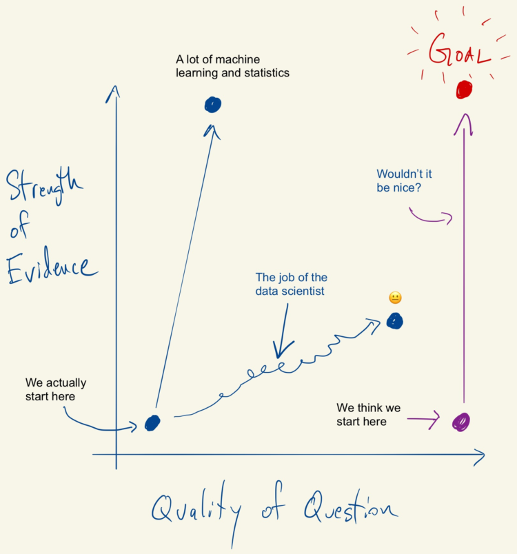
    Feeding off the words of John Tukey, Roger Peng proposes a search for better questions in analysis:

    The goal in this picture is to get to the upper right corner, where you have a high quality question and very strong evidence. In my experience, most people assume that they are starting in the bottom right corner, where the quality of the question is at its highest. In that case, the only thing left to do is to choose the optimal procedure so that you can squeeze as much information out of your data. The reality is that we almost always start in the bottom left corner, with a vague and poorly defined question and a similarly vague sense of what procedure to use. In that case, what’s a data scientist to do?

    Story of my life.

  • What happened at Notre-Dame

    April 17, 2019

    Topic

    Infographics  /  New York Times, Notre-Dame

    Notre-Dame in Paris, France was on fire. The New York Times describes what happened in a detailed yet concise information graphic. Made in only a day, a 3-D model provides the imagery, and rotation and zooming highlight the relevant points.

  • Facial recognition machine for $60

    April 17, 2019

    Topic

    Statistics  /  face detection, New York Times, privacy

    For The New York Times, Sahil Chinoy on privacy and how easy it is now to automate surveillance through public video feeds:

    To demonstrate how easy it is to track people without their knowledge, we collected public images of people who worked near Bryant Park (available on their employers’ websites, for the most part) and ran one day of footage through Amazon’s commercial facial recognition service. Our system detected 2,750 faces from a nine-hour period (not necessarily unique people, since a person could be captured in multiple frames). It returned several possible identifications, including one frame matched to a head shot of Richard Madonna, a professor at the SUNY College of Optometry, with an 89 percent similarity score. The total cost: about $60.

    A part of me finds this creepy. The other part wants to try out the system.

  • Data Underload  /  income

    Percentage of Households in Each Income Level

    What percentage of households fall into lower-, middle-, and upper-income levels when you adjust for household size?

    Read More
  • Comparing the potential cost of Medicare for everyone

    April 15, 2019

    Topic

    Infographics  /  health care, medicare, Upshot

    For The Upshot, Josh Katz, Kevin Quealy, and Margot Sanger-Katz, consulted economists to ask what the cost of Medicare for all might look like:

    The proposals themselves are vague on crucial points. More broadly, any Medicare for all system would be influenced by the decisions and actions of parties concerned — patients, health care providers and political actors — in complex, hard-to-predict ways. But seeing the range of responses, and the things that all the experts agree on, can give us some ideas about what Medicare for all could mean for the country’s budget and economy.

    The treemap shows the categories of spending, and the overall size of the treemap changes based on the total cost. Blast from the past.

  • Data Underload  /  income, middle class

    What Qualifies as Middle-Income in Each State

    The meaning of “middle-income” changes a lot depending on where you live and your household size.

    Read More
  • Members Only

    Shifting to Responsive Charts, Tools for Mobile (The Process #35)

    April 11, 2019

    Topic

    The Process  /  mobile, responsive design

    In this issue I go over my somewhat delayed shift towards making charts that work in different screen sizes and the tools that work for me.

  • Contrasting social media Democrats to real life

    April 11, 2019

    Topic

    Infographics  /  elections, social media, Upshot

    As many know (I hope), what we see on social media often doesn’t mirror real life. It’s a filtered and algorithmically-driven point of view. This grows problematic when people make decisions based solely on what they see through their feeds. For The Upshot, Nate Cohn and Kevin Quealy look at the contrasts between the filtered view and the real life view and how it factors into voting.

  • All of the deaths in Game of Thrones

    April 10, 2019

    Topic

    Infographics  /  deaths, Game of Thrones, Washington Post

    A few years back, The Washington Post illustrated every death in Game of Thrones. With the new season on the way, the death count is up and the graphics updated.

  • Issues Democratic hopefuls are talking about on social media

    April 9, 2019

    Topic

    Infographics  /  social media, Washington Post

    For the Washington Post, Kevin Schaul and Kevin Uhrmacher parsed the social media of Democrats:

    A Washington Post analysis of more than 5,600 social media posts from March found significant differences in the issues that each candidate emphasized. While most candidates discussed social justice and health care, only a few talked much about foreign policy or immigration. No candidate made gun control a first or second priority in their social media strategy during the month.

    I hope the Post explores how the issues change over time.

  • Bad data from a faulty sensor on the Boeing 737 Max

    April 9, 2019

    Topic

    Infographics  /  Boeing, crash, New York Times

    The New York Times illustrated what likely happened in the Ethiopian Airlines and Lion Air crashes. The walkthrough uses a picture of a plane, simple and clear annotation, and animation to help readers understand the dangers of a faulty sensor.

  • FiveThirtyEight evaluates their forecasts

    April 8, 2019

    Topic

    Statistics  /  FiveThirtyEight, forecasting

    FiveThirtyEight uses forecasts to attach probabilities to politics and sports, and they get most of their attention before the events. After all, we don’t need a forecast after something happened. But forecasts aren’t useful if they don’t represent reality. So, FiveThirtyEight evaluated all of their projections.

  • Finding context for the data

    April 5, 2019

    Topic

    Statistics  /  context, data journalism

    Context makes data useful. Without it, it’s easy to get lost in numbers that mean little, but finding the context of data isn’t especially straightforward. Catherine D’Ignazio explains why it’s so hard and what data journalists (or anyone trying to understand data) can do about it:

    First of all, data are typically collected by institutions for internal purposes and they’re not intended to be used by others. As veteran data reporter Tim Henderson, quoting Drew Sullivan, said to the NICAR community, “Data exists to serve the bureaucracy, not the journalist”. The naming, structure and organisation of most datasets are done from the perspective of the institution, not from the perspective of a journalist looking for a story. For example, one semester my students spent several weeks trying to figure out the difference between the columns ‘PROD.WASTE(8.1_THRU_8.7)’ and ‘8.8_ONE-TIME_RELEASE’ in a dataset tracking the release of toxic chemicals into to the environment by certain corporations. This is not an uncommon occurrence!

  • Brexit voting divisions

    April 4, 2019

    Topic

    Infographics  /  Brexit, Economist

    The Economist charted the divisions within political parties using Brexit votes as proxy. I’m here for the bubbles.

  • Census data downloader to reformat for humans

    April 3, 2019

    Topic

    Data Sources  /  census, formatting, Los Angeles Times

    There is a lot of Census data. You can grab most of the recent aggregates through the American FactFinder or via FTP or some obscure Census page that hasn’t been updated in a decade. It’s, uh, not always the best experience. The Census Data Downloader from the Los Angeles Times data desk is a Python library that streamlines the download process, if just a little bit.

    The main added value comes from a way to use existing definitions or make your own to download tables as CSV. That way you get readable headers instead of meaningless table codes.

  • Where the IRS most likely audits

    April 3, 2019

    Topic

    Maps  /  IRS, ProPublica, taxes

    Using estimates from a study on regional bias in tax audits, ProPublica mapped the likelihood of getting audited by the IRS. They then turn their attention to Humphreys County, Mississippi:

    In a baffling twist of logic, the intense IRS focus on Humphreys County is actually because so many of its taxpayers are poor. More than half of the county’s taxpayers claim the earned income tax credit, a program designed to help boost low-income workers out of poverty. As we reported last year, the IRS audits EITC recipients at higher rates than all but the richest Americans, a response to pressure from congressional Republicans to root out incorrect payments of the credit.

  • Data comic shows an average American day

    April 2, 2019

    Topic

    Infographics  /  comic, time use

    Matt Hong used a stacked bar chart over time as the frame for a data comic about American time use. Each row represents a 2-hour window during the day, and each stack represents the percentage of Americans doing an activity: sleep, work, free, and other. The activity with the highest percentage gets a highlight.

    As a fan of time use data, this is totally my jam. Also, the data comic space is underutilized.

  • A long distance relationship between a temperature difference

    April 1, 2019

    Topic

    Self-surveillance  /  Alyssa Fowers, relationships, temperature

    Everyone’s story is a little different. Alyssa Fowers tracked her long-distance relationship in the context of the temperature between two locations and the travel to and from.

  • Texting history after the first swipe

    April 1, 2019

    Topic

    Self-surveillance  /  relationships, texting

    Speaking of relationship timelines, Chris Lewis used texting history with his girlfriend after the first swipe on Bumble as the backdrop of their own story. A few 21k messages later, they’re engaged and live together. [Thanks, Chris]

  • Remaking charts from The Economist, by a journalist at The Economist

    March 29, 2019

    Topic

    Design  /  Economist, remake

    Sarah Leo, a visual journalist at The Economist, looked through the archives and found some charts that could use a re-design.

    After a deep dive into our archive, I found several instructive examples. I grouped our crimes against data visualisation into three categories: charts that are (1) misleading, (2) confusing and (3) failing to make a point. For each, I suggest an improved version that requires a similar amount of space — an important consideration when drawing charts to be published in print.

    Very nice. Archive lookups are often accompanied by “ooo, vintage, therefore good” but Leo takes it the other direction.

    Found this tidbit interesting: “Until fairly recently, we were less comfortable with statistical software (like R) that allows more sophisticated visualisations.”

  • Page 126 of 392
  • <
  • 1
  • ...
  • 123
  • 124
  • 125
  • 126
  • 127
  • 128
  • ...
  • 392
  • >

Analyze, visualize, and communicate data usefully, beyond the defaults.

Become a member →

Recently for Members

May 8, 2025
When the data is not what it seems

May 1, 2025
Finding the Right Charts

April 24, 2025
Visualization Tools, Datasets, and Resources – April 2025 Roundup

April 17, 2025
Breaking Out of Chart Software Defaults

April 15, 2025
Line Chart with Decorative Neon Accents

Browse by Chart Type See All →

Spike Map Bar Chart Surface Plot Pyramid Chart Dot Map Bump Chart Chord Diagram Slope Chart Histogram Step Chart

Browse By Topic

  • Visualization

    Seeing data

  • Maps

    Seeing geographic data

  • Infographics

    Explaining data

  • Networks

    Connecting data

  • Statistics

    Analyzing data

  • Software

    Working with data

  • Sources

    Getting data

  • Design

    Making data readable

Get the Book

Visualize This: The FlowingData Guide to Design, Visualization, and Statistics

Available now.

Order: Amazon / Bookshop

Made by FlowingData

  • The Process

  • Data Underload

  • Chart Everything

  • Guides

  • Books

  • Shop

  • About
  • Contact
  • Newsletter
  • LinkedIn
  • Instagram
  • Bluesky
  • RSS
Copyright © 2007-Present FlowingData. All rights reserved.