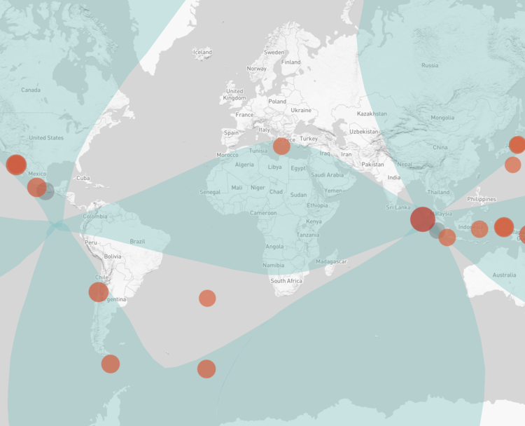
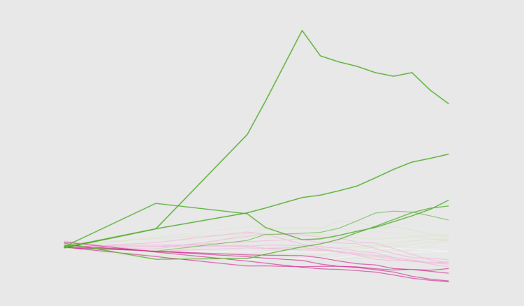
• Membership
  • Newsletter
  • Projects
  • Learning
  • About
  • Member Login
  • Members Only

    Axis Labels, Better Than Defaults (The Process #38)

    May 2, 2019

    Topic

    The Process  /  axes, context, labels

    In this guide, I look maybe a little too closely at how to adjust axis labels for more readable charts.

  • How many Skittles packs before finding identical ones?

    May 2, 2019

    Topic

    Statistics  /  combinations, Skittles

    A note on a pack of Skittles reads, “No two rainbows are the same. Neither are two packs of Skittles. Enjoy an odd mix.” Of course that can’t possibly be right, because there are a finite number of color combinations and there are many packs of Skittles in the world. That led possiblywrong down a path of wondering how many packs it’d take before getting two identical ones. The answer came 27,000 Skittles later.

  • Data Underload  /  work

    When People Find a New Job

    Looking at the 100 most common jobs people switched to, a timeline comes into view when we adjust the relative switch rates by age.

    Read More
  • Game of Thrones death predictor

    April 30, 2019

    Topic

    Statistics  /  death, Game of Thrones, modeling

    Monica Ramirez tried her hand with modeling deaths on Game of Thrones and trying to predict the next ones:

    Since the series is so famous for killing principal characters (It’s true! Yu can’t have a favourite character because he/she wouls die, and slowly, other characters take the lead… and would probably die too), I decided to make a Classification Model in Python, to try to find any rule or pattern and discopver: Who will die on this last season?

    I’m always on a viewing delay with this stuff, so I’m not sure whether this is right or completely wrong, but there you go. The above shows the characters ordered by probability of death (not order in which they will die).

  • GitHub is meant to track code

    April 29, 2019

    Topic

    Self-surveillance  /  annotation, context, GitHub

    Jen Luker noted, “As amazing as @github is, it is a tool designed to track code, not people. I’m sharing my annotated GitHub history to show you what it can’t tell you about a developer.”

    As amazing as @github is, it is a tool designed to track code, not people. I'm sharing my annotated GitHub history to show you what it can't tell you about a developer. pic.twitter.com/b94kYqQHaZ

    — Jen Luker (@knitcodemonkey) April 25, 2019

    Data as footprints? Footprints can tell you where someone went, but you have to evaluate surroundings to figure out what he or she did along the way. And there’s a lot that can happen between when the footprints set and when you find them.

  • Maps of natural disasters and extreme weather

    April 26, 2019

    Topic

    Maps  /  disaster, flood, hurricane, Washington Post, weather, wildfire

    For The Washington Post, Tim Meko mapped floods, tornados, hurricanes, extreme temperatures, wildfires, and lightning:

    Data collection for these events has never been more consistent. Mapping the trends in recent years gives us an idea of where disasters have the tendency to strike. In 2018, it is estimated that natural disasters cost the nation almost $100 billion and took nearly 250 lives. It turns out there is nowhere in the United States that is particularly insulated from everything.

    NOWHERE IS SAFE.

  • Members Only

    Visualization Tools and Resources, April 2019 Roundup; Visualize This Reboot

    April 25, 2019

    Topic

    The Process  /  roundup

    Every month I collect the new tools, resources, and datasets. Here they are for April.

  • Playing the odds for record-breaking Jeopardy! wins

    April 25, 2019

    Topic

    Statistics  /  FiveThirtyEight, Jeopardy

    James Holzhauer is the new hotness on Jeopardy! with Daily Double hunting, big wagers, lightning clicks, and all-around trivia skills. For FiveThirtyEight, Oliver Roeder looks at how Holzhauer dominates:

    Holzhauer has played this game like no one has ever played it before — large bets coupled with expert navigation of the game board. He has now played 14 games with his total winnings sitting above $1,000,000 and counting, and he is well on his way to surpassing the $2,520,700 won by the most famous “Jeopardy!” record-holder of all, Ken Jennings. One difference? It took Jennings 74 straight victorious shows to bring in that haul, and if he maintains his current pace, Holzhauer is on track to break that record in as few as 34.

    So not only is he hunting for Daily Doubles (because we know where they usually are), but he builds a pot first so that he’ll have more to wager. And then, when the time comes, he has no problem putting the money on the line.

  • Chart Everything  /  basketball, Damian Lillard, R

    Damian Lillard’s Game-Winner in Context

    Here are all the playoff threes he’s made in his playoff career, plus some R code.

    Read More
  • When bad data leads to a disappearing neighborhood

    April 24, 2019

    Topic

    Statistics  /  Google Maps, missing data

    Caitlin Dewey for OneZero describes the case of the Fruit Belt neighborhood in Buffalo, New York, or “Medical Park” as it was incorrectly named in Google Maps:

    Lott learned that the issue had been festering for years, and she wanted answers. The 2,300 residents in the Fruit Belt didn’t refer to the community as “Medical Park,” but Google Maps had done so since the late 2000s. Community members argued the designation was a calculated tweak in favor of gentrification, a digital rechristening that would be used to sell houses, market Airbnbs, and wrest the neighborhood’s future from the people who had made a home there for generations.

    Lott didn’t know it at the time, but the misnomer also revealed a great deal about the invisible process major tech firms use to put neighborhoods on their maps — and how decisions based off arcane data sets can affect communities thousands of miles away.

  • Does the first to 100 points usually win in the NBA?

    April 23, 2019

    Topic

    Statistics  /  basketball, Los Angeles Times

    Los Angeles Clippers commentator Ralph Lawler has a saying: “First to 100 wins. It’s the law.” The Los Angeles Times checked the numbers to see how true the statement is. It’s been true for over 90 percent of games over the years, but has become less true as pace and the three-point shot has changed dramatically in recent years. Now it’s more like first to 114.

  • How to Make a Moving Bubble Chart, Based on a Dataset

    Ooo, bubbles… It’s not the most visually efficient method, but it’s one of the more visually satisfying ones.

  • Stephen Curry scores every arena’s popcorn

    April 22, 2019

    Topic

    Self-surveillance  /  New York Times, popcorn, Stephen Curry

    I marked this article for later reading. It’s about Stephen Curry’s love of popcorn as a pre-game and half-time snack. Sounded amusing. Then I got to it and discovered that he scores every arena’s popcorn on a five-factor, five-point scale using a worksheet. Nice.

    Give him the MVP on this factoid alone.

    See the full scorecard.

  • A more detailed view of the Mueller Report

    April 22, 2019

    Topic

    Infographics  /  Axios, Mueller

    By now we’ve all seen the zoomed out thumbnail view of the Mueller Report. It gives you a quick look at the amount of the report redacted, but that’s about it. So, Axios tagged every paragraph with events, topics, people, and places to make things easier to find and jump to.

  • Explore generative models and latent space with a simple spreadsheet interface

    April 19, 2019

    Topic

    Statistics  /  generative models, images, latent space

    Generative models can seem like a magic box where you plug in observed data, turn some dials, and see what the computer spits out. SpaceSheet is a simple spreadsheet interface to explore and experiment for a clearer view of the spaces between. Even if you’re not into this research area, it’s fun to click and drag things around to see what happens.

  • Redacted

    April 18, 2019

    Topic

    Chart Everything  /  Mueller, report

    The redacted version (pdf) of the Mueller report was released today. Here’s the thumbnailed view for a sense of the redactions.
    Read More

  • DataCamp noindex (The Process #36)

    April 18, 2019

    Topic

    The Process  /  DataCamp, harassment

    This week’s issue is public.

    Hi,

    Warning: This week’s issue talks about sexual harassment at DataCamp.
    Read More

  • Exploring data to form better questions

    April 18, 2019

    Topic

    Statistics  /  design, exploration, John Tukey, Roger Peng

    Feeding off the words of John Tukey, Roger Peng proposes a search for better questions in analysis:

    The goal in this picture is to get to the upper right corner, where you have a high quality question and very strong evidence. In my experience, most people assume that they are starting in the bottom right corner, where the quality of the question is at its highest. In that case, the only thing left to do is to choose the optimal procedure so that you can squeeze as much information out of your data. The reality is that we almost always start in the bottom left corner, with a vague and poorly defined question and a similarly vague sense of what procedure to use. In that case, what’s a data scientist to do?

    Story of my life.

  • What happened at Notre-Dame

    April 17, 2019

    Topic

    Infographics  /  New York Times, Notre-Dame

    Notre-Dame in Paris, France was on fire. The New York Times describes what happened in a detailed yet concise information graphic. Made in only a day, a 3-D model provides the imagery, and rotation and zooming highlight the relevant points.

  • Facial recognition machine for $60

    April 17, 2019

    Topic

    Statistics  /  face detection, New York Times, privacy

    For The New York Times, Sahil Chinoy on privacy and how easy it is now to automate surveillance through public video feeds:

    To demonstrate how easy it is to track people without their knowledge, we collected public images of people who worked near Bryant Park (available on their employers’ websites, for the most part) and ran one day of footage through Amazon’s commercial facial recognition service. Our system detected 2,750 faces from a nine-hour period (not necessarily unique people, since a person could be captured in multiple frames). It returned several possible identifications, including one frame matched to a head shot of Richard Madonna, a professor at the SUNY College of Optometry, with an 89 percent similarity score. The total cost: about $60.

    A part of me finds this creepy. The other part wants to try out the system.

  • Page 125 of 391
  • <
  • 1
  • ...
  • 122
  • 123
  • 124
  • 125
  • 126
  • 127
  • ...
  • 391
  • >

Analyze, visualize, and communicate data usefully, beyond the defaults.

Become a member →

Recently for Members

May 8, 2025
When the data is not what it seems

May 1, 2025
Finding the Right Charts

April 24, 2025
Visualization Tools, Datasets, and Resources – April 2025 Roundup

April 17, 2025
Breaking Out of Chart Software Defaults

April 15, 2025
Line Chart with Decorative Neon Accents

Browse by Chart Type See All →

Frequency Trails Spiral Chart Unit Chart Pyramid Chart Network Graph Dot Density Map Stacked Bar Chart Bar Chart Race Variable Width Bar Chart

Browse By Topic

  • Visualization

    Seeing data

  • Maps

    Seeing geographic data

  • Infographics

    Explaining data

  • Networks

    Connecting data

  • Statistics

    Analyzing data

  • Software

    Working with data

  • Sources

    Getting data

  • Design

    Making data readable

Get the Book

Visualize This: The FlowingData Guide to Design, Visualization, and Statistics

Available now.

Order: Amazon / Bookshop

Made by FlowingData

  • The Process

  • Data Underload

  • Chart Everything

  • Guides

  • Books

  • Shop

  • About
  • Contact
  • Newsletter
  • LinkedIn
  • Instagram
  • Bluesky
  • RSS
Copyright © 2007-Present FlowingData. All rights reserved.