Here is the good stuff for June 2019.
Here is the good stuff for June 2019.
In some public places, such as schools and hospitals, microphones installed with software listen for noise that sounds like aggression. The systems alert the authorities. It sounds useful, but in practice, the detection algorithms might not be ready yet. For ProPublica, Jack Gillum and Jeff Kao did some testing:
Yet ProPublica’s analysis, as well as the experiences of some U.S. schools and hospitals that have used Sound Intelligence’s aggression detector, suggest that it can be less than reliable. At the heart of the device is what the company calls a machine learning algorithm. Our research found that it tends to equate aggression with rough, strained noises in a relatively high pitch, like D’Anna’s coughing. A 1994 YouTube clip of abrasive-sounding comedian Gilbert Gottfried (“Is it hot in here or am I crazy?”) set off the detector, which analyzes sound but doesn’t take words or meaning into account. Although a Louroe spokesman said the detector doesn’t intrude on student privacy because it only captures sound patterns deemed aggressive, its microphones allow administrators to record, replay and store those snippets of conversation indefinitely.
Marvelous.

In the biggest crossover event of the century, Tom Lum used the Wikipedia API to chart the number of views for every reference in Billy Joel’s We Didn’t Start the Fire. Yes. [via @waxpancake]

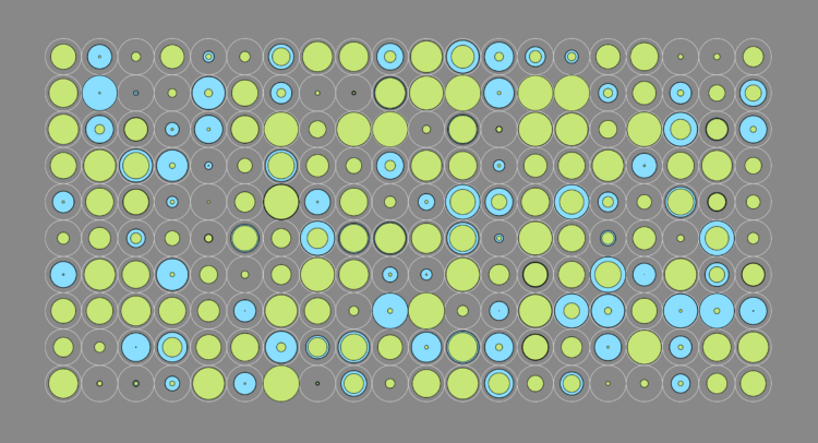
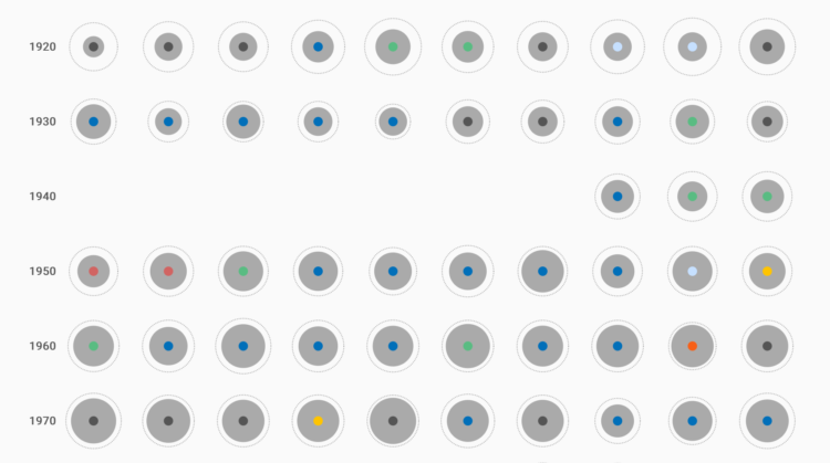
Sonja Kuijpers used abstract imagery to represent some sobering numbers:
You might be wondering what you are viewing here. This landscape, each element in it represents a person who committed suicide in the Netherlands in the year 2017.
The cityscape leads into more traditional views, which in turn feel much more heavy.
For The New York Times, Kevin Roose on the possibility of machines becoming your boss:
The goal of automation has always been efficiency, but in this new kind of workplace, A.I. sees humanity itself as the thing to be optimized. Amazon uses complex algorithms to track worker productivity in its fulfillment centers, and can automatically generate the paperwork to fire workers who don’t meet their targets, as The Verge uncovered this year. (Amazon has disputed that it fires workers without human input, saying that managers can intervene in the process.) IBM has used Watson, its A.I. platform, during employee reviews to predict future performance and claims it has a 96 percent accuracy rate.
Splendid.
Ben Fry using the “tropiest of design tropes”, describes his goals for visualization. On communication:
Communication is the most basic part: the table stakes of information design. If the piece doesn’t communicate, then it’s useless. A lot of time, attention, and effort goes into creating PDF documents that few people will ever read. In the past this was even more expensive, because the result was elegant printed reports that would go straight to someone’s shelf. If you create something that nobody uses, you’ve failed to communicate.

You know those sped up videos where there’s a long line for something and someone walks the length of it? The New York Times did the scrolly equivalent for the recent Hong Kong protest, using snaps from aerial video and stringing them together geographically. A lot of people showed up.
After you’ve made your carefully designed data graphics, you probably want to share them online at some point. This is how I do it.
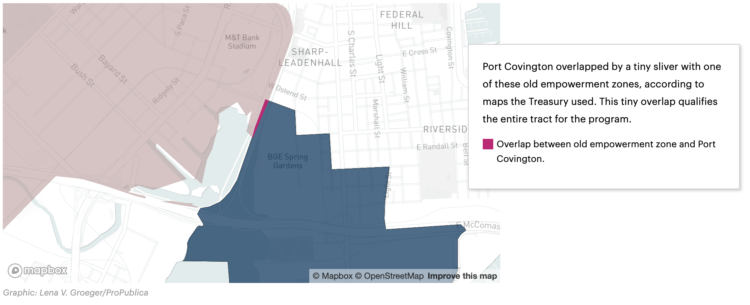
A small discrepancy in a couple of shapefiles led to a misclassification of land. Wealthy investors are taking advantage. For ProPublica, Jeff Ernsthausen and Justin Elliott:
They have President Donald Trump’s 2017 tax overhaul law to thank. The new law has a provision meant to spur investment into underdeveloped areas, called “opportunity zones.” The idea is to grant lucrative tax breaks to encourage new investment in poor areas around the country, carefully selected by each state’s governor.
But Port Covington, an ambitious development geared to millennials to feature offices, a hotel, apartments, and shopping, is not in a census tract that is poor. It’s not a new investment. And the census tract only became eligible to be an opportunity zone thanks to a mapping error.
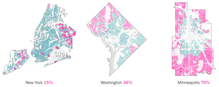
The single-family home. It’s part of the American dream, but it can be awfully expensive when land grows scarce. Emily Badger and Quoctrung Bui for The Upshot map and discuss the current approaches of major cities:
A reckoning with single-family zoning is necessary, they say, amid mounting crises over housing affordability, racial inequality and climate change. But take these laws away, many homeowners fear, and their property values and quality of life will suffer. The changes, opponents in Minneapolis have warned, amount to nothing less than an effort to “bulldoze” their neighborhoods.
Using building footprints instead of just colored polygons provide nice depth and detail.
Learn how to build a custom visualization using D3.js and get acquainted with the popular JavaScript library.
Researchers went around rural Pennsylvania, showing people the charts above and asking what they thought about them. Evan Peck with one of the main findings from the study:
As we analyzed and coded our interviews, we were reminded of something that we often forget — data can be intimate and personal. If someone found a personal connection to any graph, it didn’t matter the color, the style or the technique. For the people we talked to, charts with personal connections superseded all other design dimensions.
Small data caveat: there were only 42 interviews.
But still, ever since I got into visualization for an audience, this was always my thought. Some say people are self-centered so readers want to know about themselves first. Maybe that’s partially true, but I also think we just like to start with what’s familiar.
So, if the data allows for it, make that familiarity and quick connection to the data easy to access.
Financial Times, in an effort to streamline a part of the data journalism process, developed templates for data stories. They call it the Story Playbook:
The Playbook is also an important driver of culture change in the newsroom. We have a rich and familiar vocabulary for print: The basement (A sometimes light-hearted, 350-word story that sits below the fold on the front page), for example, or the Page 3 (a 900–1200 word story at the top of the third page that is the day’s most substantive analysis article). For FT journalists, catflaps, birdcages, and skylines need no explanation.
The story playbook creates the equivalent for online stories, by introducing a vocabulary that provides a shared point of reference for everyone in the newsroom.
I compared time use for those with children under 18 against those without. Here’s where the minutes go.
Got a chuckle out of me:
Me explaining why standardizing your variables is important: pic.twitter.com/mQKj0nEJ0G
— Chelsea Parlett Pelleriti (@ChelseaParlett) June 12, 2019
Assuming you have a dataset in hand, how do you decide what visualization method to use?
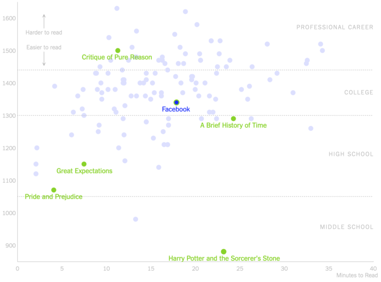
For The New York Times, Kevin Litman-Navarro plotted the length and readability of privacy policies for large companies:
To see exactly how inscrutable they have become, I analyzed the length and readability of privacy policies from nearly 150 popular websites and apps. Facebook’s privacy policy, for example, takes around 18 minutes to read in its entirety – slightly above average for the policies I tested.
The comparison is between websites with a focus on Facebook, but the main takeaway I think is that almost all privacy policies are complex, because they’re not there for the users.

Machine learning can feel like a foreign concept only useful to those with access to big machines. Runway ML aims to make machine learning easier to use for a wider audience, specifically for creators. It provides a click-and-drag interface that lets you link algorithms, import datasets, and most importantly, experiment.
Looks like fun. Give it a go.
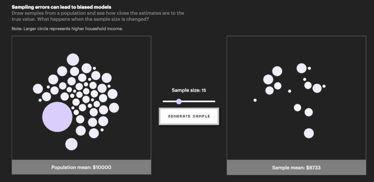
In its inaugural issue, Parametric Press describes how bias can easily come about when working with data:
Even big data are susceptible to non-sampling errors. A study by researchers at Google found that the United States (which accounts for 4% of the world population) contributed over 45% of the data for ImageNet, a database of more than 14 million labelled images. Meanwhile, China and India combined contribute just 3% of images, despite accounting for over 36% of the world population. As a result of this skewed data distribution, image classification algorithms that use the ImageNet database would often correctly label an image of a traditional US bride with words like “bride” and “wedding” but label an image of an Indian bride with words like “costume”.
Click through to check out the interactives that serve as learning aids. The other essays in this first issue are also worth a look.
From Tableau CEO Adam Selipsky:
In 2003, Tableau set out to pioneer self-service analytics with an intuitive analytics platform that would empower people of any skill level to work with data. Our customers grew with us to form the strongest analytics community in the world. And today, that mission to help people see and understand data grows stronger.
I’m excited to announce that Tableau has entered into an agreement to be acquired by Salesforce in an acquisition that combines the #1 CRM with the #1 analytics platform. By joining forces we will accelerate our ability to accomplish our mission. Together, Salesforce and Tableau share a deep commitment to empowering their respective communities and enabling people of every skill level to transform their businesses, their careers, and their lives through technology.
I’m an outsider looking in, so this surprised me, but maybe it was expected for those closer. Tableau sponsored this little site of mine for nearly a decade, so I think it might have appeared smaller to me than it actually is.
Anyways, it’ll be interesting to see where Tableau goes from here, especially for those who worked with the software outside a marketing context.
 Visualize This: The FlowingData Guide to Design, Visualization, and Statistics (2nd Edition)
New tools, refined process.


