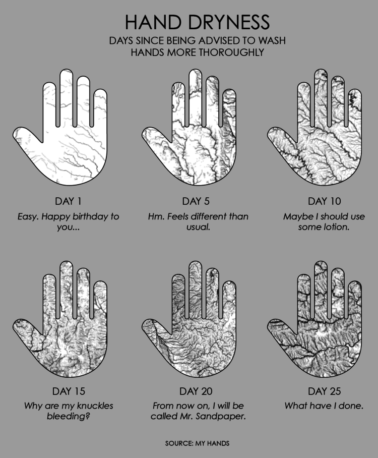
I spend 50% of my waking hours washing my hands. I spend the other 50% trying not to touch my face.
I spend 50% of my waking hours washing my hands. I spend the other 50% trying not to touch my face.
David Spiegelhalter on communicating a crisis:
There are some basic principles, which I learnt from John Krebs, former Chair of the Food Standard Agency, who had to deal with many crises. The first thing is that you should be communicating a lot, consistently and with trusted sources. You have to be open and transparent. You have to say what you do know and then you have to say what you don’t know. You have to emphasise, and keep emphasising, the uncertainty, the fact that there is much we don’t know. Then you have to say what you are planning to do and why. Finally, you have to say what people themselves can do, how they should act. The crucial thing to say is that this will change as we learn more.
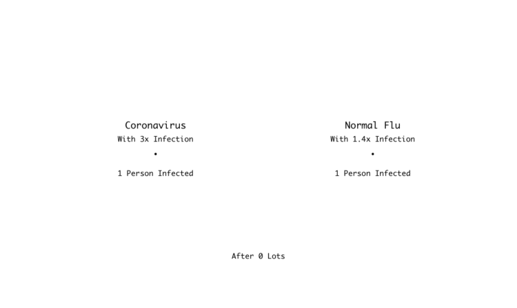
In a Channel 4 clip, Hugh Montgomery does some back-of-the-napkin math contrasting the normal flu against the coronavirus. Here’s a chart version.
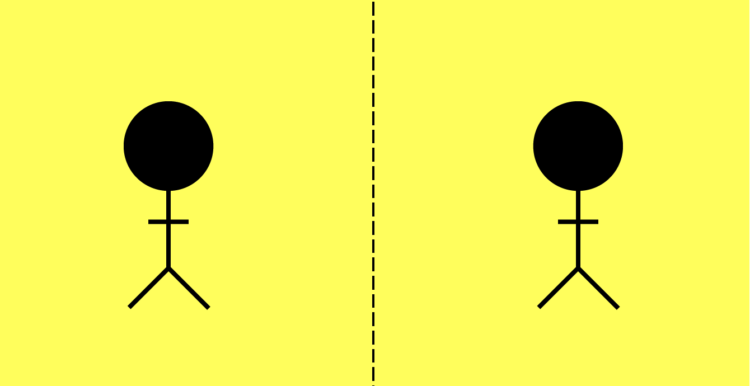
For The Spinoff, Toby Morris illustrates how individuals can break a chain of events:
The good news is, we can do things that will reduce the chances of us spreading the virus. That means we can break these chains and potentially stop hundreds or even thousands of people getting Covid-19. Check out The Spinoff cartoonist Toby Morris’ excellent illustration to understand how individual discipline can have an outsize impact.
Of course infection between people in a community is more complex. Just because one chain is broken doesn’t mean people further down won’t be infected by others in some other way. The goal though is to break as many chains as possible.
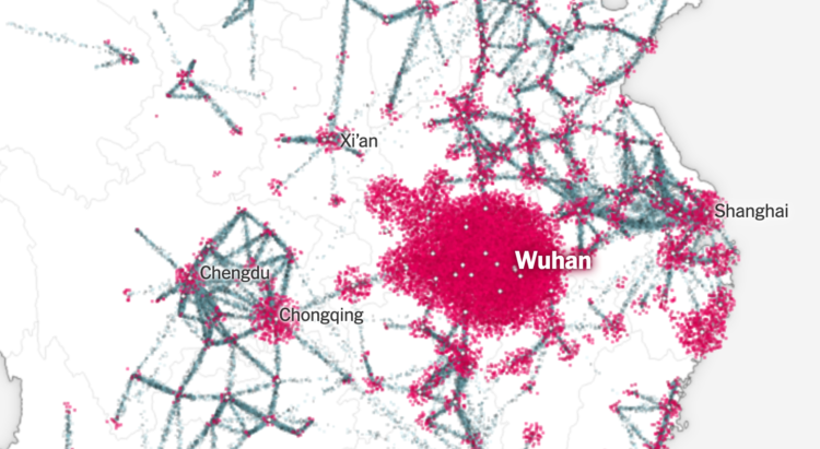
Using a combination of estimates based on cell phone movements and outbreak size, The New York Times shows how the coronavirus started with a few cases and then spread around the world.
The particle flows to represent travel volume from city to city is something else. NYT used a scrollytelling format that starts on a geographic map. You see a few points at first, the virus spreads, and then there’s a transition to an abstract view that looks like a subway map. You end up in the United States with a view of the current estimates.
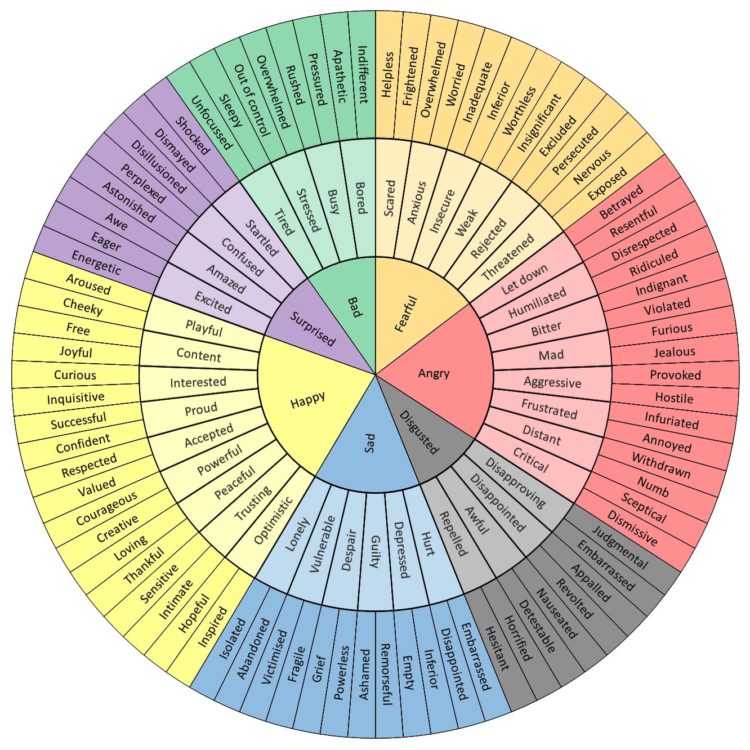
You’re probably feeling a range of emotions these days. It helps if you can express them. This emotional word wheel by Geoffrey Roberts might help:
I work with people who have limited emotional vocabulary and as a result the intensity of their negative emotions and experiences is heightened because they can’t describe their feelings (especially their negative feelings). That’s why this list is heavily focused on negative emotions/ experiences. Being able to clearly identify how we are feeling has been shown to reduce this intensity of experience because it re-engages our rational mind.
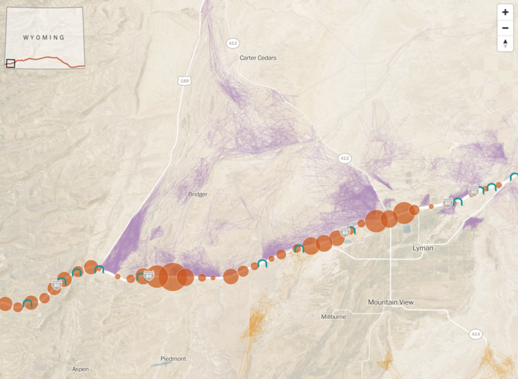
With the climate changing, animals will need to migrate to different areas to live, but that can be a challenge when there is a giant highway blocking the way. The Washington Post looks at how scientists in Wyoming are hoping to clear the path:
“We can’t predict exactly what the impacts of climate change are going to be, or what species are going to be impacted,” said Hall Sawyer, a research biologist at Western Ecosystems Technology. “We do know one fundamental truth: That if we can keep this landscape connected, improve that permeability, they’ll be better off.”
Kurzgesagt, which make videos to explain complex and abstract concepts in an understandable way, explain the coronavirus and what you should do. Spoiler alert: wash your hands and keep your distance.
The entire state of California just went full on stay-at-home. I hope it works.
Vox used a lotion that mimics viruses to demonstrate the power of washing your hands for twenty seconds:
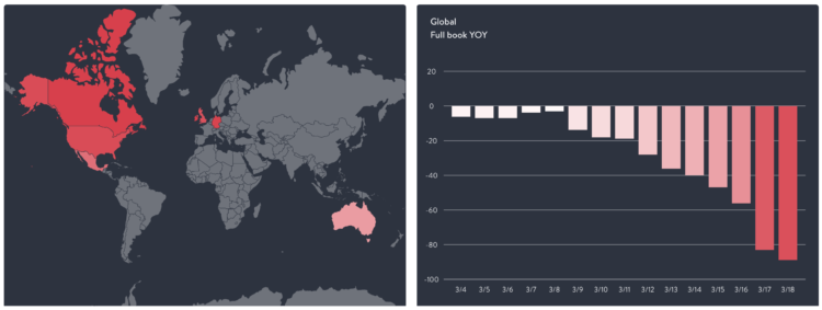
The restaurant industry is taking a big hit right now, as most people are staying put at home. OpenTable provides a downloadable dataset to show how much restaurant dining is down:
This data shows year-over-year seated diners at restaurants on the OpenTable network across all channels: online reservations, phone reservations, and walk-ins. For year-over-year comparisons by day, we compare to the same day of the week from the same week in the previous year. For example, we’d compare Tuesday of week 11 in 2020 to Tuesday of week 11 in 2019. Only states or cities with 50+ restaurants in the sample are included. All restaurants on the OpenTable network in either period are included.
It’s red all the way down. Support your local businesses the best you can.
We don’t know what’s going to happen in the future, but we can look at what we do know and make our best guess.
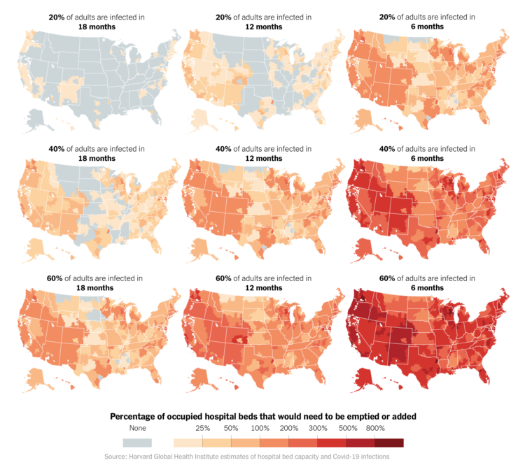
Using estimates from the Harvard Global Health Institute, The Upshot mapped what hospital bed occupancy might look like across the country if we don’t make changes now:
“If we don’t make substantial changes, both in spreading the disease over time and expanding capacity, we’re going to run out of hospital beds,” said Dr. Ashish Jha, the director of the Harvard Global Health Institute, which produced the estimates. “And in that instance, we will not be able to take care of critically ill people, and people will die.”
Jeffrey Leek, Lucy D’Agostino McGowan, and Elizabeth Matsui have a free/ pay-what-you-want book on understanding data and statistics in the medical literature:
Whether you are a medical student reading their first journal article or a healthcare professional trying to use the latest research to improve patient care, understanding data and statistics has never been more fundamental for extracting accurate information from the medical literature. This is a high-level, introduction to the concepts you need to know. It is targeted at busy students and professionals, and therefore efficient, with short lessons that can be completed in 5 to 10 minutes, with the whole course-time totaling around 4 hours. We leave out the mathematical detail and focus on the conceptual ideas. Anyone can pick this course up and gain a better understanding of the medical literature.
We’re probably going to see a lot of research come out over the next weeks and months, and it’s more important than ever to understand the results and distill what it actually means. If anything, it might help you explain the current situation to others.
Using R, we look at how your decreased interaction with others can help slow the spread of infectious diseases.
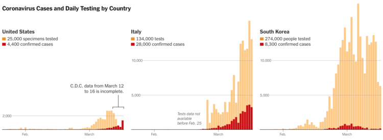
Coronavirus testing in the United States has been a slow process to say the least. The New York Times shows how test counts contrast against other countries. There’s some catching up to do.
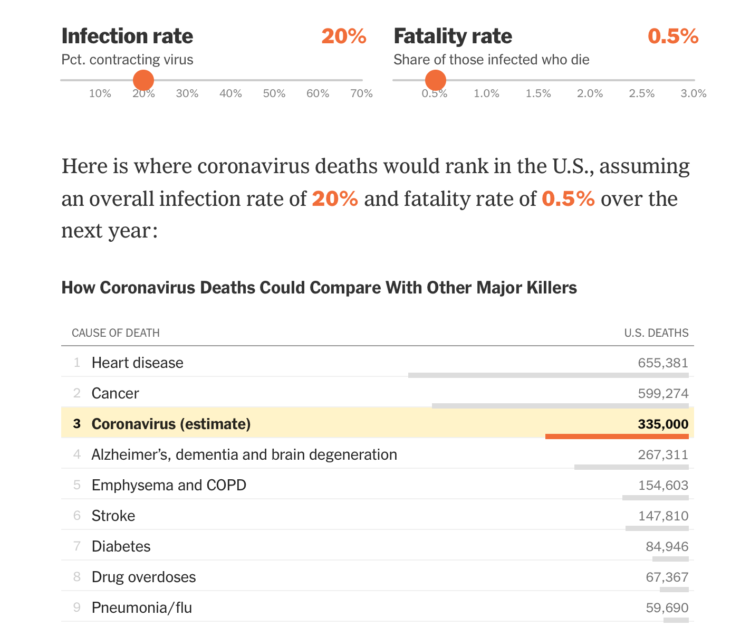
Based on estimates from public health researcher James Lawler, The Upshot shows the range of coronavirus deaths, given variable infection and fatality rate. Adjust with the sliders and see how the death count (over a year) compares against other major causes of death:
Dr. Lawler’s estimate, 480,000 deaths, is higher than the number who die in a year from dementia, emphysema, stroke or diabetes. There are only two causes of death that kill more Americans: cancer, which kills just under 600,000 in a year, and heart disease, which kills around 650,000.
A coronavirus death toll near the top of the C.D.C. range (1.7 million) would mean more deaths from the disease than the number of Americans typically killed by cancer and heart disease put together.
Can we all agree now that brushing off coronavirus by floating annual flu numbers is a bad comparison? The most worrisome part of the data we have is the uncertainty and then the range of possibilities that come out of that uncertainty.
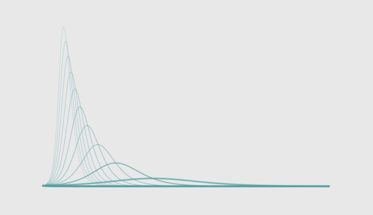
Social distancing is the game plan these days. Try to stay at home and avoid contact with others as much as you can. But why? For The Washington Post, Harry Stevens used simplified simulations of an imaginary virus to show how social distancing can flatten the curve.
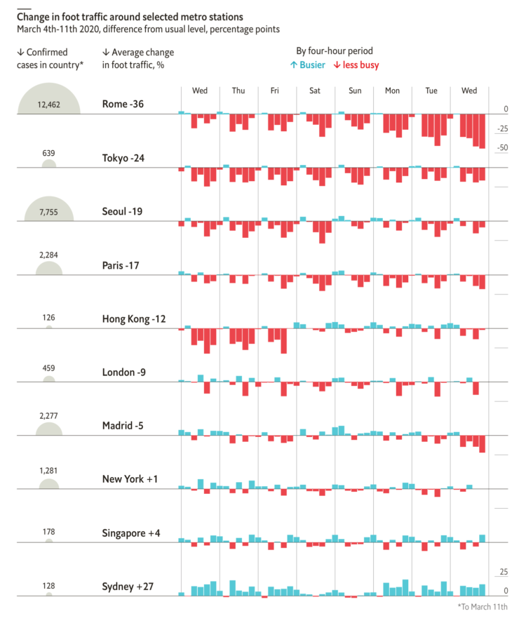
From The Economist, this chart shows the (mostly) decrease in foot traffic in major cities with coronavirus outbreaks. It’s based on data scraped from that section in Google Maps that shows how busy a location is, which I’m kind of surprised the Google limits allowed for. See James Fransham’s thread for more details on their process.
This issue of The Process is public.
Hi,
I don’t know about you, but I’ve been finding it hard to concentrate the past week or so. I keep getting guidelines on washing hands and reassurances from the kids’ school that everything is sanitized multiple times per day. There are empty shelves at the stores with toilet paper and hand sanitizer. It all just feels very uneasy.
And, as I’m sure you heard, the World Health Organization classified Covid-19 as a pandemic. Naturally, I continued voraciously consuming information about the coronavirus. Here’s a rundown of the useful visuals that have crossed my way. They didn’t help with the uneasiness, but they at least provide a window into what’s happening.
There’s a lot of figures and numbers floating around about the coronavirus disease. Some conflict with each other and some are from less trustworthy sources. It’s getting tough to filter through. So Our World in Data, which typically offers a view of global progress, has been compiling research and data with links to its sources:
Most of our work focuses on established problems, for which we can refer to well-established research and data.
COVID-19 is different. All data and research on the virus is preliminary; researchers are rapidly learning more about a new and evolving problem. It is certain that the research we present here will be revised in the future. But based on our mission we feel it is our role to present clearly what the current research and data tells us about this emerging problem and especially provide an understanding of what can and cannot be said based on this available knowledge.
 Visualize This: The FlowingData Guide to Design, Visualization, and Statistics (2nd Edition)
New tools, refined process.


