Add a book to the humorous-charts-documenting-the-everyday genre. Am I Overthinking This? by Michelle Rial charts the everyday. I like how Rial uses everyday objects to show everyday data informally. [Amazon link]
-
Which sandwich do people not like the most? The winner: the Cheese and Tomato, if that even counts as an actual sandwich.
-
Dorota M. Skowron et al. made the first 3-D map of the galaxy. Sean Greene and Andrea Roberson reporting for the Los Angeles Times:
Astronomers have understood since the 1950s that the galaxy is curved, but until now, they’ve based that idea on models and indirect measurements.
Over a six-year period, the researchers took more than 100 images of the galaxy from their observatory in the Chilean Andes. In particular, they monitored 2,400 stars called classical Cepheids, a category of “young” supergiants less than 400 million years old.
-
For Carto, Matt Forrest explains why you shouldn’t use ZIP codes for spatial analysis:
The problem is that zip codes are not a good representation of real human behavior, and when used in data analysis, often mask real, underlying insights, and may ultimately lead to bad outcomes. To understand why this is, we first need to understand a little more about the zip code itself.
In a nutshell, ZIP Codes don’t represent geographic areas, so it doesn’t make sense to treat them like they are.
-
Speaking of earthquakes, Will Chase looked back at a 2012 earthquake in Sumatra that triggered not only a bunch of small ones in the vicinity, but other large ones around the world:
In the ten days following the Sumatra mainshock, 44 earthquakes M5.5+ were recorded. The statistics were clear: this nine-fold increase was highly significant, and most researchers agreed the likely explanation was remote triggering by the M8.6 Sumatra earthquake. This massive triggering of large earthquakes was unprecedented, and many wondered if the strike-slip mechanism at such a large magnitude was a unique combination that led to this outsized response.
-
For The New York Times, Derek Watkins used animated maps to show how a large earthquake can lead to thousands of small ones.
Living in California, I’ve experienced a handful of these, but it had been a while before feeling one a few weeks ago. I may or may not have immediately started looking at earthquake insurance.
-
Members Only
-
Over the past four years, Planet deployed 293 satellites in low orbit to take a snapshot of Earth every day. This animation by Nadieh Bremer shows how the snapshot gets pieced together. Most of me is like, yeah awesome. But then there’s that remaining bit of me that is a little bit nervous.
-
This animated interactive explains how a research group is using light to measure the speed of objects millions of miles away. Light that is farther away will appear to be a different color than a light that is closer. So by measuring the rate of color shifts, they can estimate velocity.
-
Survey participants were asked to grade fast food burger restaurants on eight criteria. This is how each restaurant ranked.
-
In a compare-your-preconceptions-against-reality quiz, The Upshot asks, “Are you rich?” Enter your nearest metro area, income, and what you consider to be rich. See where you actually land.
-
Gerry uses congressional district boundaries as letters. Hahahahaha. Oh wait.
-
Members Only
-
Here are the estimates from the Current Population Survey for the most recent time segment between 2017 and 2018.
-
Members Only
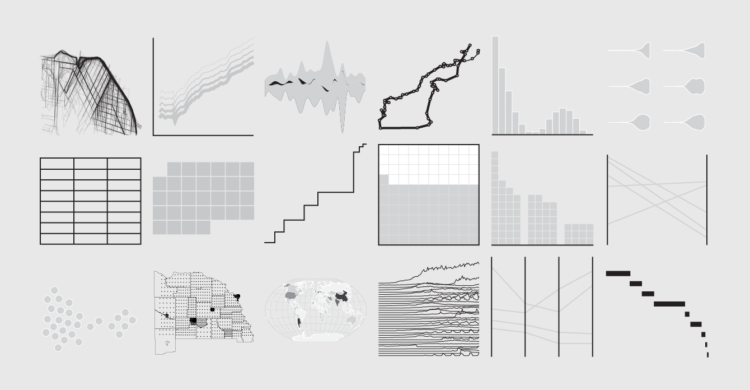
The baseline chart is a specific type of line chart that shows percentage changes over time. With that in mind, if you know how to make a line chart, then you know how to make a baseline chart.
The key is what comes before the actual chart-making. If you have absolute counts, you have to calculate relative change, which can be done in various ways depending on what you want to show and what you’re interested in.
-
Using blobbies with varying traits such as size, speed, and food gathering ability, Primer simulates natural selection in the explainer video below. Blobby.
-
Lauren Baldo illustrated how he applies color theory in his paintings and illustrations. You don’t have to travel far to see how this transfers to visualization.
-
When staying at national parks, some people choose a tent. Some bring an RV. Others might stay in a lodge or sleep under the stars. Of course, it depends on where they stay and the weather during any given time of year. Using data from the National Park Service, Jordan Vincent charted all these things with a multi-faceted approach.
Each band represents patterns for an accommodation type over a year, band width represents number of nights stayed per month, and radius represents volume. Average temperature sits in the background.
Oftentimes, putting so many variables together in one view hides patterns, but this abstract view feels intuitive, even if less concrete. [Thanks, Dario]
-
Andrew DeGraff painted maps that show the geography in movies and their characters’ paths. Above is the map for Back to the Future, with 1985 Hill Valley on the top and 1955 Hill Valley on the bottom.
There’s also a book version. [via kottke]
-
Seung Lee collected sleep data for his son’s first year. Then he knitted a blanket to visualize the data. The blanket is impressive. Collecting a baby’s sleep data for a year? More so.