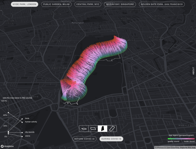
• Membership
  • Newsletter
  • Projects
  • Learning
  • About
  • Member Login
  • Remix and make music with audio from the Library of Congress

    May 6, 2020

    Topic

    Apps  /  Brian Foo, Library of Congress, music

    Brian Foo is the current Innovator-in-Residence at the Library of Congress. His latest project is Citizen DJ, which lets you explore and remix audio from the Library:

    It invites the public to make hip hop music using the Library’s public audio and moving image collections. By embedding these materials in hip hop music, listeners can discover items in the Library’s vast collections that they likely would never have known existed. For technical documentation and code, please see the repo.

    Give it a go. Even if you’re not into making music, you can still explore the sounds, listen to them in their full context, and end up reading about some song written in the early 1900s.

    I’ll take all the rabbit holes I can get.

  • Possible vaccine timelines

    May 6, 2020

    Topic

    Infographics  /  coronavirus, New York Times, Stuart A. Thompson, vaccine

    It’d be great if we could conjure a vaccine or a “cure” seemingly out of nowhere just like in the movies. Unfortunately, there’s a necessary process involved to make sure that something works and that it is safe to distribute to billions of people. For New York Times Opinion, Stuart A. Thompson shows typical vaccine timelines, which can take decades, against hopeful coronavirus vaccine timelines.

  • Coronavirus testing accuracy

    May 5, 2020

    Topic

    Infographics  /  coronavirus, Quartz, testing, uncertainty

    Medical tests do not always provide certain results. Quartz illustrated this with the accuracy of a simulated antibody test that identifies 90% of those infected and 95% of those not infected:

    That means that if you took the test and got a positive result, there’s a 45.1% chance it’s correct. If you got a negative result, there’s a 99.6% chance your result is accurate.

    Of course, this doesn’t mean don’t take the test. Detecting 90% of infections with false positives is a good thing. However, it does help to understand what the numbers mean before you do anything with them.

  • Comparing Covid-19 models

    May 5, 2020

    Topic

    Statistics  /  coronavirus, FiveThirtyEight, modeling

    FiveThirtyEight compared six Covid-19 models for a sense of where we might be headed. With different assumptions and varying math, the trajectories vary, but they at least provide clues so that policymakers can make educated decisions.

    If you’re interested in the data behind these models, check out the COVID-19 Forecast Hub maintained by the Reich Lab at the University of Massachusetts Amherst. They helped with the FiveThirtyEight comparisons and are also the source for the official CDC forecast page.

  • Playable simulations to decide what happens next

    May 4, 2020

    Topic

    Infographics  /  coronavirus, Marcel Salathé, Nicky Case, simulation

    The timelines keep shifting and people are getting antsy for many valid (and not-so-valid) reasons. When will this end? Will we ever get “normal” again? At this point, simulations are probably the closest we can get to seeing what might happen next. Marcel Salathé and Nicky Case peer into what happens next with these playable simulations.

    Where many simulations have felt like distant, abstract ideas, Salathé and Case’s explanations and interactives are rooted in optimism and practical things that we can do now.

  • Looking for generational gaps in music

    May 1, 2020

    Topic

    Statistics  /  generations, music, Pudding

    Inspired by the genre of YouTube videos where younger people listen to older music, The Pudding is running a project to find the generational music gaps. Enter your age, songs play, and you say if you know the song or not.

    The aggregate results are shown as more people listen. For example, the above shows the percentage of people in a given age group who did not recognize the listed songs.

    I’m looking forward to what they do with the finished dataset.

  • Neural network generates convincing songs by famous singers

    April 30, 2020

    Topic

    Statistics  /  Jukebox, music, neural network, OpenAI

    Jukebox from OpenAI is a generative model that makes music in the same styles as many artists you’ll probably recognize:

    To train this model, we crawled the web to curate a new dataset of 1.2 million songs (600,000 of which are in English), paired with the corresponding lyrics and metadata from LyricWiki. The metadata includes artist, album genre, and year of the songs, along with common moods or playlist keywords associated with each song. We train on 32-bit, 44.1 kHz raw audio, and perform data augmentation by randomly downmixing the right and left channels to produce mono audio.

    A lot of the time, generative music sounds artificial and mechanical, but these results are pretty convincing. I mean you can still tell it’s not from the artist, but many of the examples are listenable.

    OpenAI also published the code.

  • Members Only

    Visualization Tools, Datasets, and Resources – April 2020 Roundup

    April 30, 2020

    Topic

    The Process  /  roundup

    Every month, I collect visualization tools and resources that might help you make better charts. Here’s the good stuff for April.

  • Data Underload  /  money, World Health Organization

    Who Funds the World Health Organization

    A couple of weeks ago — or maybe it was a couple of years ago, I’m not sure — the administration announced it would withdraw funding from the World Health Organization. Here’s what that does to the overall picture.

    Read More
  • Text-to-speech models trained on celebrity voices

    April 29, 2020

    Topic

    Statistics  /  celebrity, deepfake, neural network, voice

    [arve url=”https://www.youtube.com/watch?v=m7u-y9oqUSw” loop=”no” muted=”no” /]

    The Vocal Synthesis channel on YouTube trains text-to-speech models using publicly available celebrity voices. Then using this new computer-generated voice, the celebrities “recite” various scripts. For example, the above is Jay-Z rapping the “To be, or not to be” soliloquy from Hamlet, but it’s not him.

    Find out more about the voice generation here, which was developed in 2017. Maybe more interesting, Jay-Z recently filed a copyright claim against the videos.

  • Pretend mall map to show at-risk brands

    April 29, 2020

    Topic

    Infographics  /  coronavirus, mall, stores, Washington Post

    Many brands that were at-risk before the pandemic or ran with low profit margins might not make it through this thing. The Washington Post used a faux mall map to show the levels of risk:

    Companies in this faux mall are rated as speculative investments at Moody’s and S&P as of April 13. These stores are already in financial trouble, and may not be able to access government stimulus money. The stores with the worst ratings are closer to the top of the mall. Brands that are part of the same company, like the Gap and Old Navy, are included in the same storefront.

    The above is one level out of four, and each rectangle is sized by a company’s revenue.

    I’m getting childhood flashbacks passing time inside the circles of clothes.

  • Text from press briefings categorized

    April 27, 2020

    Topic

    Infographics  /  coronavirus, New York Times, press, text

    The New York Times went through the words used during press briefings, pulling out five main categories and highlighting one in particular:

    Viewed simply as a pattern of Mr. Trump’s speech, the self-aggrandizement is singular for an American leader. But his approach is even more extraordinary because he is taking credit and demanding affirmation while he asks people to look beyond themselves and bear considerable hardship to help slow the spread of the virus.

    Hm.

  • Excess deaths

    April 27, 2020

    Topic

    Statistical Visualization  /  coronavirus, Washington Post

    We cannot know the true number of coronavirus-related deaths. Maybe it’s because of a lack of tests. Maybe cause of death is ambiguous because of pre-existing conditions. So, for a different point of view, you might compare the usual number of deaths against total deaths. The Washington Post and researchers from the Yale School of Public Health looked at the differences.

    See also a similar comparison for other countries by The New York Times.

  • Search trends during the pandemic

    April 27, 2020

    Topic

    Statistical Visualization  /  coronavirus, Google, search

    As you would imagine, what we search for online shifted over the past few months. The unknowns push information gathering. Schema Design, in collaboration with the Google News Initiative and Axios, broke down the main changes in search since January.

    Using a beeswarm chart, each circle represents a query and the size of a circle represents the rank in a query. I really wanted to mouse over the circles to see specifics, but maybe that would’ve been too much information in one view.

  • Visualization helping us during the pandemic

    April 24, 2020

    Topic

    Visualization  /  coronavirus, impact

    Hayleigh Moore for the College of Information Studies at the University of Maryland on visualization and the pandemic:

    With new updates developing by the hour amidst the evolving COVID-19 pandemic, trying to grapple at the most relevant information can be overwhelming. Data visualization has helped to synthesize this complex phenomena and shape the timeline of the Coronavirus pandemic that has drastically changed how we go about our daily lives. While commonly used to communicate data to the general population, visualization is now having quite a real-world impact in the face of this crisis.

    Visualization the field often struggles with real-world examples for how its work plays a role in people’s lives. There should be no questions about that now.

  • Testing the infinite monkey theorem

    April 23, 2020

    Topic

    Statistics  /  infinite monkey, music, Pudding

    If you have a room of monkeys hitting keys on typewriters for an infinite amount of time, do you eventually end up with a Shakespeare play? For The Pudding, Russell Goldenberg and Amber Thomas put the infinite monkey theorem to the test directing the computer to randomly generate musical note patterns to match classic songs.

    All said and done, the point here isn’t the real numbers, but the faith that given enough time, randomness will prevail. Will our experiment eventually play even the simple Nokia ringtone in our lifetime? Almost certainly not. Given enough time would it? Almost surely.

    The experiment has been running for 10 days so far, currently working on “Another One Bites the Dust” by Queen.

  • Members Only

    Charting for Others (The Process 086)

    April 23, 2020

    Topic

    The Process  /  audience, clarity, course

    There’s a new tool-agnostic course now available for members. Check it out now.

  • How We Reopen

    April 23, 2020

    Topic

    Infographics  /  coronavirus, reopen, Vi Hart

    Vi Hart, along with a group of experts from different political backgrounds and fields, proposes a plan for how we reopen:

  • People of the Pandemic, a game that simulates social distancing in your ZIP Code

    April 22, 2020

    Topic

    Infographics  /  coronavirus, game, social distancing

    People of the Pandemic is a game that lets you choose how many times you leave the house to get food or go for a walk. Using data for population and hospital beds in your ZIP code, the game then simulates infection, death, and recovery for a hypothetical virus, based on your choices and 19 others’ choices who played before you.

    The infection rate felt aggressive no matter what choices I made in my ZIP code, so it’s probably worth emphasizing again that the game uses a simplified model. See the methodology here. But I like the effort to localize our individual decisions.

  • Missing deaths

    April 21, 2020

    Topic

    Statistical Visualization  /  baseline, coronavirus, New York Times

    The daily counts for coronavirus deaths rely on reporting, testing, and available estimates, which means the numbers we see are probably lower than the real counts. So, for The New York Times, Jin Wu and Allison McCann plotted overall deaths against historical averages for a better sense of what’s really happening.

    The contrasting red lines provide an obvious figure against the “would have died anyways” argument.

  • Page 105 of 392
  • <
  • 1
  • ...
  • 102
  • 103
  • 104
  • 105
  • 106
  • 107
  • ...
  • 392
  • >

Analyze, visualize, and communicate data usefully, beyond the defaults.

Become a member →

Recently for Members

May 8, 2025
When the data is not what it seems

May 1, 2025
Finding the Right Charts

April 24, 2025
Visualization Tools, Datasets, and Resources – April 2025 Roundup

April 17, 2025
Breaking Out of Chart Software Defaults

April 15, 2025
Line Chart with Decorative Neon Accents

Browse by Chart Type See All →

Bubble Chart Frequency Trails Surface Plot Radar Chart Grid Map Pyramid Chart Treemap Line Map Baseline Chart

Browse By Topic

  • Visualization

    Seeing data

  • Maps

    Seeing geographic data

  • Infographics

    Explaining data

  • Networks

    Connecting data

  • Statistics

    Analyzing data

  • Software

    Working with data

  • Sources

    Getting data

  • Design

    Making data readable

Get the Book

Visualize This: The FlowingData Guide to Design, Visualization, and Statistics

Available now.

Order: Amazon / Bookshop

Made by FlowingData

  • The Process

  • Data Underload

  • Chart Everything

  • Guides

  • Books

  • Shop

  • About
  • Contact
  • Newsletter
  • LinkedIn
  • Instagram
  • Bluesky
  • RSS
Copyright © 2007-Present FlowingData. All rights reserved.