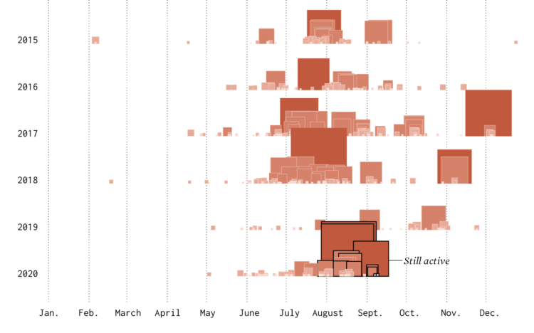
To reopen safely, meatpacking plants have to take precautions to provide space and separation for workers. But the process typically involves a lot of people working close together. The New York Times illustrates the process and the challenges moving forward.
-
The numbers are from a survey by the Pew Research Center conducted in 2016. I suspect the percentages are higher right now, but the gaps between police and public perception seem to say a lot. It’s easy to see where “one bad apple” comes from.
-
A large proportion of those who died from Covid-19 had pre-existing medical conditions. The percentage of those who have pre-existing medical conditions changes a lot by income group. Based on estimates from the Centers for Disease Control and Prevention, we can see by how much. For New York Times Opinion, Yaryna Serkez charted the difference for the largest cities in the United States.
-
Pen plotters slowly draw out a picture line-by-line, so when you watch a chart plot out, it shows up on the paper one piece at a time. Silfa Huttner and Duncan Geere’s use this unraveling “feature” in Plottervision. In the video above, they describe fluctuating oil prices.
Pen plotters are all the rage these days. I think it must be some combination of pressure and time. That’s all it takes really. Pressure and time.
-
The visualization work of W.E.B. Du Bois and his students has been on FD before, but it’s worth another look. In 1900, they put together a series of charts for a Paris exhibition visualizing black America. You can access the collection via the Library of Congress.
If you’re looking for more context for the charts and the times, Whitney Battle-Baptiste and Britt Rusert wrote about the history and motivations in W.E.B. Du Bois’s Data Portraits: Visualizing Black America. On the line chart above:
What appears to be another straightforward line chart is one of the most overtly political charts in the Georgia study. An undulating black line shows extrapolated property values in outline and actual property values in solid black crossing a red grid of squares. Tucked into the grid is a series of disquieting socioeconomic and political trends: the rise of the Ku Klux Klan and political unrest in the 1870s; new industrialism in the 1880s; followed by lynching, financial panic, disenfranchisement, and proscriptive laws in the 1890s. The diagram powerfully links the economic progress of black Georgians to larger regimes of violence against African Americans, pointing to the widespread disenfranchisement and dispossession of black people in the post-Reconstruction era.
Again, this is from 1900.
-
Maddy Varner reporting for The Markup:
“All protesting and all marches are a series of balancing acts of different priorities and acceptable risks,” said Mason Donahue, a member of Lucy Parsons Labs, a Chicago-based group of technologists and activists that run digital security training classes and have investigated the Chicago Police Department’s use of surveillance technology. “There is a lot of communication ability that goes away if you don’t bring a phone period,” he said.
So if you’re going to take your phone, you might want to do some of the following things to minimize risk.
These are straightforward items like installing an app or changing a setting on your phone, so it should only take a few minutes before you step out.
-
The New York Times reports on how the CDC struggled and failed on many levels. On the data front, where it was so important in the beginnings to gauge what was about to happen, the CDC failed to get accurate data to the people who needed to make decisions quickly:
The C.D.C. could not produce accurate counts of how many people were being tested, compile complete demographic information on confirmed cases or even keep timely tallies of deaths. Backups on at least some of these systems are made on recordable DVDs, a technology that was state-of-the-art in the late 1990s.
The result is an agency that had blind spots at just the wrong moment, limited in its ability to gather and process information about the pathogen or share it with those who needed it most: front-line medical workers, government health officials and policymakers.
Painful.
Also, a little too familiar.
In 2014, I wrote a guide on how to make government data sites better. I used the CDC data offerings as my running example.
I criticized how hard it was to get data in a usable format, how the extraction tools were a chore to use, the lack of context to go with the data, and the challenge of just finding the data on a sprawling website.
The kicker at the end:
There’s plenty more stuff to update, especially once you start to work with the details, but this should be a good place to start. It’s a lot easier to point out what you can do to improve government data sharing than it is to actually do it of course. There are so many people, policies, and oh yes, politics, that it can be hard to change.
Maybe give it a try anyway.
Seek out the people who care.
Maybe start with an area you are already strong, improve on it, and branch from there. In the case of CDC, a start with WONDER or Data.CDC might be where it’s at. Or maybe start by unifying the topic pages and all those spreadsheets.
As an outsider looking in, I can’t say for sure the best place to start. I don’t know all the administrative baggage that comes with updating these sites. I would just hate to come back to this five years from now and see that nothing changed or worsened because of age.
Nothing changed. And it worsened with age.
-
There’s a lot of misinformation passing through the internets right now. A lot. Connie Jin, for NPR, made a comic that explains how to spot it.
I suspect FD readers are better than average at staying skeptical, but maybe pass this along to the family members who aren’t so good and picking out what is real and not.
-
It’s hard to think of much else. These maps show the racial divide between black and white people in major cities.
-
We like to complain about how data is messy, not in the right format, and how parts don’t make sense. Reality is complicated though.
-
The Census Bureau has been running the Household Pulse Survey since April 23, 2020 to get some gauge for how the pandemic is changing things at home. Here’s how things look so far.
-
Members Only
-
The Federal Procurement Data System tracks federal contracts of $10,000 or more. For ProPublica, Moiz Syed and Derek Willis made the data for coronavirus-related contracts more accessible with a searchable database. Browse the items, the companies, and the amounts. Somehow it seems like so much, and yet so not enough.
See also the accompanying article highlighting some of the more questionable contracts.
-
The coronavirus has changed everything. Larry Buchanan, for The New York Times, goes minimalist with a series of up and down arrows to show which direction things moved.
Even though there’s no magnitude or axes, it still works. In some ways, the simplistic view is more effective than regular charts.
-
This map by Tim Meko for The Washington Post uses time series lines to show change in confirmed cases by county. Using a combination of line thickness, height, and color, the map highlights the counties with the greatest change since early May.
Hairy.
-
For Reuters, Manas Sharma and Simon Scarr animated a coronavirus outbreak in Singapore between January and April, going with the force-directed bubble view. It starts small, then there’s the spread, and clusters form.
-
A Yahoo News/YouGov poll recently showed this:
Only 40% of American adults are like, “No way. This is false.” But then there are 32% who are like, “Well… maybe? I don’t know.” Then there are over a quarter who are like, “Yeah, he’s trying to track us.”
Really? Please tell me there is some study that shows internet-based polls are crazy. My brain is having trouble processing these results.
-
The New York Times used their full front page to list 1,000 names of the 100,000 who died due to the virus. There is an online version, which is equally moving.
-
This is The New York Times front page for Sunday, May 24, 2020.