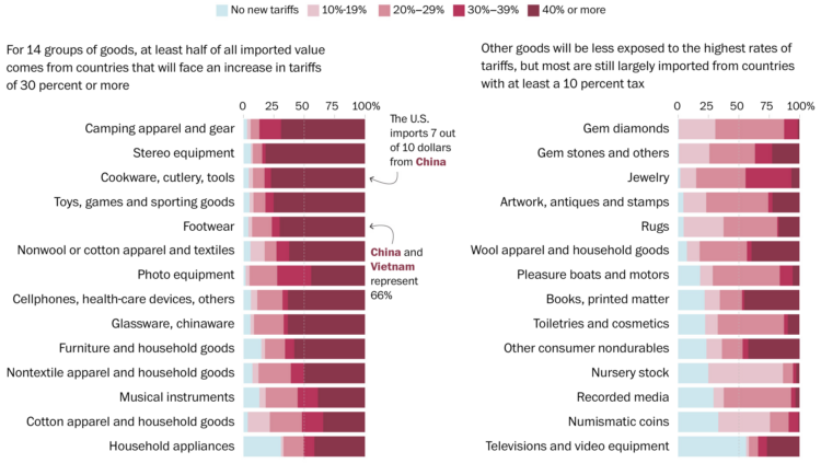
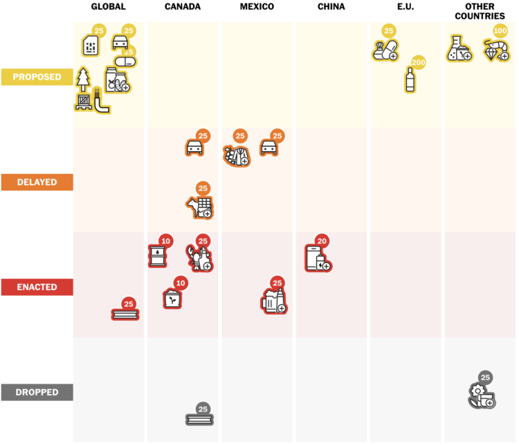
You get a tariff. And you get a tariff. And you. And you. Everybody gets a tariff. But not the same for every type of consumer good. For the Washington Post, Luis Melgar, Rachel Lerman, and Szu Yu Chen show the percentages of imported value by category.
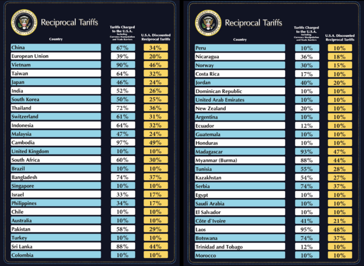
That means products that the United States commonly gets from Vietnam, such as clothing and shoes, would be subject to a new 46 percent tax, whereas goods from Colombia, like flowers, would see a lower new 10 percent levy. Imports from Mexico, such as avocados, will have no new tax. In any case, shopping is about to get more expensive for Americans.
It looks like camping gear, stereo equipment, cookware, and toys are going to get hit the hardest, but at least numismatic (?) coins won’t get taxed as hard.


 Visualize This: The FlowingData Guide to Design, Visualization, and Statistics (2nd Edition)


