Apple’s value passed $1 trillion on Thursday, and as tradition requires, we must…
Infographics
Telling stories with data and graphics.
-
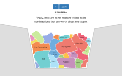
Bucket o’ companies compared to Apple $1 trillion value
-

Same stars, different constellations
Cultures have formed different stories and pieced together different constellations from the stars,…
-
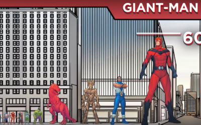
Marvel size chart
The logistics of being a 60-foot man must be a pain.…
-
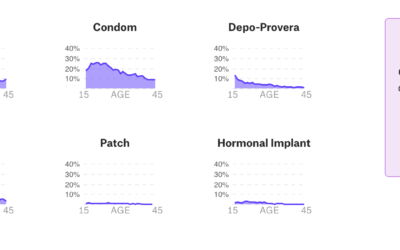
Data-centric view of birth control
Birth control is one of those topics often saved for private conversations, so…
-
Products with tariffs in the trade war
The trade war started in January of this year when the administration imposed…
-
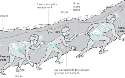
Graphics explaining Thai boys rescue
The eighth Thai boy was rescued from the flooded cave recently. Great news.…
-
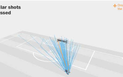
Expected versus actual goals in the World Cup
Benjamin Pavard from France made a low-probability goal the other day. Seth Blanchard…
-
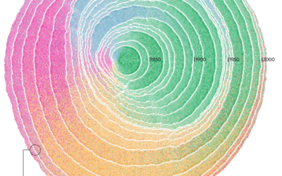
Immigration in the United States visualized as rings of tree trunk
Pedro M. Cruz, John Wihbey, Avni Ghael and Felipe Shibuya from Northeastern University…
-
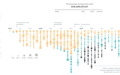
$16.1m in political and taxpayer spending at Trump properties
ProPublica compiled spending data from a wide range of sources to calculate the…
-

Blockchain visually explained
I feel like I was supposed to know what blockchain is a while…
-

Little League baseball analytics that would change the game forever
Oh. So that’s why I was always placed in right field that one…
-

History of the health meter in video games
The health meter in video games wasn’t always so commonplace. It took time,…
-
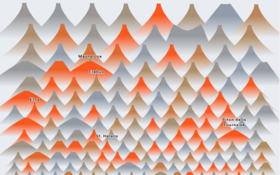
All the volcano eruptions
Slowly becoming the person who charts the past century of natural disaster events,…
-

Vintage chart shows the evolution in design of everyday objects
By Raymond Loewy, this chart from 1934 shows the shifts in design of…
-

Nigel Holmes new illustrated book on Crazy Competitions
Nigel Holmes, the graphic designer known for his playful illustrated graphics, has a…
-

What’s in a food truck
Food trucks are the real deal these days. The best ones serve a…
-
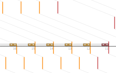
Subway delays visually explained
Adam Pearce for The New York Times describes the sad state of affairs…
-
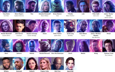
Get all caught up with The Avengers using this timeline
It’s been a decade since the first Iron Man movie, and some 30…
Recently for Members
Second Edition
 Visualize This: The FlowingData Guide to Design, Visualization, and Statistics (2nd Edition)
 Visualize This: The FlowingData Guide to Design, Visualization, and Statistics (2nd Edition)
New tools, refined process.
Browse by Chart Type See All →


