Sisi Wei for ProPublica and Nick Fortugno of Playmatics made a game to…
Infographics
Telling stories with data and graphics.
-

Waiting Game, through the steps of asylum seekers
-
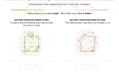
Umpire strike zone changes to finish games earlier
When watching baseball on television, we get the benefit of seeing whether a…
-
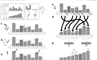
Algorithms drawn as IKEA furniture instructions
Learning algorithm steps can be a challenge when viewed only through code or…
-
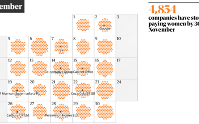
Day of the year companies stop paying women
One way to think about gender pay gap is to imagine women receive…
-
A musical journey in 1939, retold with visualization
In 1939, John and Ruby Lomax traveled through ten southern states in three…
-
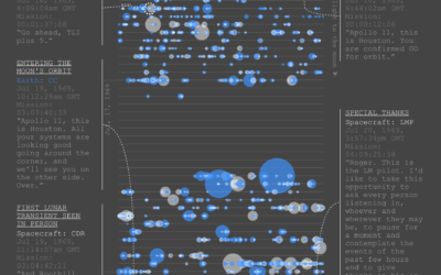
Apollo 11 conversations on the way to the moon
As you can imagine, there was plenty of conversation between Earth and Apollo…
-
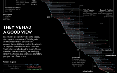
All the astronauts and their spaceflights
556 people have gone to space. In an article on their changed perspectives,…
-
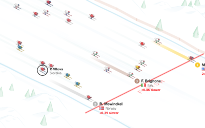
Mikaela Shiffrin pulling away for gold
Mikaela Shiffrin won her first gold medal in PyeongChang with a fraction of…
-
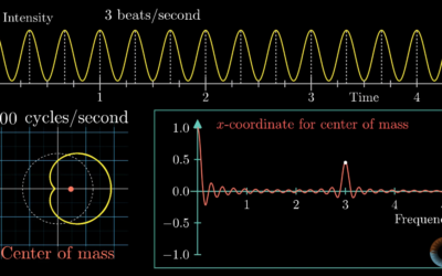
Visual introduction to the Fourier Transform
One of my least favorite electrical engineering courses in college was on signals…
-
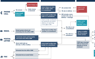
Where constituent input ends up
When you have input to send Congress, you have a number of communication…
-

Olympian mechanics
Well this is awesome. The New York Times highlighted four olympians with a…
-

Olympians in your living room through augmented reality
Well this is awesome. The Winter Olympics start this Friday, and The New…
-

Scissors congruence
The Wallace–Bolyai–Gerwien theorem says that if you have two polygons of equal area,…
-
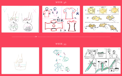
Hand-drawn how-to instructions using zero words
Inspired by Dear Data, the data drawing pen pal project, designers Josefina Bravo,…
-
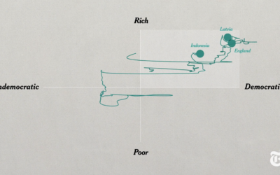
Is there something wrong with democracy?
Max Fisher and Amanda Taub, for The New York Times, answer the question…
-
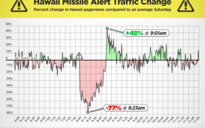
Porn traffic before and after the missile alert in Hawaii
PornHub compared minute-to-minute traffic on their site before and after the missile alert…
-
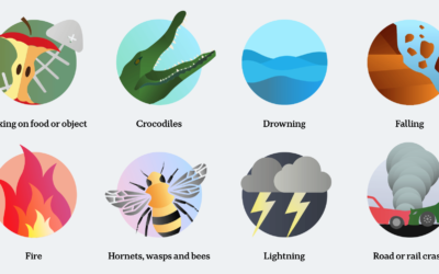
Compare your fears against reality
From ABC News, this is a clever comparison between people’s worst fears and…
-
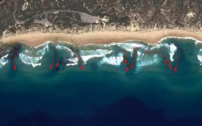
Spotting rip currents
Rip currents are like hidden rivers near the shore that head out to…
Recently for Members
Second Edition
 Visualize This: The FlowingData Guide to Design, Visualization, and Statistics (2nd Edition)
 Visualize This: The FlowingData Guide to Design, Visualization, and Statistics (2nd Edition)
New tools, refined process.
Browse by Chart Type See All →


