Gerrymandering doesn’t sound like an especially sexy topic, but it’s an important one…
Infographics
Telling stories with data and graphics.
-
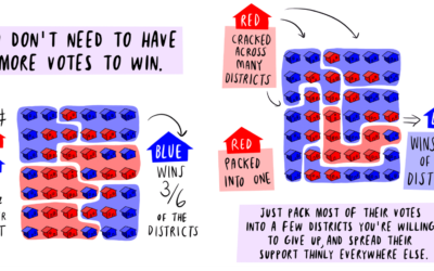
Math to fix gerrymandering, explained in comic
-
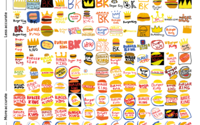
Logos drawn from memory
Signs asked 150 people to draw famous logos — Apple, Starbucks, Burger King,…
-

LaVar Ball trolling to the top, through a tweet count lens
I didn’t know who LaVar Ball was, and suddenly, it was non-stop sports…
-
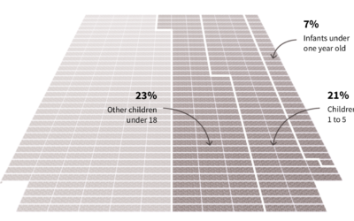
Mass exodus at human scale
Big numbers are too abstract in our minds to fully understand the scale…
-
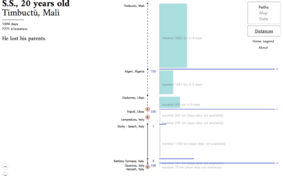
Visual narrative of six asylum seekers
We often visualize migration and people movement as lines that go from point…
-

Most frequent how-tos we search for
Xaquín G.V., in collaboration with the Google News Lab, investigated what people around…
-

Measuring things with ships
We might be in an age of big data, but people have been…
-
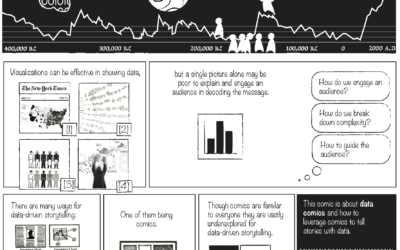
Data Comics
Comics are a way to tell stories and for a while now, people…
-
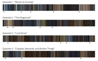
Color profiles of every Game of Thrones episode
As the final episode of Game of Thrones nears, Kavya Sukumar for Vox…
-
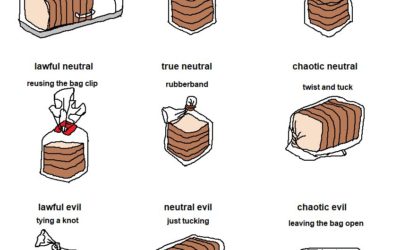
Bread bag alignment chart
From @aurelianrabbit, the bread bag alignment chart. Lawful neutral, right here.…
-

Why automation is different this time
Since forever, we’ve tried to make jobs easier. More automated. In many cases,…
-
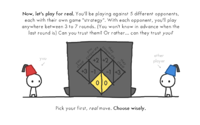
Explaining the evolution of trust with game theory
Nicky Case, who has a knack for making complex topics playfully fun, delves…
-
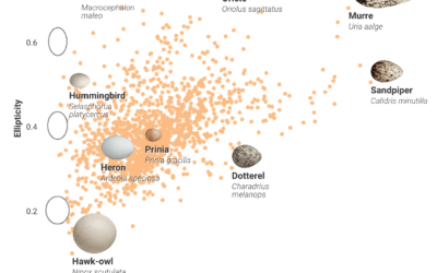
Charting bird egg shapes, and why so many varieties
Bird eggs come in all shapes and sizes, and people didn’t really know…
-

Hidden oil patterns on bowling lanes
This explainer video by Vox on the oil patterns on bowling lanes was…
-
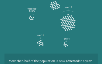
Australia as 100 people
Opting for the force-directed clusters route, Catherine Hanrahan and Simon Elvery for ABC…
-
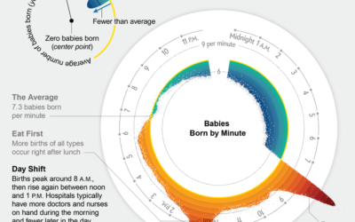
When babies are born, the cycle
Movies would have you believe that birth is random and unpredictable. (And if…
-
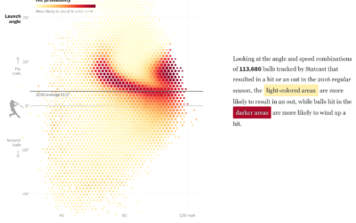
Baseball hitting angles on the rise
After the crackdown on performance-enhancing drugs, home runs in professional baseball dipped the…
-
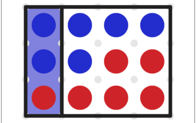
Gerrymandering game shows you how it works
Gerrymandering is the practice of manipulating boundaries in such a way that favors…
Recently for Members
Second Edition
 Visualize This: The FlowingData Guide to Design, Visualization, and Statistics (2nd Edition)
 Visualize This: The FlowingData Guide to Design, Visualization, and Statistics (2nd Edition)
New tools, refined process.
Browse by Chart Type See All →


