Process the data into a usable format, which makes the visualization part more straightforward.
How I Made That
-
Members Only
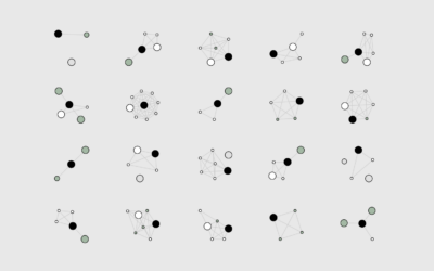
How I Made That: Network Diagrams of All the Household Types
-
Members Only
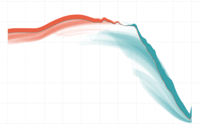
How I Made That: Animated Difference Charts in R
A combination of a bivariate area chart, animation, and a population pyramid, with a sprinkling of detail and annotation.
-
Members Only
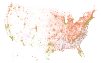
How I Made That: National Dot Density Map
Mapping one dot per person, it’s all about putting the pieces together.
-
Members Only
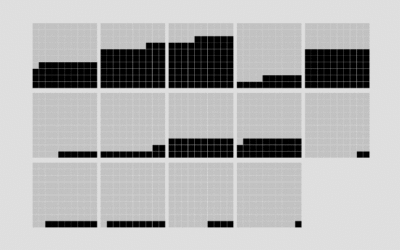
How I Made That: Animated Square Pie Chart
Also known as waffle charts. Using animated transitions between values, you can allow for comparisons between categories.
-
Members Only
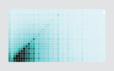
How I Made That: Interactive Heatmap
Add interaction so that you can show different segments of the data and allow comparisons.
-
Members Only
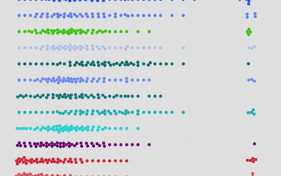
How I Made That: Interactive Beeswarm Chart to Compare Distributions
The histogram is my favorite chart type, but it’s unintuitive for many. So I’ve been using the less accurate but less abstract beeswarm.
-
Members Only
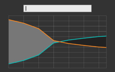
How I Made That: Searchable Time Series Chart
When there are too many options or categories, it can be helpful to make the data searchable.

 Visualize This: The FlowingData Guide to Design, Visualization, and Statistics (2nd Edition)


