Charles Piller, for Science, highlights the work of Matthew Schrag, who uses image…
Mistaken Data
Hm. That does not look right.
-
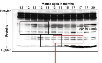
Looking for falsified images in Alzheimer’s study
-
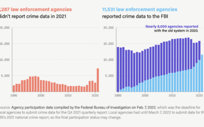
Unreliable FBI crime data
The Marshall Project and Axios report that the FBI changed their reporting system…
-
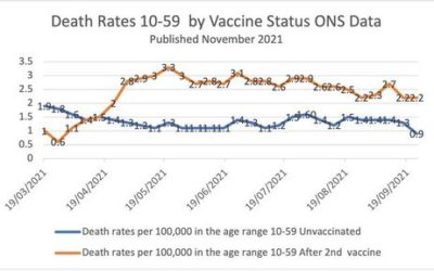
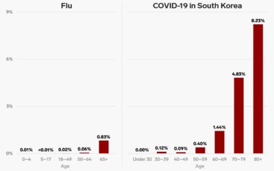
Simpson’s Paradox in vaccination data
This chart, made by someone who is against vaccinations, shows a higher mortality…
-
Scientists with bad data
Tim Harford warns against bad data in science:
Some frauds seem comical. In… -
‘Less than 10 percent’ outdoors
The CDC said that “less than 10 percent” of coronavirus cases were from…
-
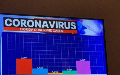
Excel spreadsheet limit leads to 16,000 Covid-19 cases left off daily count
Microsoft Excel is useful for many things, but it has its limitations (like…
-
FDA commissioner corrects his misinterpretation of reduced mortality
Talking about a possible plasma treatment for Covid-19, the Food and Drug Administration…
-
Algorithm leads to arrest of the wrong person
Even though there was supposedly a person in the decision-making process and a…
-
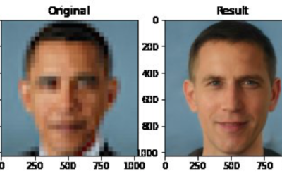
Face depixelizer with machine learning, and some assumptions
In crime shows, they often have this amazing tool that turns a low-resolution,…
-
Bad bar chart
Welcome to whose bar chart is it anyway: where the geometries are made…
-
Bad denominator
With coronavirus testing, many governments have used the percentage of tests that came…
-
Poor comparison between two bar charts
A chart from Business Insider makes a poor attempt to compare the death…
-
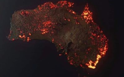
Misinterpreted or misleading fire maps
With all of the maps of fire in Australia, be sure to check…
-
Study retracted after finding a mistaken recoding of the data
A study found that a hospital program significantly reduced the number of hospitalizations…
-
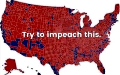
The ‘impeach this’ map has some issues
Philip Bump explains why the “impeach this” map is a bit dubious:
By… -
NOAA chief scientist highlights the forecast contradiction
In regards to the press release that seemed to contradict the National Weather…
-
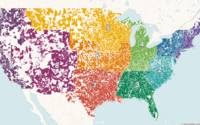
Why you shouldn’t use ZIP Codes for spatial analysis
For Carto, Matt Forrest explains why you shouldn’t use ZIP codes for spatial…
-
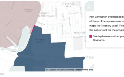
Millions of dollars in tax breaks — because of a mapping error
A small discrepancy in a couple of shapefiles led to a misclassification of…
-
Big storm on the way. Oh wait, no, it’s a cloud of ladybugs
Apparently ladybugs migrate this time of year, and it’s enough to show up…
-
When geolocation makes everyone think you stole their phone
People show up unannounced at John and his mother Ann’s home in South…
Recently for Members
Second Edition
 Visualize This: The FlowingData Guide to Design, Visualization, and Statistics (2nd Edition)
 Visualize This: The FlowingData Guide to Design, Visualization, and Statistics (2nd Edition)
New tools, refined process.
Browse by Chart Type See All →


