Max Read for New York Magazine describes the fake-ness of internet through the…
Mistaken Data
Hm. That does not look right.
-
Fake internet
-

Spotting AI-generated faces
Computers can generate faces that look real. What a time to be alive.…
-

Lessons from posting a fake map about pies
Brian Brettschneider made a joke map randomly designating the favorite pies of certain…
-
When data is not quite what it seems
FiveThirtyEight used a dataset on broadband as the basis for a couple of…
-
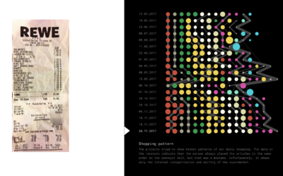
When the interesting pattern ends up just being computer byproduct
Good lesson here. Christian Laesser was playing around with receipt data and initially…
-
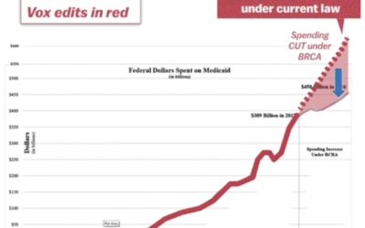
Misleading Medicaid funding with the baseline
The administration tweeted a chart that shows the Senate Republican health care bill…
-
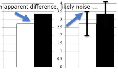
Common statistical interpretation mistakes
Statistics is a game of subtleties, and you lose when you don’t pay…
-
Data distributed as clipart
Government data isn’t always the easiest to use with computers. Maybe it’s in…
-

Skittle disconnect
This is what happens when there is a disconnect between data and what…
-
Sans human, Facebook’s Trending Topics algorithm faired poorly
Last week, Facebook announced that it was making the Trending Topics section more…
-
Guide to spotting data BS
As we delve deeper into election season, politicians will spit out more and…
-
Link
The most misleading charts of 2015, fixed →
Suggestions. Not just snark.
-
Science formally retracts LaCour paper
Last week, graduate student Michael J. LaCour was in the news for allegedly…
-
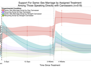
Graduate student makes up data for fake findings
Last month, This American Life ran a story about research that asked if…
-
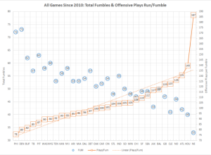
Questionable fumble statistics for Deflate-Gate
A data-centric look at New England Patriots fumble rates at home made the…
-
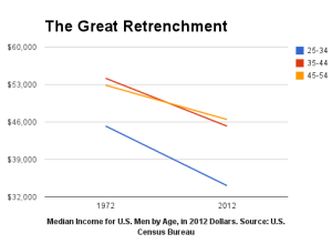
Basic chart, wrong conclusions
A short post on Bloomberg from 2013 describes the fall of U.S. mens’…
-

Unintentional Venn diagram suggests opposite meaning
Most people probably wouldn’t think much about this poster that shows the values…
-

Geography.
By way of David Kennerr, something in this CNN frame seems off.…
-

Newborn false positives
Shutterfly sent promotional emails that congratulate new parents and encourage them to send…
-
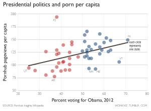
Porn views for red versus blue states
Pornhub continues their analysis of porn viewing demographics in their latest comparison of…
Recently for Members
Second Edition
 Visualize This: The FlowingData Guide to Design, Visualization, and Statistics (2nd Edition)
 Visualize This: The FlowingData Guide to Design, Visualization, and Statistics (2nd Edition)
New tools, refined process.
Browse by Chart Type See All →


