Last week, Australia released data for their 2011 Census. Small Multiples, in collaboration…
Statistical Visualization
Finding patterns, distributions, and anomalies.
-
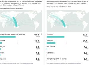
Side-by-side comparisons for Australian Census
-
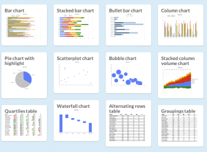
Chart Chooser helps you choose charts
There are a lot of charts to choose from, and if you pick…
-
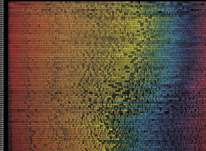
Evolution of movie poster colors
We’ve seen a number of looks at movie poster cliches, but this is…
-
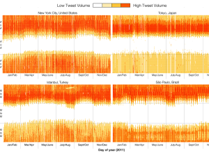
When the world sleeps, based on Twitter activity
Twitter engineers Miguel Rios and Jimmy Lin explored tweet volumes in different cities…
-
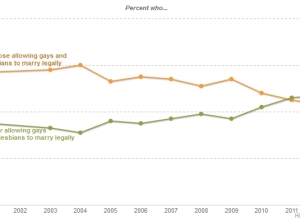
Even simple charts can tell a story
Regardless of your politics, this chart is a great example of how data…
-
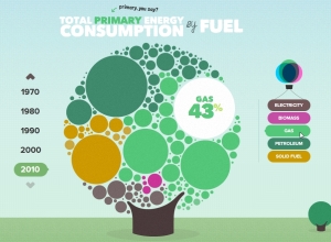
The U.K. energy consumption guide
I’m a sucker for anything cute and bubbly, and the U.K. Energy Consumption…
-
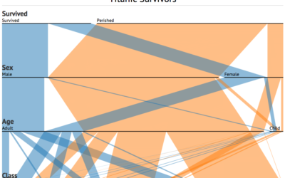
Parallel Sets for categorical data, D3 port
A while back, Robert Kosara and Caroline Ziemkiewicz shared their work on Parallel…
-
How recruiters look at your resume
In a study by TheLadders (of n equals 30), recruiters looked at resumes…
-
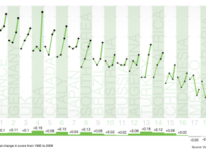
Towards a Low-carbon World
Carbon output. We want to reduce it, but some countries have a longer…
-
Odds of losing in roulette
Jay Jacobs has some fun with roulette simulations and explores the odds of…
-
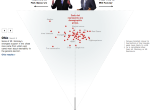
Who voted for Santorum and Romney
As a complement to Shan Carter’s exit poll dancing boxes, The New York…
-

Thomas the Tank Engine and Friends, accidental chart
This came via Twitter from @christopferd:
Will @flowingdata caption my 2 yr old’s… -
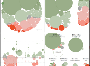
Slicing Obama’s 2013 budget proposal four ways
With Obama’s recent budget for next year proposed, Shan Carter et. al of…
-
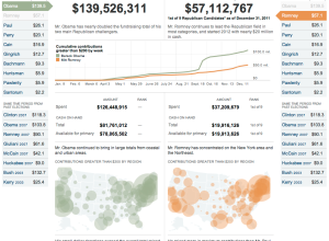
Compare presidential candidate fundraising
Presidential candidates have raised $186 million up to now, according to the Federal…
-
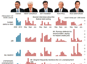
Words used in SOTU and Republican presidential candidates in debates
Jonathan Corum for The New York Times examines word usage by President Barack…
-
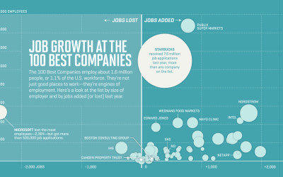
Job growth at the best companies to work for
Nicolas Rapp and Anne Vandermey with a straightforward look at new jobs added…
-
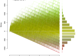
Optimized dart throwing and other games
If you play darts just trying to hit the bullseye, you aren’t playing…
-
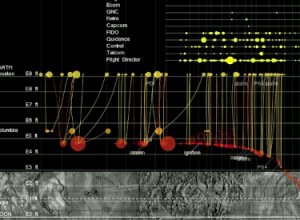
Apollo 11 lunar landing told through data
From Yanni Loukissas of the MIT Laboratory for Automation, Robotics, and Society, comes…
Recently for Members
Second Edition
 Visualize This: The FlowingData Guide to Design, Visualization, and Statistics (2nd Edition)
 Visualize This: The FlowingData Guide to Design, Visualization, and Statistics (2nd Edition)
New tools, refined process.
Browse by Chart Type See All →


