Football players are getting bigger. Noah Veltman, a developer for the WNYC Data…
Statistical Visualization
Finding patterns, distributions, and anomalies.
-
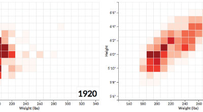
NFL players getting bigger
-
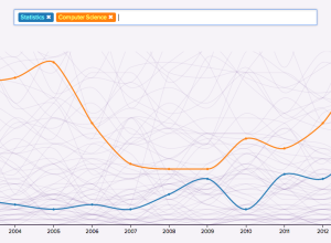
A decade of college degrees
North by Northwestern looked closer at degrees awarded by their university over the…
-
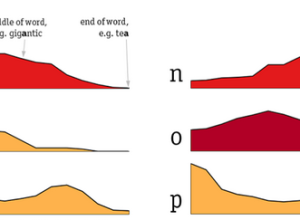
Distribution of letters in the English language
Some letters in the English language appear more often in the beginning of…
-
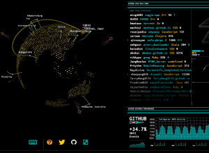
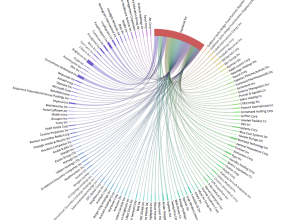
Tron-style dashboard shows Wikipedia and GitHub streams
As a fun learning exercise, Rob Scanlon made a dashboard that shows GitHub…
-
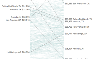
Your income versus what it feels like →
Incomes and the cost of living vary across the country. Some areas might…
-
Alcohol consumption per drinker
We’ve seen rankings for alcohol consumption per capita around the world. These tend…
-
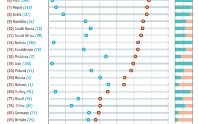
Views of white Americans
In light of the Donald Sterling brouhaha, Amanda Cox for The Upshot put…
-
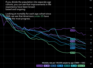
How people die in America
Matthew Klein for Bloomberg View explored mortality in America through a slidedeck of…
-
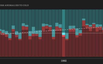
Five decades of warm and cold weather anomalies
This year’s polar vortex churned up some global warming skeptics, but as we…
-
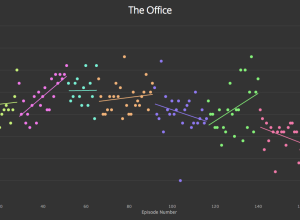
Graph TV shows ratings by episode
Kevin Wu made a straightforward interactive that lets you see IMDB television ratings…
-
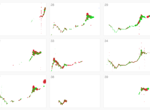
Failed Bitcoin market activity
Stamen visualized Bitcoin activity, noting a variety of traders who knew what they…
-
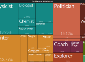
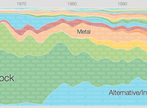
An exploration of cultural production
Pantheon, a project from the Macro Connections group at The MIT Media Lab,…
-
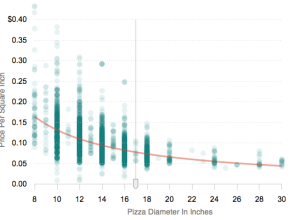
Why you should buy the bigger pizza
Because you get more pizza to eat, and if you don’t finish it,…
-
A human-readable explorer for SEC filings
Maris Jensen just made SEC filings readable by humans. The motivation:
But in… -
Music timeline of plays and history
Two Google research groups, Big Picture and Music Intelligence, got together and made…
-
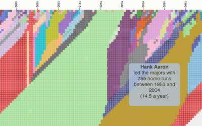
Cherry picking years for random sports statements
When you watch sports, it can sometimes feel like the stat guy pulls…
-
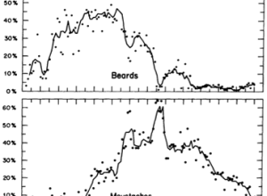
Facial hair trends over time
In 1976, Dwight E. Robinson, an economist at the University of Washington, studied…
-
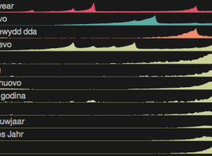
Happy new year around the world
New Year’s is a worldwide event, but as we know, it doesn’t happen…
Recently for Members
Second Edition
 Visualize This: The FlowingData Guide to Design, Visualization, and Statistics (2nd Edition)
 Visualize This: The FlowingData Guide to Design, Visualization, and Statistics (2nd Edition)
New tools, refined process.
Browse by Chart Type See All →


