Famed statistician John Tukey created the boxplot in 1970. It shows a distribution summary in a small amount of space. Hadley Wickham and Lisa Stryjewski look back on the old standby and its evolution up to present. Keep it in mind, while still used today, the boxplot was created with pencil and paper.
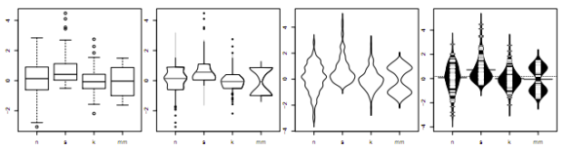
One of the original constraints on the boxplot was that it was designed to be computed and drawn by hand. As every statistician now has a computer on their desk, this constraint can be relaxed, allowing variations of the boxplot that are substantially more complex. These variations attempt to display more information about the distribution, maintaing the compact size of the boxplot, but bringing in the richer distributional summary of the histogram or density plot. These plots can overcome problems in the original such as the failure to display multi-modality, or the excessive number of “outliers” when n is large.
Alright, computers are useful. I guess.
 Visualize This: The FlowingData Guide to Design, Visualization, and Statistics (2nd Edition)
I’ve been using beanplots a lot lately. 99% of the graphs I draw are distributional visualizations, and beanplots are particularly good for comparing multiple pairs of distributions (e.g., diversity in two classes of sites by region).
Thanks for sharing this article!
Hey Raphael!
Could you tell me what the outer edges of bean plots imply and why they are of such varying shapes.
John Tukey deserves enormous credit for his energetic and enthusiastic advocacy of box plots (and, naturally, much, much else in statistical graphics, statistical science, and science, generally).
But the claim that he invented the box plot, although passed on from course to course and text to text as an invariable meme, is at best a half-truth. Re-invention, very likely.
Box plots were used in climatology and geography from at least 1933, usually under the dull name “dispersion diagram”. later Mary Ellen Spear included them in 1952 as “range bars” in a text on graphics, as this paper acknowledges. Such diagrams showed median, quartiles and extremes, and often _more_ detail about other data points than many box plots do at present. (That box plots often leave out too much is a frequent discovery.)
The name “box plot” is, so far as I can gather, 100% Tukey, as are his rules on when to show individual data points beyond the “whiskers”.
Should be: Mary Eleanor Spear. Also, according to a report by John Bibby, A.L. Bowley was using box plots in his lectures about 1897.