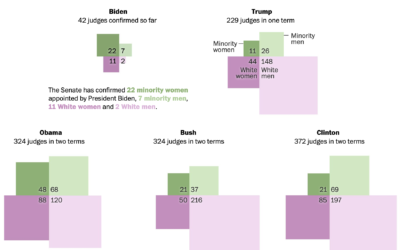
Adrian Blanco for The Washington Post used squares connected at the corners to…
Statistical Visualization
Finding patterns, distributions, and anomalies.
-
Diversity of federal judge picks, compared by president
-
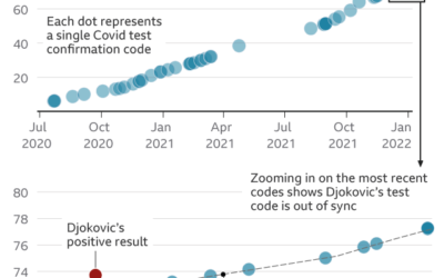
Questioning Novak Djokovic’s Covid tests, based on data
Tennis player Novak Djokovic is not vaccinated against the coronavirus, and as a…
-
Death rates by vaccination booster status
Our World in Data continues their important work on providing and showing up-to-date…
-
Analytics for U.S. government websites
With the announcement of free Covid-19 tests through the United States Postal Service,…
-
A visual and audio tour of sound at Nap Nap Swamp
When I think swamp noise, I imagine a blob of sound that’s some…
-
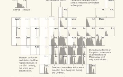
Congressmen who enslaved people
Using old Census records and documents, Julie Zauzmer Weil, Adrian Blanco and Leo…
-
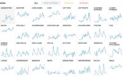
New shopping search patterns from the pandemic
Schema Design, Google Trends, and Axios collaborated on The New Normal, looking at…
-
Settling all the internet debates in one go with a bunch of polling
The internet was once this fun place where people had goofy debates about…
-
False positives with prenatal tests for rare conditions
Sarah Kliff and Aatish Bhatia for NYT’s The Upshot look at the uncertainty…
-
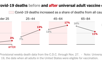
Covid-19 mortality before and after vaccine eligibility
Denise Lu and Albert Sun for The New York Times show the shifts…
-
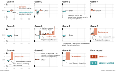
World Chess Championship in charts
Magnus Carlsen continued to assert his dominance at the World Chess Championship. FiveThirtyEight…
-
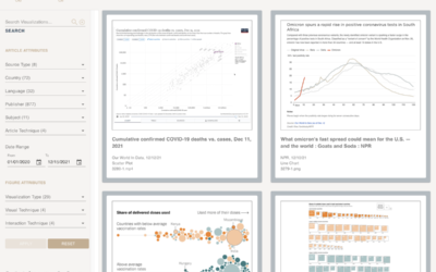
A catalog of all the Covid visualizations
The COVID-19 Online Visualization Collection is a project to catalog Covid-related graphics across…
-
What works in visualization, scientifically speaking
Steven L. Franconeri, Lace M. Padilla, Priti Shah, Jeffrey M. Zacks, and Jessica…
-
Why we listen to the same Christmas songs
You know it’s the holiday season when Mariah Carey starts singing about wanting…
-
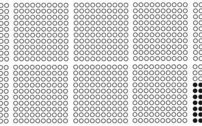
Vaccination rates compared against country wealth
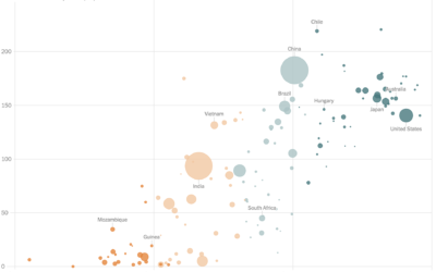
Vaccine supply is only part of the equation. For The New York Times,…
-
Leland Wilkinson, creator of The Grammar of Graphics, passed away
Leland Wilkinson passed away on Friday, according to his daughter Amie. In visualization…
-
Most used emoji for the year
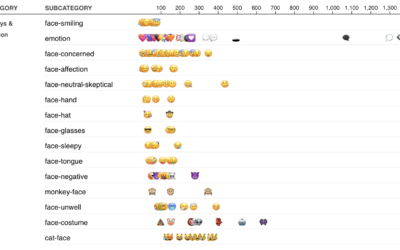
I am told people use these things called emoji in their messages to…
-
Stephen Curry career threes compared to other players
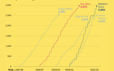
Stephen Curry is about to break the record for number of three-pointers made…








 Visualize This: The FlowingData Guide to Design, Visualization, and Statistics (2nd Edition)


