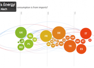
Gregor Aisch wanted a better way to make maps online that allowed something…
Software
Programs and online applications to help you make use of data.
-
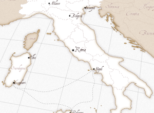
Kartograph aims to make interactive vector maps easier
-
Link
Creating Animated Bubble Charts in D3 →
Use of Force layout, collision detection, and transitions to make this graphic from The New York Times
-
Link
Must-Have R Packages for Social Scientists →
Oldie but a goodie
-
Live coding and inventing on principle
This talk by Bret Victor caught fire a few days ago, but I…
-
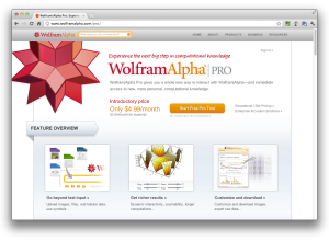
WolframAlpha Pro launches in an effort to democratize data science
Taking the next step in the Wolfram|Alpha experiment, Wolfram launches a Pro version…
-
Weave for visualization development
Web-based Analysis and Visualization Environment, or Weave for short, is open source software…
-
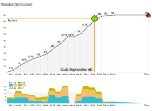
Angry Birds productivity tracker
With the new year, many of you (myself included) and your employers resolved…
-
Programming gets you freedom to do what you want with data
Casey Reas and Chandler McWilliams asked visual designers why they write their own…
-
Quick time series visualization with Cube
Seeing how things change over time can be important for a business so…
-
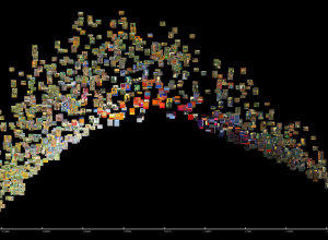
Explore large image collections with ImagePlot
When we make charts and graphs, we usually think of the data abstractions…
-
BuzzData aims to make data more social
In many ways, data wants to be social. It wants to get out…
-
On the Launch of Visually
A couple of weeks ago, Visually, a new infographics-based startup, launched with a…
-
Visualizing Player makes it easier to share visualization
It’s easy to share static graphics. Save an image and then upload it…
-
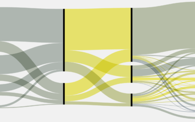
Make Sankey flow diagrams with Fineo, sort of
Whenever I post a Sankey diagram (for example, here, here, and here), someone…
-
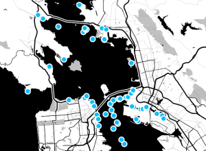
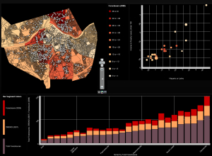
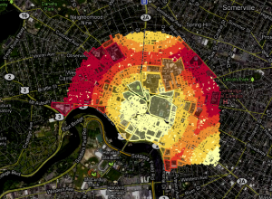
Dotspotting to make city data more legible
Last year Stamen Design received a grant from the Knight News Challenge to…
-
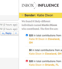
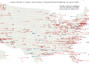
Inbox Influence shows political contributions by the people in your email
While browser plugins like Rapportive tell you the social networks that people in…
-
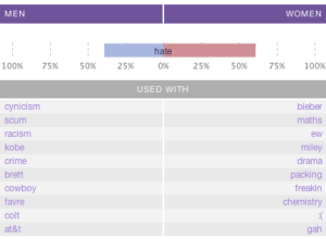
Gender and time comparisons on Twitter
Men and women are different. You know that. But do they tweet differently?…
-
GeoCommons 2.0, now with more mapping features
GeoCommons, an open repository of data and maps, launched version 2.0 this week,…
-
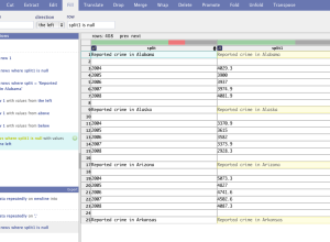
DataWrangler for your data formatting needs
Formatting data is a necessary pain, so anything that makes formatting easier is…
-
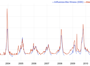
Google Correlate lets you see how your data relates to search queries
A while back, Google showed how Influenza outbreaks correlated to searches for flu-related…
Recently for Members
Second Edition
 Visualize This: The FlowingData Guide to Design, Visualization, and Statistics (2nd Edition)
 Visualize This: The FlowingData Guide to Design, Visualization, and Statistics (2nd Edition)
New tools, refined process.
Browse by Chart Type See All →


