Analyze web traffic [via]
Software
Programs and online applications to help you make use of data.
-
Link
R Google Analytics →
-
Link
Arc Diagrams in R →
Using this Protovis example with Les Misérables
-
Link
svg.js →
A lightweight library for manipulating and animating SVG
-
Link
Shiny Server →
Run R applications online
-
Link
Ayasdi →
A tool that advertises “automatic insights” from complex data, looks like mainly with clustering and network graphs
-
Link
slitscanner.js →
Make a sound sculpture from any YouTube video
-
Link
D3 3.0 →
Built-in geographic projections, better transitions, and more extensive asynchronous requests
-
Sitegeist: A mobile app that tells you about your data surroundings
From businesses to demographics, there’s data for just about anywhere you are. Sitegeist,…
-
Link
Hexagonal binning in D3 →
Useful with dense point clouds; also this method using size instead of color
-
Shiny allows web applications with R
RStudio, the folks behind the IDE for R released last year, continues to…
-
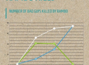
xkcd-style charts in R, JavaScript, and Python
The ports and packages to make your charts look like they came from…
-
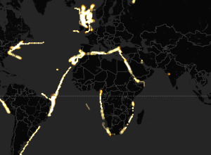
Torque for mapping temporal data
Mapping data over time can be challenging, especially when you have a lot…
-
Easy and customizable maps with TileMill →
I’m late to this party. TileMill, by mapping platform MapBox, is open source…
-
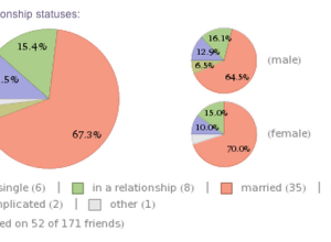
Analyze your Facebook profile with Wolfram|Alpha
Feeding off the momentum from Stephen Wolfram’s personal analytics earlier this year, Wolfram|Alpha…
-

New open data platform launches
Open data is everywhere. However, open data initiatives often manifest as mere CSV…
-
More infographic software
Recently there’s been a spate of infographic tools popping up (e.g., easel.ly, venngage,…
-
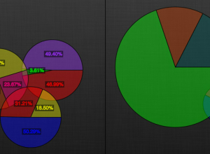
Venn pie-agrams
So I got to thinking, since I’m on this pie chart kick, “what…
-
Automated infographics with easel.ly
I’m pretty sure I’m not in their target audience, but my main takeaway…
-

Miso: An open source toolkit for data visualisation
Your online visualization options are limited when you don’t know how to program.…
-
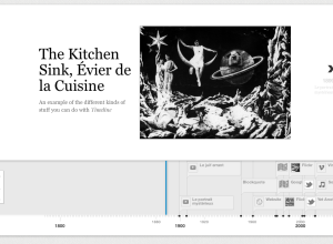
Timelines that are Easy to Make and Use
As a project of the Knight News Innovation Lab, Timeline by Verite is…
Recently for Members
Second Edition
 Visualize This: The FlowingData Guide to Design, Visualization, and Statistics (2nd Edition)
 Visualize This: The FlowingData Guide to Design, Visualization, and Statistics (2nd Edition)
New tools, refined process.
Browse by Chart Type See All →


