In a fun one by Alyssa Fowers, for The Washington Post’s Department of…
Maps
Intuitive to look at spatial patterns and great for distributing geographic data.
-
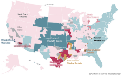
Map of donut federations
-
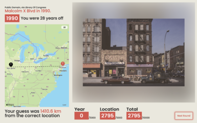
A guessing game for place and time
Add another geolocation guessing game that I am terrible at. TimeGuessr shows you…
-
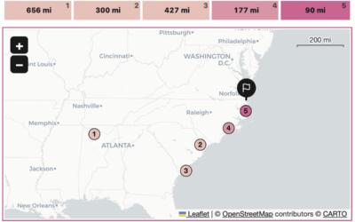
A geolocation game in the format of Wordle
With a cross between the games Wordle and GeoGuessr, Russell Samora for The…
-

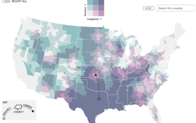
Population surrounded by interstate highways
Filed under random but fun calculations, Alasdair Rae estimated the number of people…
-
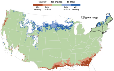
Mapping where trees will grow
As the climate changes, the places that different types of trees will grow…
-
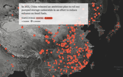
When you cross hydropower and a battery
Mira Rojanasakul and Max Bearak for The New York Times highlight the rise…
-
Melting ice, global effects
Ice is melting at the poles, which makes it seem like a localized…
-
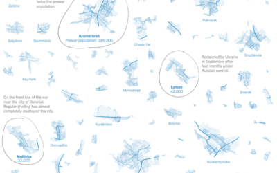
Areas still controlled by Ukraine
For The New York Times, Josh Holder and Marco Hernandez show the areas…
-
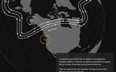
Science behind California rains
It rained a lot more than usual this winter in California. Diana Leonard…
-
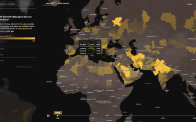
World water gap
We tend to use more water than is available in the world, which…
-

Mapping where Taylor Swift performs on stage during a show
Taylor Swift is currently on tour. During a show, she sings 44 songs…
-
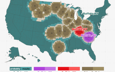
Among cities with the same name, which one people are probably talking about given their location
Throughout the United States, there are a surprising number of cities that have…
-
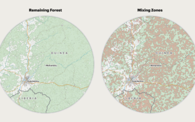
Deforestation and increased risk of outbreaks
For ProPublica, Al Shaw, Irena Hwang, and Caroline Chen explain the increased risk…
-
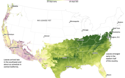
When spring is coming where you live
Going off the calendar, today is the first day of spring, but nature…
-
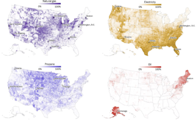
Maps of home heating sources in the United States
For The Washington Post, John Muyskens, Shannon Osaka, and Naema Ahmed mapped the…
-
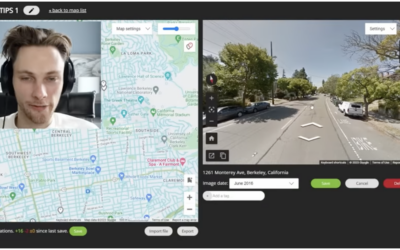
Finding the physical location in an online video via Google Maps clues
GeoGuessr player rainbolt is next-level good at reading Google Maps. Given a short…
-
Hypothetical map that shows how access changes if more states ban abortion
Based on analysis by economics professor Caitlin Myers, FiveThirtyEight provides a hypothetical map…
-
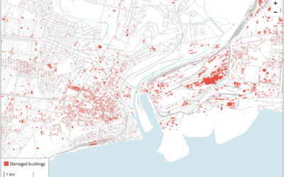
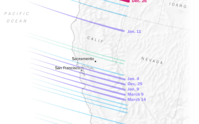
Using satellite imagery to assess the damage in Ukraine
The Economist combined two satellite imagery sources, one that estimates fire events and…
Recently for Members
Second Edition
 Visualize This: The FlowingData Guide to Design, Visualization, and Statistics (2nd Edition)
 Visualize This: The FlowingData Guide to Design, Visualization, and Statistics (2nd Edition)
New tools, refined process.
Browse by Chart Type See All →


