For Reuters, Mariano Zafra, Anurag Rao, and Jon McClure describe how bird flu…
Infographics
Telling stories with data and graphics.
-
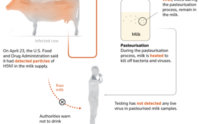
Low risk for human bird flu transmission
-
Cicada brood timeline
The cicadas are coming. This year is unique, because there are two broods…
-
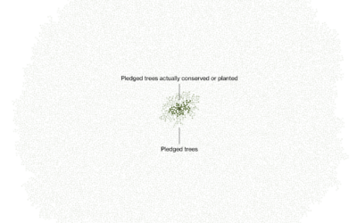
Limited progress towards a plan for planting 1 trillion trees
Marc Benioff, the CEO of Salesforce, set out to plant and conserve 1…
-
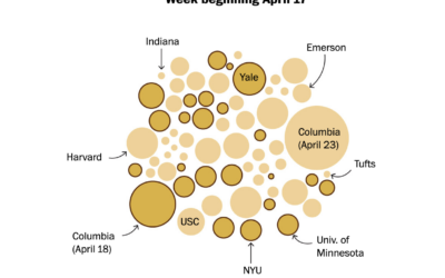
Counts for pro-Palestinian college protests increasing
Based on estimates from the Crowd Counting Consortium, the Washington Post shows the…
-

Flipbook drawn by strangers on the internet
The Pudding ran an experiment that asked people to trace a shape. They…
-
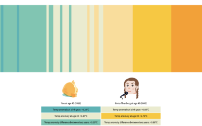
Climate change in your lifetime and the next
One of the challenges of understanding the weight of climate change is that…
-
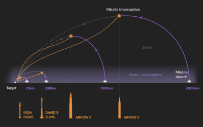
Israel uses Iron Dome as defense against rockets
Using a series of graphics, Reuters explains Israel’s defense against rockets, also known…
-
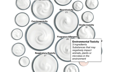
Scented products with potentially harmful ingredients
For Bloomberg, Daniela Sirtori, Madeline Campbell, and Marie Patino do some product counting:…
-
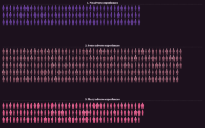
Teenage adversity that carries into adulthood
The National Longitudinal Surveys from the Bureau of Labor Statistics are unique in…
-
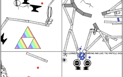
Expanding Rube Goldberg machine that you can edit
From xkcd, a Rube Goldberg machine that keeps on going. Edit a cell…
-

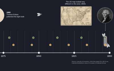
Interactive timeline of notable people throughout history
This is a fun project by Jan Willem Tulp. Based on data from…
-

Visual guide to airfoils
Bartosz Ciechanowski is at it again with an in-depth explainer that makes heavy…
-
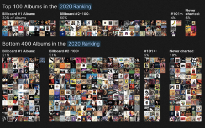
Defining the greatest albums of all time
Rolling Stone published a list in 2003 that ranked the 500 greatest albums…
-

Tiny chip manufacturing, visually explained
Microchips have gotten tiny. Like smaller than a red blood cell tiny. Financial…
-

If we didn’t have leap years
For CNN, Amy O’Kruk and Kenneth Uzquiano asked what would happen if we…
-

Interactive LED basketball court
During the 2024 NBA All-Star weekend, the basketball court was essentially a giant…
-
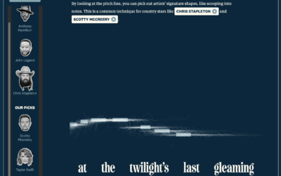
Diva-ness of national anthem renditions
You’ve probably heard various renditions of The Star-Spangled Banner, and sometimes singers put…
-

Your body as a processing plant, digesting a hot wing
Your body goes through a special process to digest spicy food. The sting,…
Recently for Members
Second Edition
 Visualize This: The FlowingData Guide to Design, Visualization, and Statistics (2nd Edition)
 Visualize This: The FlowingData Guide to Design, Visualization, and Statistics (2nd Edition)
New tools, refined process.
Browse by Chart Type See All →


