Memento Movi, a mini-app by Michael Condouris, is what you get when you…
Infographics
Telling stories with data and graphics.
-

Movie runtimes framed by life expectancy
-

Rainbow Sky, the colors mentioned on Bluesky
Martin Wattenberg drew up a live visualization that shows colors mentioned in Bluesky…
-

Emoji rain and Bluesky Matrix
Bluesky firehose fun continues. Jared Short shows emoji usage as rain drops that…
-

Tunnel through the live Bluesky firehose
Bluesky has a relatively easy-to-use firehose that lets you dip into the stream…
-

Swooping vote margins
The New York Times used swooping arrows to show vote swings left and…
-

What might have sank the Bayesian superyacht
A $40 million superyacht called the Bayesian sank off the coast of Sicily,…
-

Restored rose and lily illustrations from the Pierre-Joseph Redouté collection
In the early 1800s, botanist and painter Pierre-Joseph Redouté painted hundreds of lily…
-

Winning the Electoral College, a mini-game
For The New York Times, Lily Boyce, Jon Huang, and Blacki Migliozzi made…
-

People moving towards political affiliation
For NYT Upshot, Ronda Kaysen and Ethan Singer compared current voter registration data…
-
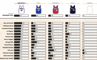
Uniform flair on the rise in NBA basketball games
In NBA basketball, the home team used to almost always wear a white…
-
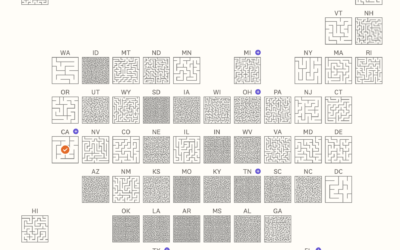
Abortion mazes to represent the complexity of abortion access
Speaking of grid maps and abortion access, Jan Diehm and Michelle Pera-McGhee, for…
-

Visual explainer for the thrilling game of Crokinole
From Russell Samora for The Pudding, “Crokinole is like a mashup of shuffleboard…
-

Scale of buildings destroyed in Gaza
Damage assessments from UNOSAT estimate that 66% of structures in Gaza are damaged…
-

Who gets shipped in fan fiction
The Pudding examines who gets shipped, which means a pairing of characters in…
-

Uber and Lyft use lockout loophole to avoid paying drivers
Based on rideshare data collected by Bloomberg, it appears that Uber and Lyft…
-

Preparing for a hurricane, a visual guide
For The Washington Post, N. Kirkpatrick, Aaron Steckelberg, and Leslie Shapiro provide a…
-

Smuggling fentanyl precursors, illustrated
In their ongoing series on fentanyl in the United States, Reuters illustrates the…
-

Reordered baseball lineup over decades
Baseball’s batting lineup has changed from what seemed to make sense to what…
Recently for Members
Second Edition
 Visualize This: The FlowingData Guide to Design, Visualization, and Statistics (2nd Edition)
 Visualize This: The FlowingData Guide to Design, Visualization, and Statistics (2nd Edition)
New tools, refined process.
Browse by Chart Type See All →


