The Doomsday Clock is a metaphorical clock that symbolizes a catastrophic end to…
Nathan Yau
-
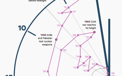
Shifts in time on the Doomsday Clock
-
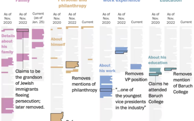
Evolution of George Santos’ biography
George Santos, currently a U.S. representative, seems to lie about his background and…
-
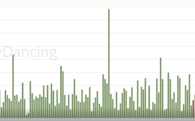
Stripper earnings tracked over four years
Reddit user nerdydancing tracked her earnings on each shift for four years. If…
-
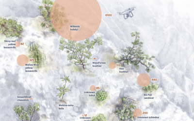
Battling plant extinction
In a story about how scientists are using drones to fight plant extinction,…
-
Generating music from text
Researchers at Google built a model that generates music based on brief text…
-
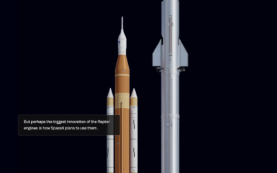
Differing approaches between SpaceX and NASA to sending rockets to the moon
For The Washington Post, William Neff, Aaron Steckelberg, and Christian Davenport show the…
-
Members Only
Visualization Tools and Learning Resources, January 2023 Roundup
Here’s the good stuff for January.
-
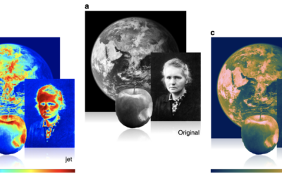
Misuse of the rainbow color scheme to visualize scientific data
Fabio Crameri, Grace Shephard, and Philip Heron in Nature discuss the drawbacks of…
-
Cinematic visualization
Using the third dimension in visualization can be tricky because of rendering, perception,…
-
Members Only
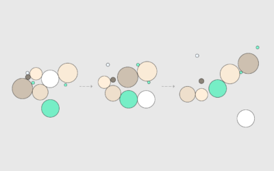
How to Animate Packed Circles in R
Pack circles, figure out the transitions between time segments, and then generate frames to string together.
-
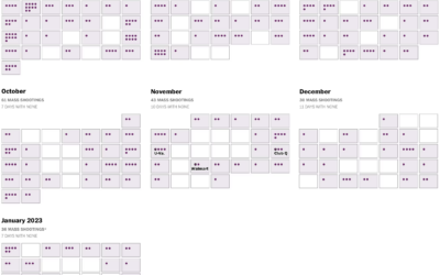
Mass shootings calendar
A shooting in Monterey Park, California on Lunar New Year’s eve left 11…
-
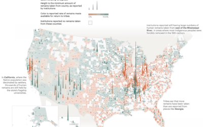
Unreturned Native American remains, mapped
A law was passed in 1990 that allowed Native American tribes to request…
-
Mixed Feelings of Happiness and Meaning
Happiness and meaning do not always travel together. Sometimes we need to pursue meaning without the happiness, and vice versa.
-

Meaning of the Chinese New Year meal
In celebration of Chinese New Year, Julia Janicki, Daisy Chung, and Joyce Chou…
-
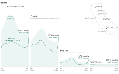
Reservoir refills in California
There’s been a lot of rain in California, which has been good to…
-
Manual removal of harmful text to train AI models
AI training data comes from the internet, and as we know but maybe…
-
Members Only
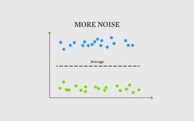
More Noise, Better Signal
Sometimes the noise, something we often try to minimize in data, makes for a better signal.
-
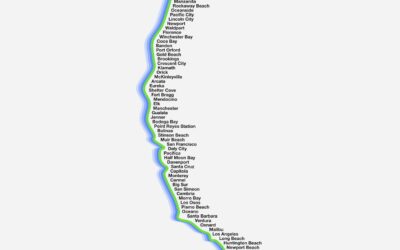
Barely a map of the west coast
Barely Maps is an ongoing project by Peter Gorman that shows geographic data…
-
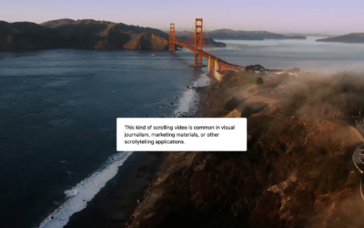
Scrolly video JavaScript library
ScrollyVideo.js is a JavaScript library that makes it easier to incorporate videos in…
-
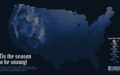
Snow cover mapped using snowflakes
To show snow cover across the United States, Althea Archer for the USGS…
Recently for Members
Second Edition
 Visualize This: The FlowingData Guide to Design, Visualization, and Statistics (2nd Edition)
 Visualize This: The FlowingData Guide to Design, Visualization, and Statistics (2nd Edition)
New tools, refined process.
Browse by Chart Type See All →


