This spiralized chart by Gus Wezerek and Sara Chodosh for NYT Opinion has sparked discussions on what it means to communicate data. A lot of people don’t like it. I’m gathering my thoughts, but I think it’s fine for two main reasons: (1) it’s a lead-in to an opinion piece and (2) it’s not trying to replace the straight-up linear views that we’ve grown uncomfortably familiar with over two-plus years.
Spiral graph to show Covid-19 cases
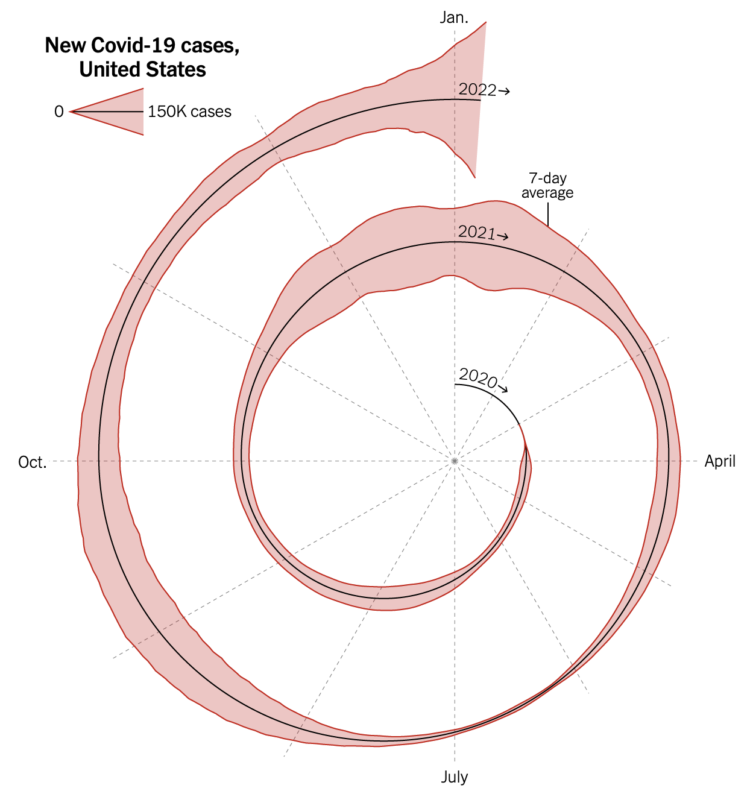
Chart Type Used

Second Edition
 Visualize This: The FlowingData Guide to Design, Visualization, and Statistics (2nd Edition)
 Visualize This: The FlowingData Guide to Design, Visualization, and Statistics (2nd Edition)
New tools, refined process.