As a world population, we’re growing taller, but South Koreans seemed to grow…
Nathan Yau
-

Why South Koreans grew taller so quickly
-

Shooting down the Chinese balloon
Shooting down a floating balloon out on its lonesome seems like a straightforward…
-
Members Only
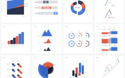
Endless Visual Options
In a sea of endless possibilities, narrow down your visualization options by looking for what works instead of looking for what is the best.
-
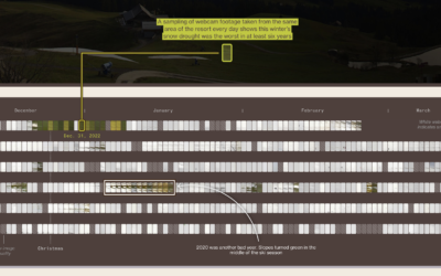
Ski resorts dealing with fewer snow days
For Bloomberg Green, Jin Wu, Laura Millan and Hayley Warren, on the challenges…
-
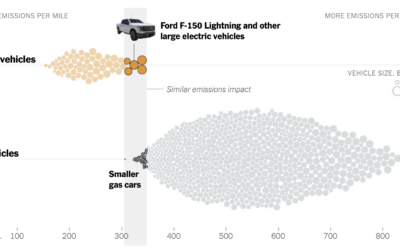
Emissions from big electric trucks vs. gas vehicles
Based on estimates from CarbonCounter by the MIT Trancik Lab, electric vehicles typically…
-
Members Only

How to Make a Smoother Animated Growth Map in R
Show change over time and geography with smooth transitions.
-
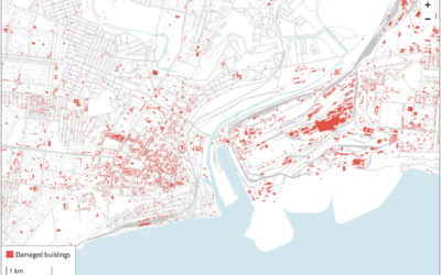
Using satellite imagery to assess the damage in Ukraine
The Economist combined two satellite imagery sources, one that estimates fire events and…
-
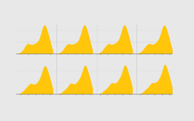
100 visualizations from a single dataset with 6 data points
The structure of a dataset can help you pick a visualization method or…
-

Greatest unexpected NBA performance
This is a fun one from Russell Samora and Reshad Malekzai for The…
-
Members Only
Visualization Tools and Learning Resources, February 2023 Roundup
Here’s the good stuff for February.
-
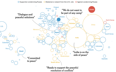
Trying to isolate Russia
The New York Times shows how the west tried to isolate Russia and…
-
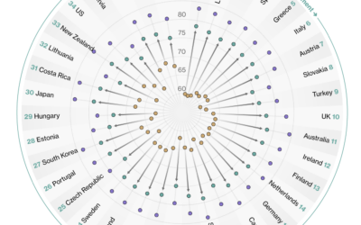
Countries with the longest healthy retirements
Bloomberg compared retirement years in the context of life expectancy and healthy life…
-
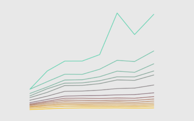
Wealthy Percentiles Rising
The rich continue to get richer, and everyone else either only kind of earns more or stays where they’re at.
-

Map of homes bought with all cash
For The Washington Post, Emmanuel Martinez, Kevin Schaul and Hamza Shaban mapped the…
-

Spy balloons and UFOs
For The New York Times, Eleanor Lutz illustrated things in the sky, because…
-

Cyanotype to represent grief
Marking the third anniversary of the first Covid deaths in the United States,…
-
Members Only
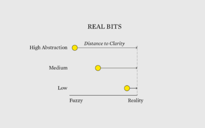
Real Bits
Tie in the real bits among the abstract shapes, colors, and geometries of charts to make the latter easier to understand.
-

Data warehouse at the supermarket
Grocery stores with loyalty programs collect data on what and when you buy…
-

Guide for working with machine learning datasets
As part of the Knowing Machines research project, A Critical Field Guide for…
-
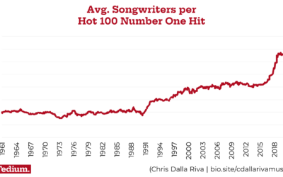
Why modern popular songs have so many more writing credits
For Tedium, Chris Dalla Riva examined why the number of credited songwriters per…
Recently for Members
Second Edition
 Visualize This: The FlowingData Guide to Design, Visualization, and Statistics (2nd Edition)
 Visualize This: The FlowingData Guide to Design, Visualization, and Statistics (2nd Edition)
New tools, refined process.
Browse by Chart Type See All →


