In a collaboration between PEER 1 Hosting, Steamclock Software, and Jeff Johnston, the…
Nathan Yau
-

App shows what the Internet looks like
-
Other ways to follow FlowingData
With Google Reader closing its doors in July (which stinks because I use…
-
Link
A Globe Hack and Good Old Mercator
A Globe Hack and Good Old Mercator. An illustration of the Mercator map projection using pennies. There’s some distortion.
-
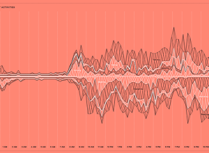
Feltron 2012 Annual Report
Today might be pi day, but yesterday was Feltron Report day. The theme…
-

Choosing the right seat →
It can be tricky picking the right seat at a dinner party. So…
-
Link
Nate Silver Discusses Data Bias, Strangeness of Fame
-
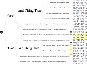
Word tree for any URL or Twitter username
In 2007, Martin Wattenberg and Fernanda Viégas created the word tree, a search…
-
Data hackathon challenges and why questions are important
Jake Porway, executive director of DataKind on data hackathons and why they require…
-

Amiigo: The exercise tracker that identifies exercises
Self-tracking devices are all the rage these days. I went to the Apple…
-
What data brokers know about you
Lois Beckett for ProPublica has a thorough piece on data brokers — companies…
-
Link
Quandl
Quandl is a search engine for time series data. Similar to DataMarket, but probably with more straightforward download.
-
FlowingData is brought to you by…
My many thanks to FlowingData sponsors who help keep the lights on around…
-

The world as one city
When we build models of the world, we often think of it broken…
-
Using search data to find drug side effects
Along the same lines as Google Flu Trends, researchers at Microsoft, Stanford and…
-
Link
General Social Survey
The General Social Survey has been running since 1972, and many questions have remain unchanged to make comparisons possible. The data from then to 2012 can now be downloaded in a variety of formats. [via]
-
Link
Hack D.C.
Hackathons to put open data to use.
-
Members Only
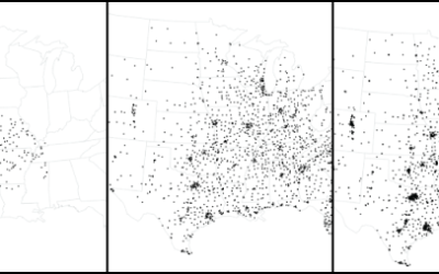
How to Make an Animated Growth Map in R
Although time series plots and small multiples can go a long way, animation can make your data feel more real and relatable. Here is how to do it in R via the animated GIF route.
-
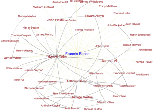
Six Degrees of Francis Bacon, a 17th century social network
These days it’s relatively easy to figure out connections between people via email,…
-
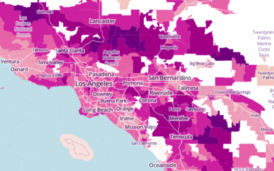
Average commute times mapped →
The United States Census Bureau just released county-level commute estimates for 2011, based…
-

xkcd: Growing dating pool
An old one from xkcd. I’m not sure whether to laugh or cry,…
Recently for Members
Second Edition
 Visualize This: The FlowingData Guide to Design, Visualization, and Statistics (2nd Edition)
 Visualize This: The FlowingData Guide to Design, Visualization, and Statistics (2nd Edition)
New tools, refined process.
Browse by Chart Type See All →