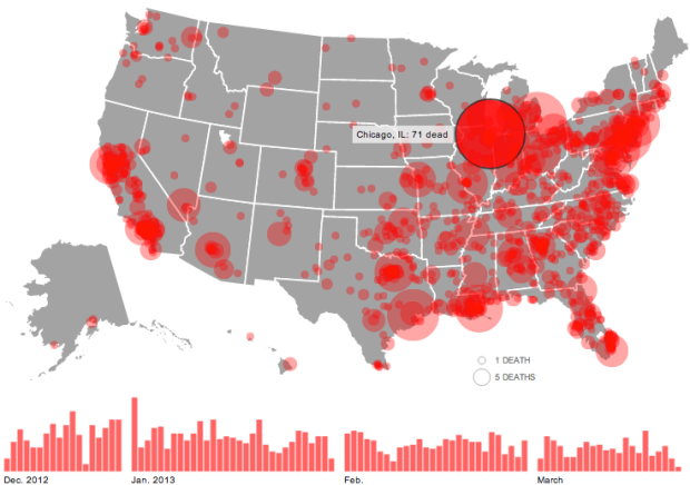
The shooting at Sandy Hook Elementary School was horrible, but there have been thousands of gun deaths since. Huffington Post is mapping them.
Circles represent the number of deaths in a city, and the larger a circle the higher the count. A bar chart on the bottom shows the data over time and serves as a navigation device. Click on a day or a location, and the names of victims appear on the right with a link to the related news story.
See also: Periscopic’s work on the topic, which now has filters and is updated in real-time.
Also: episodes 487 and 488 of This American Life, which focus on Harper High School in Chicago, where gang violence is a daily concern.
 Visualize This: The FlowingData Guide to Design, Visualization, and Statistics (2nd Edition)
Data prior to the shootings should also be presented, for context, no? … otherwise, the graphic might figure to have a socio-political motive. Without context, the graphic depicts abominal American gun policy. Representing the counts in terms of population might also help for context… the few shootings in Alaska might vastly overwhelm the 71 in Chicago when adjusted for population.
PS all that said, the practice of counting gun deaths since the shootings is a matter of activism and not necessarily focused on quality dataviz practice.
They’re a news site, telling factual stories based on what is topical is what they do.
If they were the history channel, or a public information service, then certainly, they should focus on exhaustiveness and not creating interesting content. But they’re not, they’re a commercial news site, and news broadcasters (for better or worse) use hooks to make stories topical.
Why bother, you will ask for systematic data, more studies, careful analysis and after all that accuse then of liberal media bias. Climate change, gun control, women’s health – it’s the charade for each
I agree with the map being normalized by city or state population, this chart could be a simple population map or tweets sent during the super bowl, the oly data we’re seeing is that in the more populated states there are more gun related deaths…
> … otherwise, the graphic might figure to have a socio-political motive.
It’s on a liberal political blog site. Yes, there might be a socio-political motive.
This is really, really well executed: the way it generates itself is not only dramatic, attention-grabbing and an interesting visualisation in its own right, it also in a couple of seconds tells you everything you need to know about how to find your way around their interface. A brilliantly efficient use of the reader’s time and attention.
It does what it aims to do – make an overwhelmingly large volume of information engaging and browsable – extremely well.
The only improvement I can see (that wouldn’t amount to trying to turn it into a different product with a different aim…) would be if they could include snippets of the news stories as your browse the information. Giving names that link to news stories is powerful and clear, but it would be an even more engaging news visualisation if as browsing you could see which are suicides, accidents, murders, etc and get a flavour of each individual’s story before choosing which external news sites to click onto. Maybe autobiographical details like age or occupation. Or the first paragraph of each news story, with a ‘Read on’ link. Not sure how possible or practical this would be though (might require scraping external sites)…
From where do the data come?
Well-executed demagoguery, to be sure. Unfortunately it fails to provide the most relevant bit of information–the bit that would raise it above propaganda and actually make it a useful tool for rational discussion:
How many of these deaths would have been prevented if Obama’s proposed gun regulations had been in effect 5 years ago?
I think we all have a pretty good feeling for the magnitude of that number…which is exactly why they don’t highlight it.
I came here to comment this exactly, so I’ll just +1 you. Without any comparison, this is meaningless advertising.
I usually see better curation from this site, but when it comes to gun data visualizations, they sure do stumble over themselves to press the post button.
Is that what HuffPo was trying to show? It seems that the takeaway from the graphic and the accompanying article was that the shooting at Sandy Hook was horrible, but there have also been thousands of gun deaths since, many of them violent crimes with real people involved.
Why do you say many of them were violent?
Because you can read about them in the linked articles.
Why did they pick the size circle they did? What does the size of the circle mean? It’s arbitrary, and the fact that they are huge and red doesn’t scream bias?
So when you read them, how many we’re homicides and how many we’re accidents?
I assume that your “feeling” is that it would have close to no effect? I doubt it’s worth reporting feelings, and I also doubt it’s simple to make any kind of reasonable estimate on policies like that.
Even if their only goal is propaganda, I don’t think the answer to your question is necessarily relevant – many gun control advocates like myself would want much more strict controls than anything proposed by Obama.
@kenny
“What does the size of the circle mean? It’s arbitrary”
As is the scaling of any chart…? The sizes are relative to each other, as with any other such chart.
“the fact that they are huge and red doesn’t scream bias?”
It’s a chart of gun related deaths. Would you feel better if the circles were daisies?
If portraying gun deaths as being a bad thing is a liberal bias….so be it.
I’m replying to @jlbriggs (not sure how it ended up under this thread).
Of course it’s a bad thing. The point is that you can’t tell how bad in comparison to anything else, hence the “arbitrary” nature of it. Several others here have pointed out other problems.
Attribute whatever bias you want, but most visualizations do have some intentionality behind them. If this was *purely* about the horribleness of death, perhaps including other types of deaths in comparison would have been useful?
It would be useful to be able to distinguish the violent deaths (homicide) from the accidental.
This is exactly what data visualization shouldn’t be.
1. The circles: A circle representing a single death covers around 3,500 square miles of area on the map. This is completely arbitrary and doesn’t provide any meaningful comparison except against the other circles. This means that the map as a background is completely meaningless. If each death was represented as 500 square miles of space instead, the map would look far less bloody while representing the same data.
2. The source of the data is not available, nor are the methods used in the analysis, which puts us at the mercy of the researchers, who are biased. Did they leave out accidental deaths? Deaths from guns which are already illegal? The circles are centered on cities; if someone was killed in an unincorporated part of a county, was that death not included or grouped with the nearest city?
3. Displaying representations of absolute numbers without any context is not only useless, but misleading. A sincere researcher would display, for example, the number of gun deaths as a percentage of all deaths in an area and include figures for gun deaths outside of cities. As previous commentors have noted, why not display only deaths caused by guns that they seek to outlaw? Even in this skewed representation of reality, we see that the states with the toughest gun laws today have the most gun-related deaths. That doesn’t seem to support their theory that more regulation will save lives. In fact, it implies the opposite correlation.
I’m disappointed that this was posted here as anything but an example of what not to do. I thought FlowingData was better than that.
My guess is that the problem with the sizes of the circles has to do with the magnitude of the outliers like Chicago. I think they wanted a single gun death to be easily visible, so they used a fairly large circle. This then required them to scale Chicago’s circle extremely large.
And I don’t see why data should be eliminated from the set. Why should accidental deaths be removed? Why should deaths from illegally-obtained guns be removed? Maybe they are displaying exactly what they intended to display: “Gun deaths since Sandy Hook.”
The ability to filter or see this data using just accidental, just suicides, and just homicides is useful because effective policy for handling these three different situations is likely to be different.
Accidents, suicides, and homicides are three distinct use-cases for firearms. That’s why it is would be useful to be able to see them separately. Because it will help create better policy for dealing with actual problems.
For example, if the majority of the deaths are from accidents then different safety/handling/storage initiatives might make sense. If the majority were suicides then various human service approaches might be more helpful. If homicides are the majority then initiatives dealing with the nature of the homicides including weapon acquisition etc would be useful.
By lumping all of the data together we lose the opportunity to make good policy and build a more peaceful society. Instead we get people pointing fingers, being afraid, calling names etc. on both sides of the 2nd Amendment issue this happens.
As far as the actual data visualization itself: the circles is ridiculous as everyone knows. You have data symbols (circles) being inaccurately coded to geographies miles away from here they should be.
Worse still, the circle radius expands as it represents more data. This means that _the more data in the sample the less accurate the visualization becomes_.
For me that’s a critical flaw in an information design. I don’t accuse them of being liberal or “gun grabbers” or whatever. I do accuse them of being lazy in their approach and making a non-useful graphic as a result.
It’s easy to point fingers though. How might we do it better?
Perhaps an approach that uses color saturation on a standardized dot size. In this way every death would take up the same amount of space (so that the 30th person in Chicago would take up the same amount of space as the first person in ND).
The end result would likely be something like one of those maps of the US at night where we see light pollution. Except instead of lights it would be gun deaths.
This would let us see where people die by way of firearms. If the data were coded to include nature of death (accident|homicide|suicide) then we could compare these to see what sort of policies to pursue.
Check out Slate’s version. http://www.slate.com/articles/news_and_politics/crime/2012/12/gun_death_tally_every_american_gun_death_since_newtown_sandy_hook_shooting.html
Very interesting, why not make it even more information-rich by color-coding by race of perpetrator?
Because civilized societies don’t develop policies that differentiate by race.
Being P.C. does not make a civilized society… or a free one for that matter. Ignoring details is bad science and makes for poor arguments.
Not about being politically correct. It’s about making solid policy. Building in discriminations typically is not effective.
Because race is the least important factor in such things. Socioeconomic factors that coincide with ethnic dispersion in the US are by far the more important aspect.
To actually argue that race is the important part misses the point by a huge margin, and negates any comments you might have on science and the quality of an argument.
This is very dangerous. The bubble over Oakland California, almost reaches Nevada and only represents 24 deaths. According to Wolfram Alpha, in California, 27 people die per hour from all causes, I calculate based upon the total population of the area and the death rate for all causes for the state, that the 24 victims of gun violence represent 0.03044% of the deaths in the state since Sandy Hook and 0.0000000745% of the population of the surrounding area. There is no way that a bubble stretching from Oakland no Nevada can depict that without loosing all integrity to the source data. This graphic requires serious scrutiny and ideally the data community will compile a new graphic to mitigate the serious damage being done to the public conversation by it. I believe that data and words are more powerful than bullets. The data clearly shows that American gun safety laws are working and the people of Oakland deserve praise for having such a low number of incidents. The data does not lie. 24 deaths in a population of 3.22 million is awesome news for Oakland and everyone should find comfort in that. When the graphic presented by the news media appears to say the opposite of the data, it threatens all of us with weapons more dangerous and deadly than guns will ever be: lies, stupidity and ignorance. This infographic is beyond unethical, it’s nearly criminal.
All guns should be illegal…period.
Aaand, troll.
Todos Chillin is just voicing support for a totalitarian police state with a monopoly on violence. Apparently a very trusting soul. There is room for debate on whether or not government can be trusted with this. It’s important to draw lines where they fall, his is a sentiment that I feel, at times, but many believe that government can not be trusted with a monopoly on violence, some believe that such a monopoly, if well executed, would make the people more safe. I believe that too, but can it be done? Is it possible? Perhaps we can look at our government’s track record on other fronts to get an idea of how our government might perform, if it is given the task of disarming the people. More than 30 years ago, a war on drugs was declared and trillions of dollars has been spent since then on ensuring that drugs are not available to the public. After more than 30 years of full scale effort with more than 3 million prisoners incarcerated for drug violations, I find I am still offered drugs, by strangers, simply walking down the street. Given the performance of the government in the war on drugs, I do not believe that a complete prohibition such as making all guns illegal would result in less guns in the hands of criminals. The government just does not possess the capacity to prohibit such ownership. One might hope that they do, but they have not proven the ability to take one single substance off the streets in 30 years. No matter how much one might think it would solve the problem of gun violence, it is not realistic to assume a prohibition of firearms, shutting down firearm and ammo stores, and closing commercial firing ranges would do anything other than increase the street value of guns, and create “dealer stockpiles” and underground firing ranges that take the place of taxable industries. Unless the government does it perfectly, gun prohibition would make everyone less safe. There is no way to establish the government’s ability to ban firearms, it is too dangerous to attempt without some proof that it can be done, and we do not have that. Maybe one day, but not today. Is there any proof available to anyone that shows different?
A single chart and set of data is completely and utterly meaningless and useless except for pushing any type of agenda, regardless of the topic or what site it is posted on.
Besides, why would it be any surprise there has been thousands of gun deaths since the tragedy at Sandy Hook? It’s been almost four months and the U.S. has around 12,000 gun related deaths each year (average of 1,000 per month). Typically over half are suicides…just another example of how useless this information is. They should have waited about 20 years then posted there have been over 50,000 since….nevermind….idiots….