To show the increased levels of drought throughout the state of California, Kyle…
Nathan Yau
-
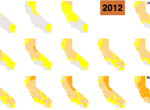
California drought in small multiples
-

Geography.
By way of David Kennerr, something in this CNN frame seems off.…
-

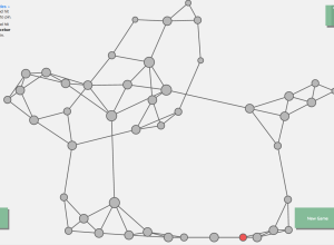
Markov Chains explained visually
Adding on to their series of graphics to explain statistical concepts, Victor Powell…
-
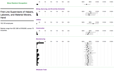
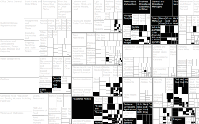
Where People Work and How Much They Make
Salaries for occupations with the same job title can vary across industries. This interactive shows you by how much and who works where.
-

Accessible Web visuals and code with p5.js →
Visualization on the Web can be tricky for those unfamiliar with code. The…
-

Wi-Fi strength revealed in physical space →
Digital Ethereal is a project that explores wireless, making what’s typically invisible visible…
-
Visual Microphone estimates sound from vibrations in objects
A group of researchers from MIT, Microsoft Research, and Adobe Research are experimenting…
-

Google Doodle Venn diagram →
In celebration of John Venn’s 180th birthday, today’s Google Doodle produces a Venn…
-

Cultural history via where notable people died
A group of researchers used where “notable individuals” were born and place of…
-
Mathematically correct bagel
I don’t know about you, but I like my bagel as two roughly…
-

This is Statistics
Statistics has an image problem. To the general public, it’s old, out of…
-
Network visualization game to understand how a disease spreads →
Vax, a game by Ellsworth Campbell and Isaac Bromley, explores how a disease…
-

Explorations of People Movements
A new data source gave rise to a different set of visualization projects. We see people.
-

Civilian casualties in Gaza →
Lazaro Gamio and Richard Johnson for the Washington Post cover civilian deaths in…
-
How well we don’t understand probability
All Things Considered on NPR ran a fine series on how we interpret…
-
Too many numbers
Numbers is a short film by Robert Hloz where some people see numbers…
-
A decade of Yelp review trends →
Yelp released an amusing tool that lets you see how the use of…
-
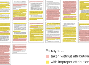
Senator John Walsh plagiarism, color-coded →
John Walsh, the U.S. Senator from Montana, is in the news lately for…
-
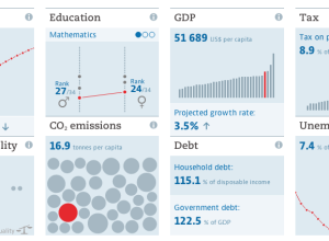
A more visual world data portal →
One of the most annoying parts of downloading data from large portals is…
-
Members Only
How to Make an Interactive Treemap
Treemaps are useful to view and explore hierarchical data. Interaction can help you look at the data in greater detail.
Recently for Members
Second Edition
 Visualize This: The FlowingData Guide to Design, Visualization, and Statistics (2nd Edition)
 Visualize This: The FlowingData Guide to Design, Visualization, and Statistics (2nd Edition)
New tools, refined process.
Browse by Chart Type See All →


