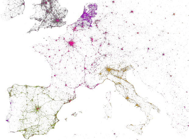
MapBox, along with Gnip and Eric Fischer, mapped 3 billion tweets and a handful of variables.
This is a look at 3 billion tweets — every geotagged tweet since September 2011, mapped, showing facets of Twitter’s ecosystem and userbase in incredible new detail, revealing demographic, cultural, and social patterns down to city level detail, across the entire world. We were brought in by the data team at Gnip, who have awesome APIs and raw access to the Twitter firehose, and together Tom and data artist Eric Fischer used our open source tools to visualize the data and build interfaces that let you explore the stories of space, language, and access to technology.
You’ll probably recognize some of the maps, as they build on Fischer’s previous projects, such as languages of Twitter and locals versus tourists. The originals were static images though. The interaction provides an exploratory view that lets you poke around the areas you’re interested in, and maybe best of all, it was built with open source software.

 Visualize This: The FlowingData Guide to Design, Visualization, and Statistics (2nd Edition)
I find it fascinating how well you can see not only major population centers, but also major highway networks, and the interconnections.
Good stuff.