It’s a common belief that if someone has a medical condition, a patient…
Nathan Yau
-
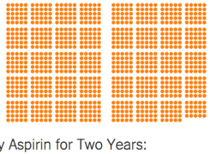
Chances that a drug treatment helps
-
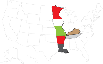
State Rorschach
Stare at boundary lines long enough, and you’ll start to see weird things too.
-
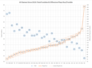
Questionable fumble statistics for Deflate-Gate
A data-centric look at New England Patriots fumble rates at home made the…
-
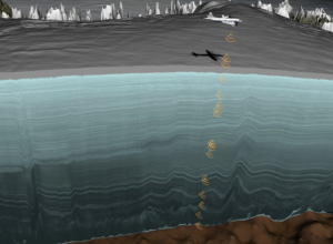
Mapping ice layers with radar data
I don’t know exactly how much data NASA has in the bank, but…
-
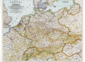
A century of National Geographic maps
Celebrating the 100th year of the National Geographic cartographic department, they provide a…
-

Fibonacci sculptures fake movement
John Edmark made some pretty things.…
-
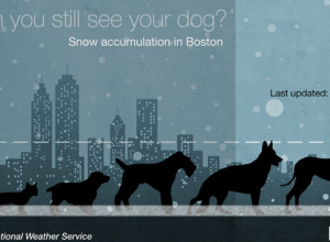
Snow depth by dogs
For the US east coasters and their pets.…
-
Members Only
Choropleth Maps and Shapefiles in R
Fill those empty polygons with color, based on shapefile or external data.
-
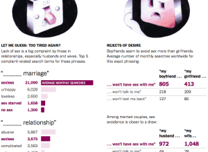
Sexual insecurities found in Google search results
Seth Stephens-Davidowitz continues with his Google search data-related op-eds for the New York…
-
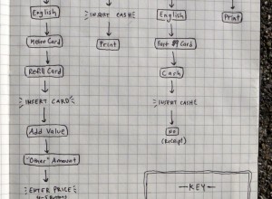
Metrocard purchasing workflows compared
The process to purchase a MetroCard for the New York Subway is different…
-
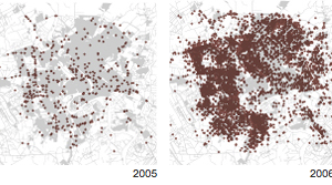
The dots are people
The simple analysis is to approach data blind, as machine output. But this…
-

Being dangerous
Think big data, and it’s tough not to associate it with big corporations…
-
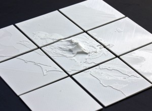
Convert geographic data to 3-D models for printing
This seems like fun. The NodeJS package shp2stl by Doug McCune lets you…
-
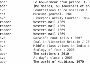
Book checkouts from the British Library
In efforts to emphasize the importance of the library (very), the British Library…
-
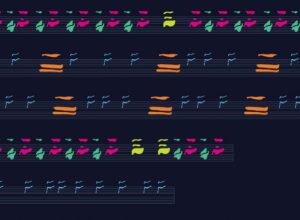
Whale songs visualized
It’s been known for decades that the sounds that whales make show patterns…
-
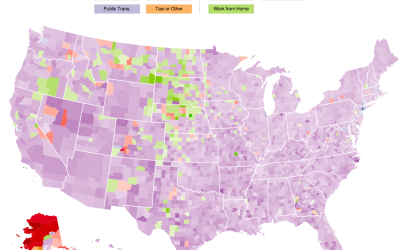
Interactive: How Americans Get to Work
The way that people get around can say a lot about how a place is made up. Here’s an interactive map that shows how people get to work in America.
-
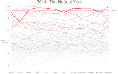
Feeling hot, hot, hot
When you look at overall global temperatures over time, you see a rising…
-

Chart none of the things
When it comes to storytelling, copious amounts of data often means lots of…
-
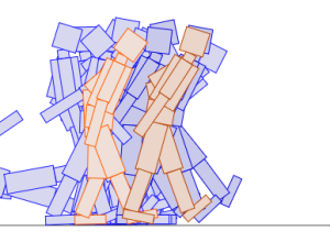
Genetic algorithm walkers
If you ever wondered what it looks like when QWOP-like figures learn to…
-
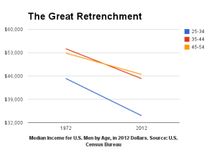
Basic chart, wrong conclusions
A short post on Bloomberg from 2013 describes the fall of U.S. mens’…
Recently for Members
Second Edition
 Visualize This: The FlowingData Guide to Design, Visualization, and Statistics (2nd Edition)
 Visualize This: The FlowingData Guide to Design, Visualization, and Statistics (2nd Edition)
New tools, refined process.
Browse by Chart Type See All →


