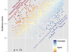
Ben Moore was curious about overrated and underrated films.
“Overrated” and “underrated” are…
Nathan Yau
-
Most underrated films
-
Create a barebones R package from scratch
While we’re on an R kick, Hilary Parker described how to create an…
-
R for cats and cat lovers
Following the lead of JavaScript for Cats by Maxwell Ogden, Scott Chamberlain and…
-
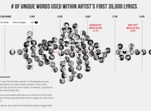
Hip hop vocabulary compared between artists
Matt Daniels compared rappers’ vocabularies to find out who knows the most words.…
-
Your mobility at various times during the day
Isoscope, a class project by Flavio Gortana, Sebastian Kaim and Martin von Lupin,…
-
The size of Game of Thrones dragons compared
Because Game of Thrones. Max Fleishman and Fernando Alfonso III for The Daily…
-
Views of white Americans
In light of the Donald Sterling brouhaha, Amanda Cox for The Upshot put…
-
Hiding a pregnancy from advertisers
You probably remember how Target used purchase histories to predict pregnancies among their…
-
Interactive visualization used as music video
George & Jonathan used an interactive audio visualization for their recent album George…
-
Combatting the Obsession with New Tools
Michal Migurski thinks about finding the right job for the tool rather than…
-
Learn regular expressions with RegExr
Learning regular expressions tends to involve a lot of trial and error and…
-
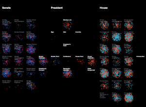
Lawmaking through the House and Senate visualized
Researchers at the University of Washington’s Center for American Politics and Public Policy…
-
Members Only
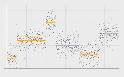
Detecting and Plotting Sequence Changes
Change detection for a time series can be tricky, but guess what, there’s an R package for that. Then show the results in a custom plot.
-
Audio visualizer made with matrix of fire
The Pyro Board is a matrix of 2,500 flames that have controllable intensity,…
-
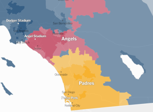
Detailed map of baseball fandom →
For the past couple of sports seasons, Facebook mapped the most liked team…
-
PourOver allows filtering of large datasets in your browser
The New York Times released PourOver, a library that lets you do database-like…
-
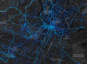
Where people bike and run, worldwide
Remember those running maps I made with limited data from RunKeeper? Strava, which…
-
The Change My Son Brought, Seen Through Personal Data
I combed through personal data that I’ve actively and passively collected since early graduate school to see how life is different now with a 6-month old.
-
The Upshot, a data-centric site from The New York Times launched
We heard a little bit about The Upshot last month. Now we get…
-
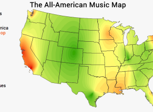
Music preference by region
Movoto mapped music preference for various genres, across the United States.
We calculated…





 Visualize This: The FlowingData Guide to Design, Visualization, and Statistics (2nd Edition)


