Erik Bernhardsson downloaded 50,000 fonts and then threw them to the neural networks…
Nathan Yau
-

Playing with fonts using neural networks
-
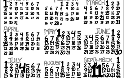
Missing 11th of the month
David Hagan looked closer at why the 11th of the month appeared to…
-
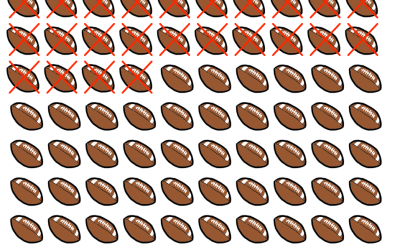
Counting your days left with emoji
While we’re on the topic of life expectancy, Tim Urban of Wait But…
-
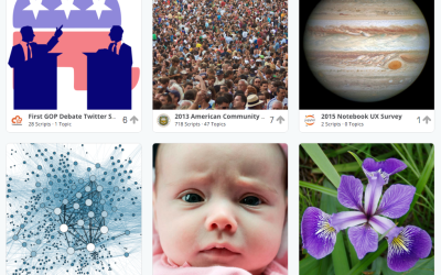
Kaggle Datasets for a place to converge on public data
Kaggle just opened up a Datasets section to download and analyze public data.…
-
US Census Bureau open source
It took forever and it’s way overdue, but the United States Census Bureau…
-
How You Will Die
So far we’ve seen when you will die and how other people tend to die. Now let’s put the two together to see how and when you will die, given your sex, race, and age.
-
Nerdy Powerball FAQ
The Powerball FAQ was most likely written by a slightly annoyed statistician. You’d…
-

Punctuation only in literary works
What do you get if you take famous literary works, strip out all…
-
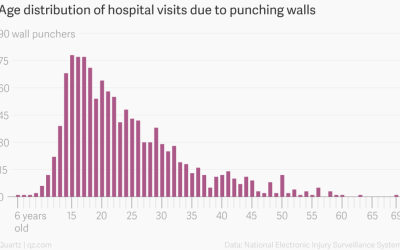
Data on people who went to ER for wall-punching
Keith Collins for Quartz ran some quick numbers for people who visited the…
-

NYPL public domain data
The New York Public Library just made over 180,000 digital items in the…
-
Immigration history
American immigration history is chock full of policies and restrictions, and you can…
-
Members Only
How to Customize Axes in R
For presentation purposes, it can be useful to adjust the style of your axes and reference lines for readability. It’s all about the details.
-
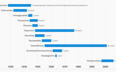
Antibiotic history and the winning bacteria
We take antibiotics. Bacteria dies, but some lives, evolves and develops a resistance…
-

Try to win the lottery
The Powerball Lottery is big news in the United States right now. The…
-

Visual breakdown of additives in food
In their book Ingredients, Dwight Eschliman and Steve Ettlinger explore additives in common…
-
Simulate the world as an emoji system of rules
We tend to think of life in terms of cause and effect. Do…
-
Link
Colors from images in R →
A how-to to break down images into just their colors.
-
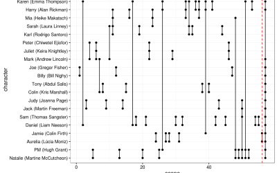
Analysis of Love Actually
Forget about Shakespeare. Let’s look at a real classic: Love Actually. Somehow I…
-
Causes of Death
There are many ways to die. Cancer. Infection. Mental. External. This is how different groups of people died over the past 10 years, visualized by age.
-
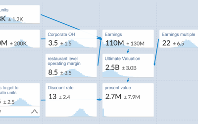
An uncertain spreadsheet for estimates
A lot of data you get are estimates with uncertainty attached. Plus or…
Recently for Members
Second Edition
 Visualize This: The FlowingData Guide to Design, Visualization, and Statistics (2nd Edition)
 Visualize This: The FlowingData Guide to Design, Visualization, and Statistics (2nd Edition)
New tools, refined process.
Browse by Chart Type See All →


