FiveThirtyEight and The Trace investigate the uncertainty and accuracy of gun injury data…
Nathan Yau
-
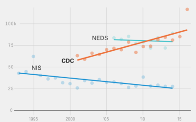
Unreliable gun data from the CDC
-
Chromebook Data Science
Getting into data science typically requires that you have access to a decent…
-
Members Only
This is Misleading, This is Not Really Misleading
The truth is that all charts are misleading. In some sense. The key is minimizing how much.
-
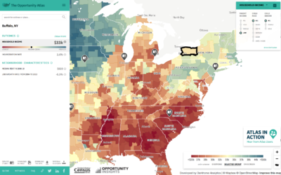
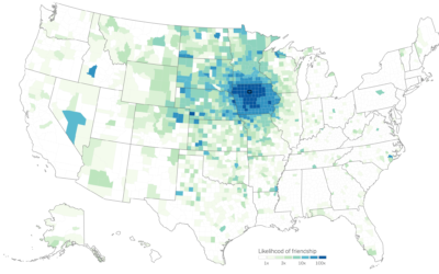
Mapping opportunity for children, based on where they grew up
Opportunity Atlas, a collaboration between Opportunity Insights and the Census Bureau, is the…
-
Shifting Causes of Death
The most common causes of death changed over the years. They vary across sex and age group. This animation shows the details of these changes.
-
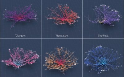
Coral-like cities to show road networks
Craig Taylor from Ito World used a coral metaphor to visualize road networks…
-
The Markup is a new journalism venture to examine technology through data
Founded by Sue Gardner, the former head of the Wikimedia Foundation and Julia…
-
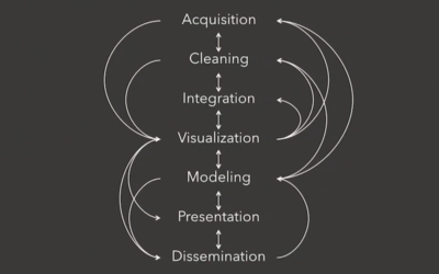
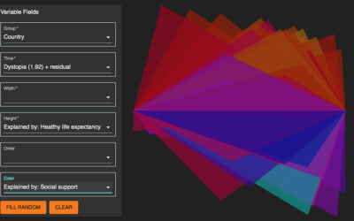
Constructing charts and graphs
Jeffrey Heer, a computer science professor at the University of Washington, provides an…
-
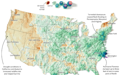
Summer rain levels compared to the norms
Tim Meko and Aaron Steckelberg for The Washington Post compared this summer’s rains…
-
Members Only
Practicing with a Visualization Toolbox, Tools and Additional Resources Roundup – September 2018
If you’re trying to learn how to work with data, make time to fiddle with the toys in your growing toolbox. Otherwise, you just have a bunch of bookmarks and no new skills.
-
Morph, an open-source tool for data-driven art without code
Morph, by Datavized in collaboration with the Google News Initiative, is a tool…
-
One Drink Per Day, Your Chances of Developing an Alcohol-Related Condition
While a drink a day might increase your risk of experiencing an alcohol-related condition, the change is low in absolute numbers.
-
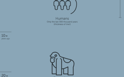
Timeline of Earth
Here’s a fun piece by Andy Bergmann that shows the timeline of Earth.…
-
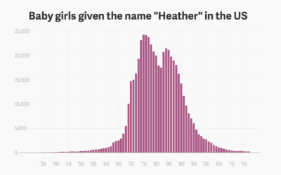
The rise and plummet of the name Heather
Hey, no one told me that baby name analysis was back in fashion.…
-
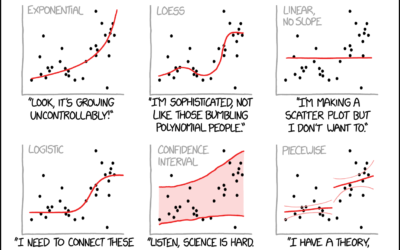
xkcd: Curve-fitting messages
xkcd tells it like it is.…
-
Members Only
Chart Components and Working On Your Graphics Piece-wise
Break the visualization into its basic pieces to make it easier to make, edit, and reuse.
-
Judging connectedness of American communities, based on Facebook friendships
We talk about geographic bubbles a lot these days. Some areas are isolated,…
-
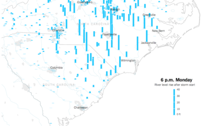
Watch rising river levels after Hurricane Florence
Hurricane Florence brought a lot of rain, which in turn made river levels…
-
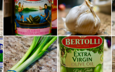
Cuisine Ingredients
What are the ingredients that make each cuisine? I looked at 40,000 recipes spanning 20 cuisines and 6,714 ingredients to see what makes food taste different.
-
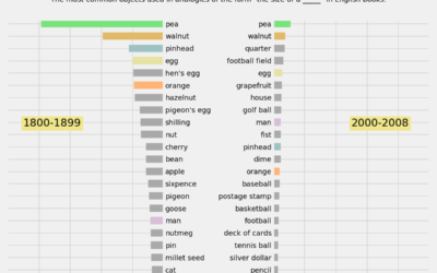
Changing size analogies and the trends of everyday things
When you try to describe the size of something but don’t have an…
Recently for Members
Second Edition
 Visualize This: The FlowingData Guide to Design, Visualization, and Statistics (2nd Edition)
 Visualize This: The FlowingData Guide to Design, Visualization, and Statistics (2nd Edition)
New tools, refined process.
Browse by Chart Type See All →


