Brad Plumer and Nadja Popovich reporting for The New York Times:
Under the…
Nathan Yau
-
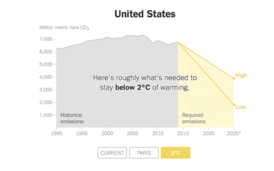
Carbon emissions goals vs. current paths
-
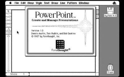
PowerPoint history lesson
David C. Brock writing for IEEE Spectrum delves into the origins of PowerPoint.…
-

Visualization song release
Ukranian band Obiymy Doschu released a new song Razom. “It’s a uplifting and…
-
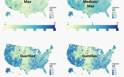
Choosing color palettes for choropleth maps
Choropleth maps, the ones where regions are filled with colors based on data,…
-
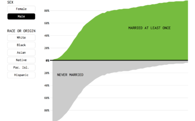
Percentage of People Who Married, Given Your Age
Or, given your age, the percentage of fish left in the sea. Here’s a chart.
-

AI-generated celebrity faces look real
Researchers from NVIDIA published work with artificial intelligence algorithms, or more specifically, generative…
-
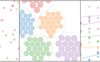
Visual explainer for hierarchical modeling
Hierarchical models, or multilevel models, are used to represent data that might vary…
-
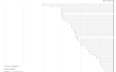
Charts show time between assaults and public allegations
As the list of sexual assault allegations grows for Harvey Weinstein (and many…
-

Project Lincoln from Adobe aims to reverse data visualization workflow
With data visualization, you start with the data and let it guide geometry,…
-
Data journalism lessons available from ProPublica Data Institute
ProPublica runs a small annual workshop to teach journalists a bit about data…
-
Link
What Makes a Good Data Scientist at a Small Company →
Being good with data, sure. Then there are other things.
-
Sorting algorithms visualized with animated color palette
I bet you woke up this morning thinking, “I haven’t seen a good…
-
Members Only
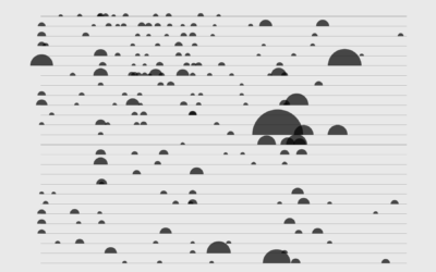
How to Make a Semicircle Plot in R
It’s the half cousin of the bubble plot with less overlap and more straight edges.
-
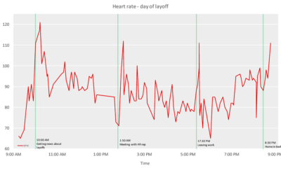
Heart rate during layoff
Add another chart to the genre of heart rate during a significant event.…
-

Visualizing fertilization of egg by sperm at the atomic level, with a Star Wars theme
Don Ingber and Charles Reilly of the Wyss Institute used data at the…
-
4 Tools to Pick Your Chart Colors
These are the quick and simple tools I use to pick colors to represent data.
-
Link
World Tile Grid Map in ggplot2 →
A straightforward tutorial on using squares instead of geographic boundaries.
-

CARTOColors is a quick set of color schemes to copy
Picking colors is one my favorite things to do with visualization when I’m…
-

A study of the geographic forms in cartography
Cartographer Geraldine Sarmiento from Mapzen explores the drawing forms in cartography, such as…
-
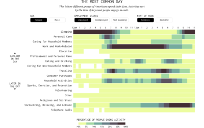
American Daily Routine
Sleep. Work. Play. The times and everything in between change depending on who you talk to.
Recently for Members
Second Edition
 Visualize This: The FlowingData Guide to Design, Visualization, and Statistics (2nd Edition)
 Visualize This: The FlowingData Guide to Design, Visualization, and Statistics (2nd Edition)
New tools, refined process.
Browse by Chart Type See All →


