It’s difficult to emphasize how much life changes when a child comes into…
Nathan Yau
-
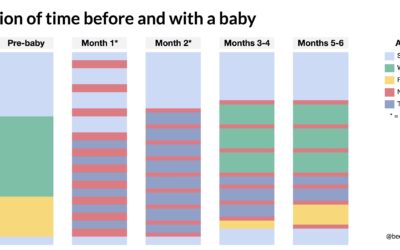
Schedule change with a baby
-
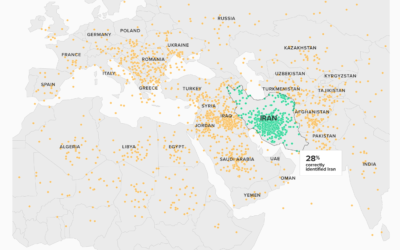
Can’t find Iran on a map
Based on a Morning Consult/Politico survey, most people don’t know where Iran is:…
-
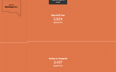
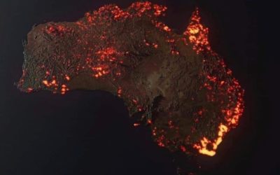
Scale of Australia bushfires shown with unit charts
Outside of Australia, it can be a challenge to get a grasp of…
-
Members Only

Just Enough Chart (The Process #71)
For those new to visualization, learning all of the methods, implementations, tools, and guidelines can seem like a daunting task. Not to mention everything that happens before the actual visualizing, such as analysis, data formatting, and context-making. You don’t have to learn it all at once.
-
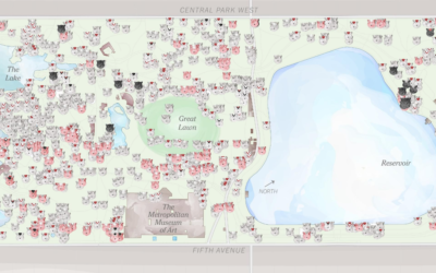
Squirrel census count in Central Park
In 2018, there was a squirrel census count at Central Park in New…
-
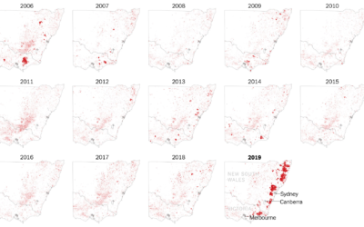
Where the Australia fires are burning
The New York Times zoomed in on southeastern Australia where the fires have…
-
Misinterpreted or misleading fire maps
With all of the maps of fire in Australia, be sure to check…
-
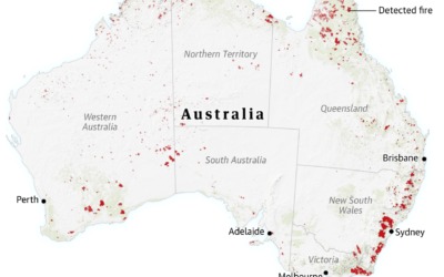
Visual guide for the fires in Australia
For The Guardian, Niko Kommenda and Josh Holder provide a visual guide to…
-
Weight gain lines
From Kim Warp for The New Yorker. Ha. Ha. It’s funny because it’s…
-
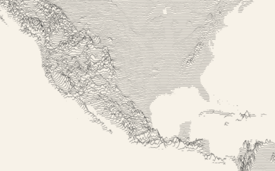
Draw a ridgeline map showing elevation, for anywhere on Earth
Ridgeline charts or frequency trails use parallel lines that overlap on the fluctuations,…
-
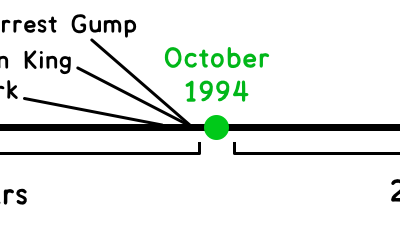
Timelines to make you feel old
One of the best ways to feel old is to look to your…
-
Members Only

Technical Know-How is Part One (The Process #70)
There’s a technical component of visualization that leans towards code, data formatting, and clicking the right buttons in the right order. Then there’s everything else that makes okay charts into something much better.
-
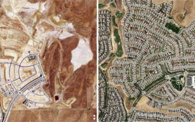
Urban growth via satellite imagery
For The Upshot, Emily Badger and Quoctrung Bui looked for major urban developments…
-

2019.
My main goal for FD this year was to make charts.
I hoped… -
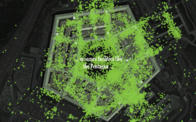
One leaked file, the location of 12 million smartphones
A file leaked to The New York Times contained location traces of 12…
-

Scripts from The Office, the dataset
The decade is almost done. You’re sitting there and you’re thinking: “I wish…
-
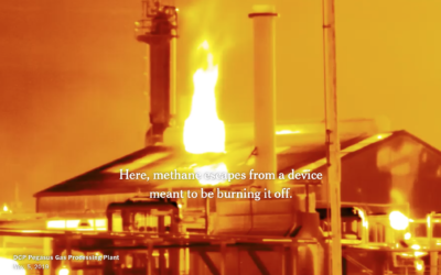
Making invisible gas leaks visible
For The New York Times, Jonah M. Kessel and Hiroko Tabuchi went to…
-
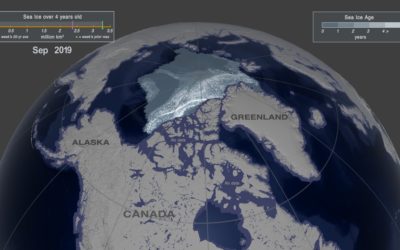
Arctic ice melting
One way to gauge the amount of ice in the Arctic is to…
-

Analysis of online sermons
Pew Research Center analyzed online sermons in U.S. searches, taking a closer look…
-
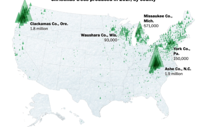
Where Christmas trees come from
For The Washington Post, Tim Meko and Lauren Tierney:
Before the 1930s, Christmas…
Recently for Members
Second Edition
 Visualize This: The FlowingData Guide to Design, Visualization, and Statistics (2nd Edition)
 Visualize This: The FlowingData Guide to Design, Visualization, and Statistics (2nd Edition)
New tools, refined process.
Browse by Chart Type See All →


