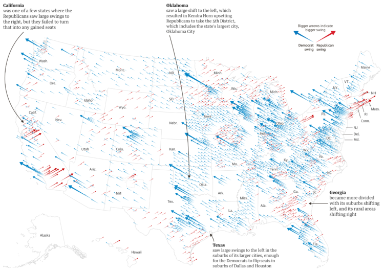
The Guardian goes with scaled, angled arrows to show the Republican and Democrat swings in these midterms for the House compared against those of 2016.
It reminds me of the classic wind-like map by The New York Times from 2012, but the angles seem to give the differences a bit more room to breathe.
Update: Also, see a similar map by NYT from 2016, except the arrows point the other direction.
 Visualize This: The FlowingData Guide to Design, Visualization, and Statistics (2nd Edition)